


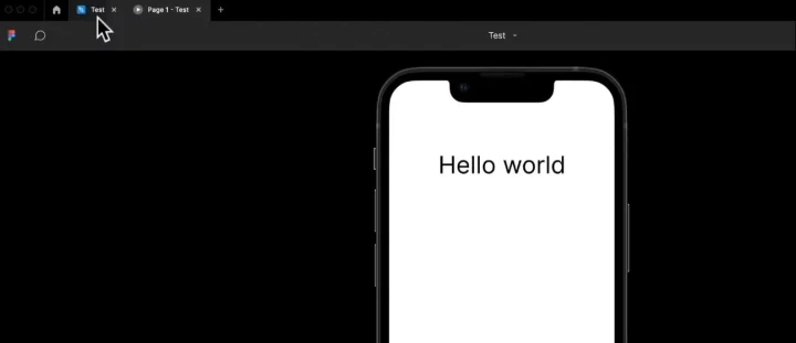
Looking to learn Figma but not sure where to start?
Well, good news! In this guide I break down the basic ‘101’ beginner information on Figma, step-by-step, so you can understand what everything does and how to use it.
- The main dashboard
- The Figma Canvas
- Each of the design and editing tools
- Collab tools
- Prototypes
- Layouts, constraints, and more!
P.S. If you're not sure if you should use Figma, check out this post I wrote with my top reasons why you should learn Figma.
Why listen to me?
My name is Daniel Schifano, I've worked as a Product Designer for over 10 years. Everything from:
- User Experience
- Visual Design
- User Research
- Product Strategy
- Lean and Agile Design Methodologies
- Building and eading design teams (including hiring and training new Designers)
- and much more
And a key tool my team and I and have been using pretty much every day for many years now is Figma. Not only that but I also teach Figma and design as an instructor at Zero To Mastery.
My courses are:
- UI/UX Product Design Bootcamp (with Figma being a key tool we use), and
- Motion Design with Figma: Animations, Motion Graphics, UX/UI
- The Complete Career Toolkit: Personal Branding, Resume Building + more
I also wrote a detailed step-by-step guide on How to Become a Product Designer & Get Hired which has become quite popular.
So rest assured, I have a lot of experience when it comes to Figma and design in general 🙂.
The best part?
I’ve actually made the first 2+ hours of my design bootcamp course where we focus on learning Figma completely free on Youtube.
This guide you're reading covers roughly the the first hour or so of the video below.
Important Note: This free video is slightly outdated. Figma (and all tools) are constantly changing and updating their UI and functionality. Unfortunately on Youtube, I can't update a video but the principles and information are still the same.
However, if you want to get a completely updated video version (and learn everything you need to get hired as a full-time UI/UX designer), then come take my ZTM design bootcamp which I'm constantly updating with new lectures.

With that out of the way, let’s dive in, and show you how Figma works.
What is Figma?
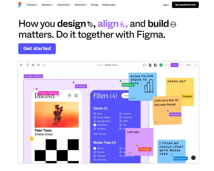
Figma is a design tool that allows you to:
- Create amazing UIs
- Build and use design systems
- Collaborate with your team incredibly easily
- Prototype and get feedback
- Enables easy handoffs for developers
- And allows you to bring your ideas to life!
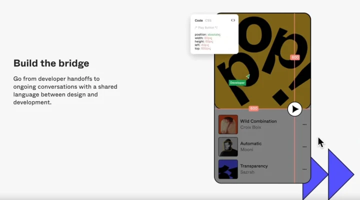
For example
Here’s how great Figma is for collaboration with devs.
By inspecting your design inside of Figma, they can then highlight your design elements and understand the code required to bring it to life, as well as any important design specifications, such as border sizes or positions!
Cool right?
Figma really is a great tool that allows you to work with your entire team. From the initial strategy, to design and development.
How much does Figma cost?
As of writing, Figma offers 4 different pricing plans:
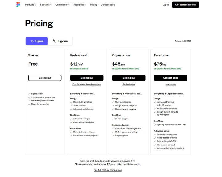
The good news is, that you only need the free version for everything that we’re about to cover.
You can try it out and learn how to use it, and then move to the professional plan when you want to save multiple projects (free is limited to 3 design files). Not only that, but the professional version allows you to use Figmas libraries of design components across multiple projects.
For now though, just get started with the free version here and then download it.
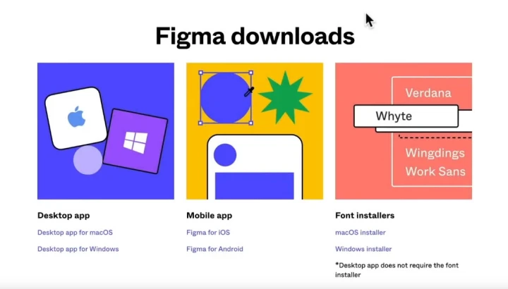
You can use it on the browser if you want to, and there’s no real difference in layout or performance. However, I recommend downloading the desktop app and using it on your desktop/laptop just in case you have any browser issues.
You can also download the mobile version to your iOS or Android device. Not so much to do design work directly, but more so if you want to communicate or collaborate with others, or check design files.
That way if there are any comments or questions you can answer them on the go.
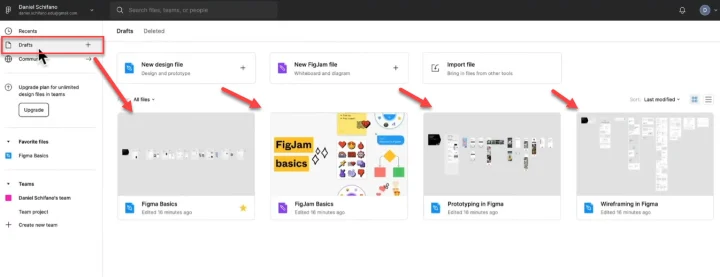
Understanding Figma’s Dashboard and UI
Before you can learn to use Figma, you need to understand its UI and the options available.
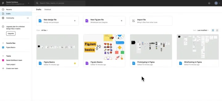
This is the standard dashboard screen that you’ll see when you first log in.
So let’s break some of this down, working from left to right.
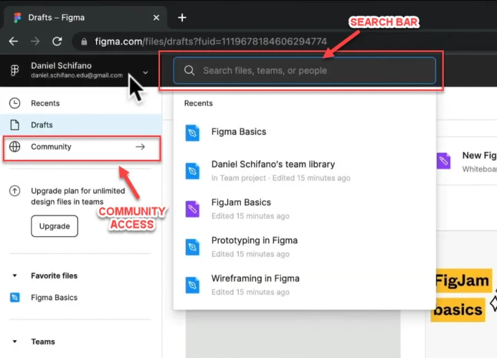
The search bar
At the top left of the screen, you have the search bar, where you can search for files, teams, team members, etc.
To the left of that, you have a few options in the sidebar.
Current logged in account
At the top, you have your current logged-in account (with the option to switch between accounts). This is handy if you have a personal account and maybe a work account, and you can bounce between them.
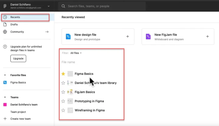
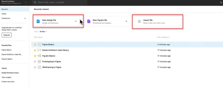
Recent files
These are the documents and files that you’ve recently opened.
Drafts
This is where you can access the current projects that you’ve been working on.
If you’re on the free plan, then this is where your projects will live.
If you have a professional plan or higher, then you’ll have another option on the left for your team. Click on that, and then you can see all the saved files for that team project.
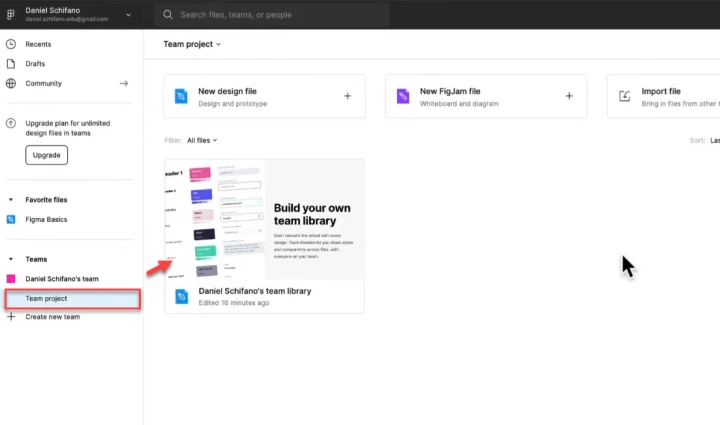
Regardless of which filing option you have, just make sure to start with good habits in mind and name your projects properly 😉.
Adding favorites
You also have the option to star or favorite files and projects, so that you can find them easier.
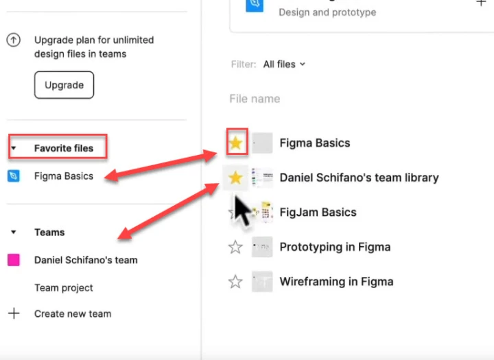
Any that you have already favorited will then appear in the left-hand sidebar able to be clicked on and jump to.
If we pan across to the middle of the dashboard, you’ll see 3 options at the top of the screen.
You can click to set up a new design file, a new Figjam file, or import a file.
Creating a new design file
Go ahead and click on ‘New Design File’. This will load up the Figma canvas that we will work from for the rest of this tutorial.
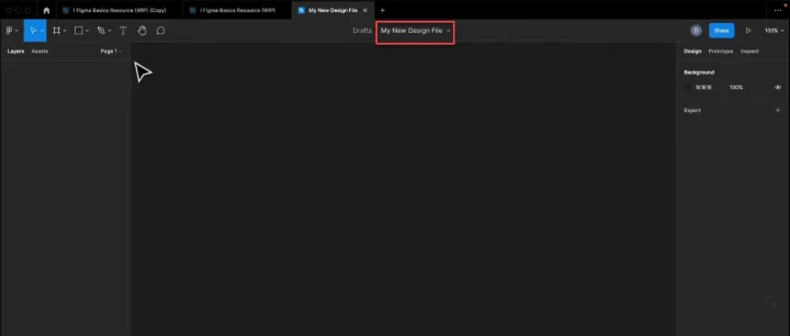
Give the file a name, and then let’s get into how to start using this.
An overview of the Figma Canvas UI
Just like with the dashboard, we need to understand the options in the Figma canvas if we want to use it properly.
The Canvas toolbar
At the top of the screen, you’ll see the toolbar with a bunch of icon options to choose from.
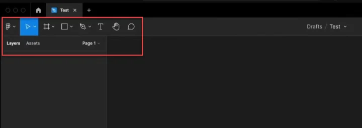
Just like before, let’s work through them from left to right.
The main Canvas menu
The very far left icon is for the menu.
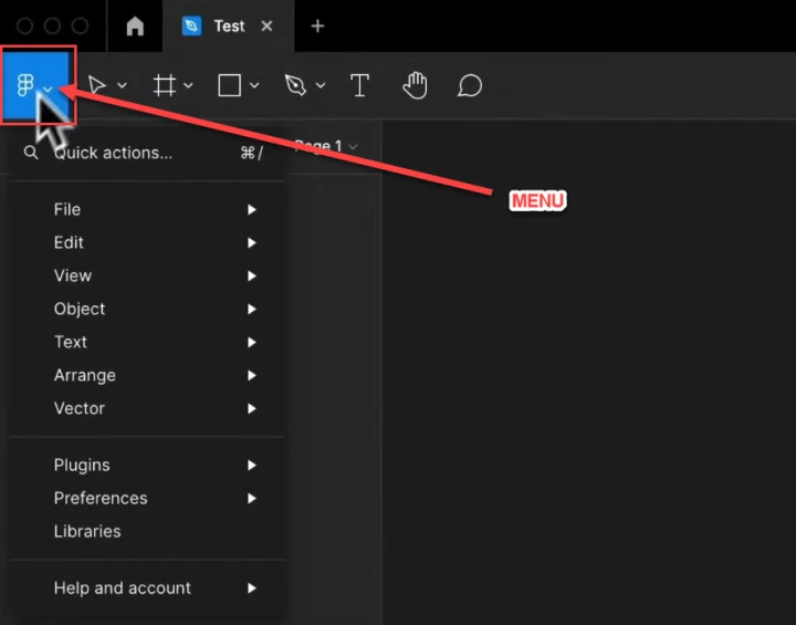
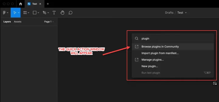
Selecting quick actions opens up a pop-up window with popular task options, as well as a search function.
Most of the other options are for settings that you’ll only really use once or twice.
However, there is a really helpful feature in the drop-down menu under ‘Help and account:’ and then ‘Keyboard shortcuts’.
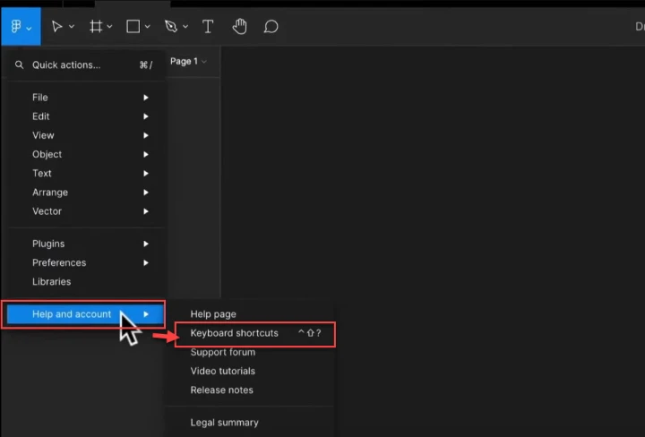
When you click on that, a bar will appear at the bottom of the canvas featuring the most essential shortcuts for each type of goal that you might have.
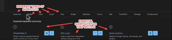
Shortcuts for:
- Zoom
- Text
- Images
- Shape
- Editing
- Transform
- Etc
For example
Here you can see common shortcuts for shapes when the shape tab is clicked on.
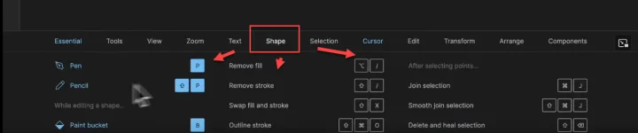
As you can guess, this is incredibly helpful.
But enough about the shortcuts, let’s carry on with the toolbar menu options and what they mean.
Move and Scale tools
The next option from the left in the top toolbar is the Move and Scale tools.
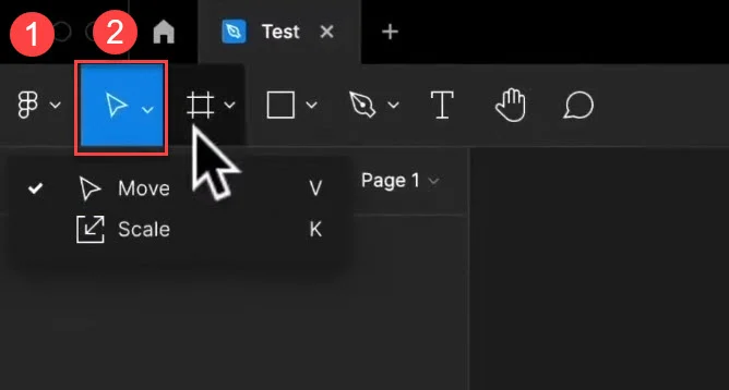
We’ll cover these more as we go through this tutorial, but just so you know where to find them.
Frame and Slice tools
Next, you have the Frame and Slice tools.
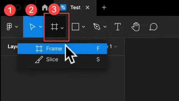
The frame is basically the artboard that you will create onto. Again, I’ll cover this more soon.
The Shape tool
Next, we have our Shape tool.
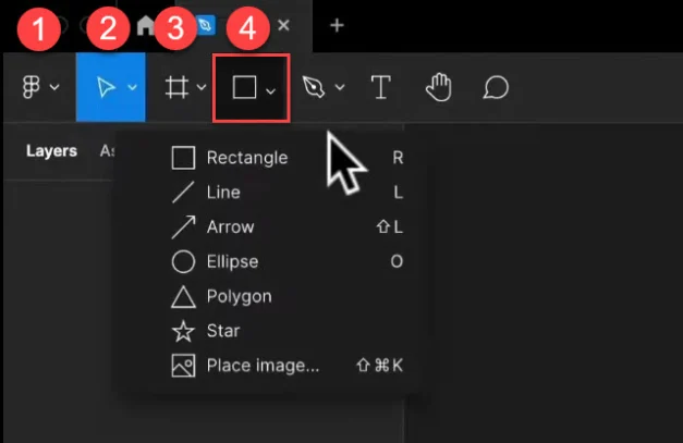
As you can guess, the shape tool allows us to create predefined shapes to our desired sizes and placements.
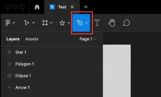
The Pen tool
The Pen tool allows you to create custom shapes.

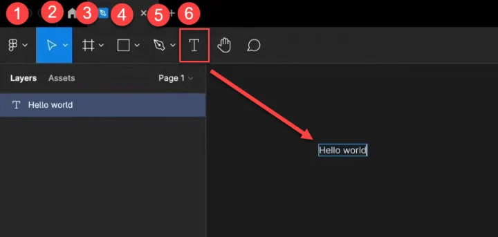
The Text tool
As you might guess, the text tool allows you to write sections of text.
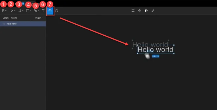
The Hand tool
The Hand tool allows you to drag and move objects in the canvas.
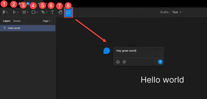
The Comment tool
Finally, the comment tool allows you to leave comments on specific elements for collaboration.
Contextual tools
These tools are at the top of the canvas but only appear when you have multiple elements selected.
For example
Here you can see that I’ve created 2 rectangles and then selected them both, and the contextual menu has appeared.
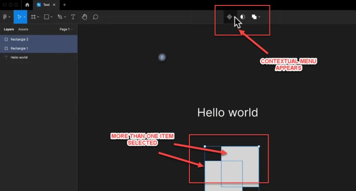
So let’s go through these.
The first option is the component menu.
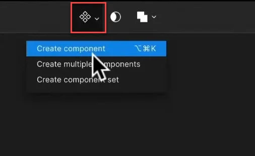
Next to that, we have the Masking tool and Boolean tools. These are all a little advanced so I’ll cover these in more detail as we start to use them later in this guide.
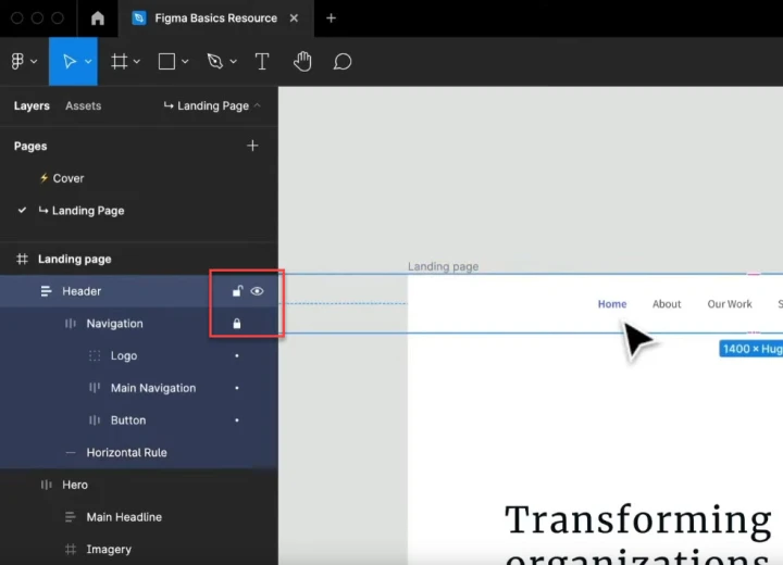
The Canvas left sidebar
The left sidebar is where the structure of your design sits and includes all layers and assets.
Layers panel
This can include everything from frames, groups, components, shapes, images, gifs, and more.
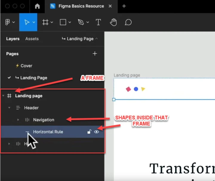
As you can see, each element inside that frame is nested - helping you to organize your designs.
You can simply drag and move elements from each layer to add, remove, or change its nested group.
Just make sure to click and give accurate names for each element so you know what they are. Once you’re doing designs with a lot of elements, it can quickly get confusing if you don’t follow good naming habits.
For example
Frame #1004 or 'lastframefinaleditusethisversion' wouldn't really give enough information even for the creator, but ‘header section’ would be much easier to understand - even for 3rd parties.
There are also a few other interactions that you can do with these elements.
If you hover over them, you can choose to lock or unlock, to stop that element being edited or moved, as well as an option to make the element invisible/hidden for the time being.
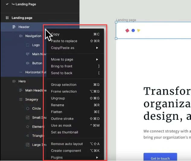
Additionally, you can right-click on any element to open up a menu with options for copy, delete, etc.
Assets panel
As well as layers, there’s also an Assets menu option in the left-sidebar.
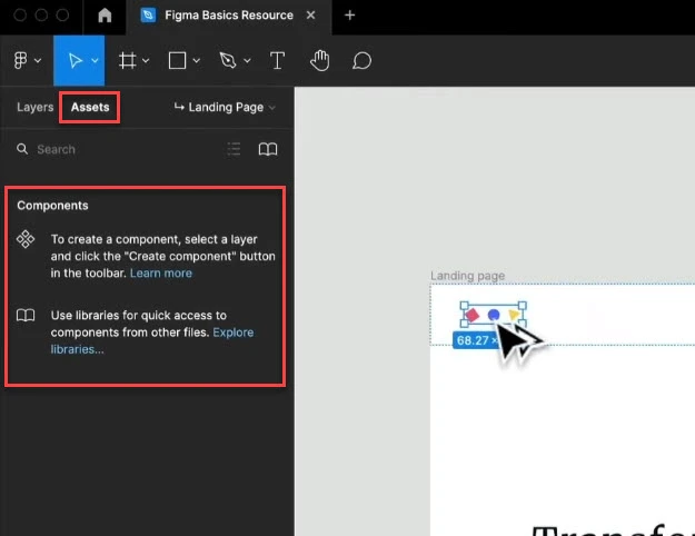
This section allows us to both create, use, and reuse components.
For example
If I already have a button component that I created, it would show up in this section.
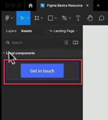
I could then click on that to create multiple copies, that I could then edit.
Notice that Figma will also give you advice on how to use each feature as you go.
One important thing to remember is that on the free plan, you can only access components here that you’ve created. (You can’t import others).
If we pan across to the far right of the toolbar menu, we have share, play, and zoom options.
The share is pretty self explanatory, and the play button is to run any prototypes that you have created. (More on this in a second).
Zoom and View tool
Likewise, the zoom and view tool is pretty easy to use.
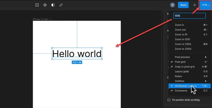
You can click and then set a percentage zoom in or out.
With those covered, let's get into the right-hand sidebar itself.
The Canvas right sidebar
OK, so the last section on understanding all the options in the canvas UI.
The left-sidebar is where we organize our layers and assets, but the right sidebar is where you’ll be doing most of your interactions with your designs.
The notification bell
At the top right-hand side of the dashboard, you’ll see a notification bell, and your account.
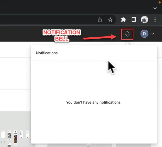
Right now there are no notifications, but this is handy when working with others and seeing when new collab messages or changes have been implemented.
Account management
You can also click on your name to access your account for billing etc.
The Design panel
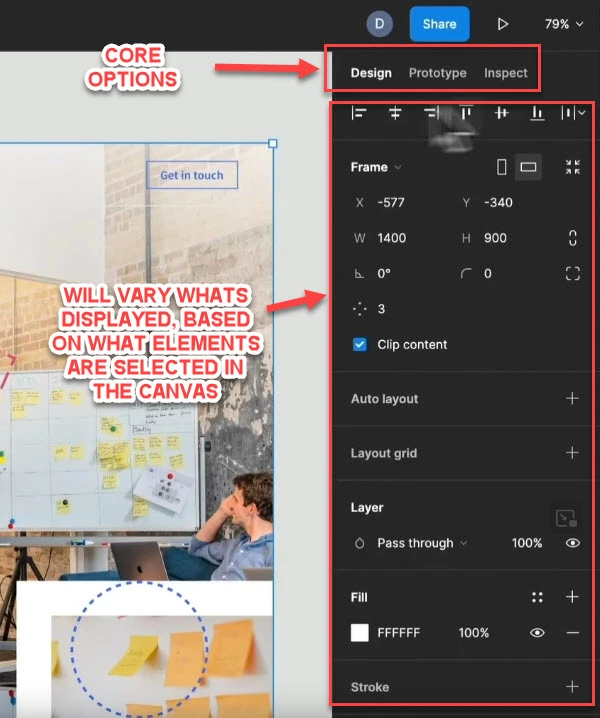
We have 3 core panel options, with design always being the main one highlighted. (I’ll cover the prototype and Inspect in a second).
Important: The right-sidebar's appearance and features will change, depending on what you are interacting with or have selected in either the canvas or left sidebar.
With that in mind, I’m going to explain some of the most common features that you’ll come across. A lot of them are intuitive and can be explained with a bit of a play around, but just so you now.
Alignment options
Assuming that we have something selected in the canvas, the first option as we work our way down the panel, are the alignment options.
We can use these to alter the alignment of any selected items, like so.
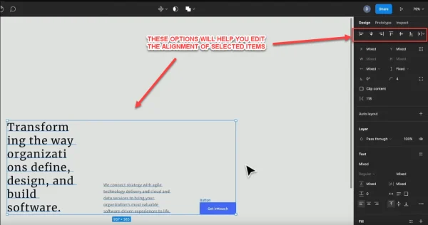
Each of these items has been set to be an equal horizontal distance apart.
The next options below this will vary, depending on what is selected, but it’s almost always to do with where the selected object or objects are on the canvas.
Location and Placement
Right now, because I have 3 elements selected, it’s giving me information on the location of this group of elements on the canvas, so that I can then set and manipulate the placement.
However, if I select a specific frame instead on the left side bar, it will then give me details about the frame instead.
Location with Frames - Frame Size and Orientation
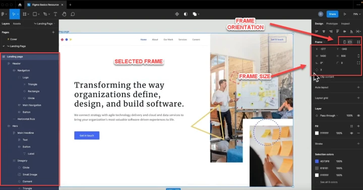
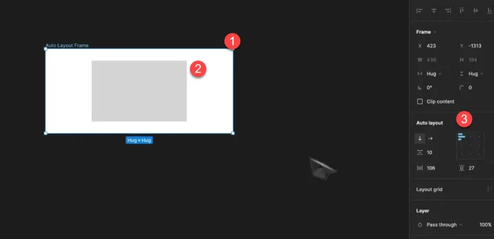
Because I have a frame selected instead of a single object, I can now see all the information about the placement of the frame instead.
I can alter where it is on the X or Y axis, adjust its rotation, its border radius, its dimensions, and more.
We also have options to edit the auto-layout and constraints, as well as layout grids, but more on these features later when we start to use them.
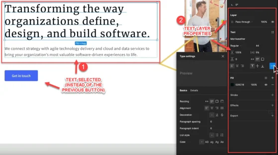
Layer properties
Finally at the bottom of the sidebar, we have our layer properties. Again, these will vary depending on what layer we have selected in the canvas.
For example
Currently I have a button selected, so I can see the button color, outline, text color, fill, effects, and more.
If I were to select text instead of a button, the layer properties would change, giving me options for that text layer.
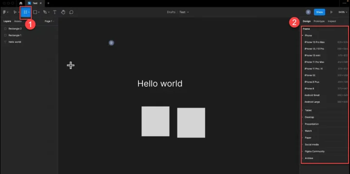
The Prototype panel
This tool is really cool. You can use pre-defined frames that emulate the size and shape of certain devices, add a design to it, and then hit run and see what the design would look like on that device.
For example
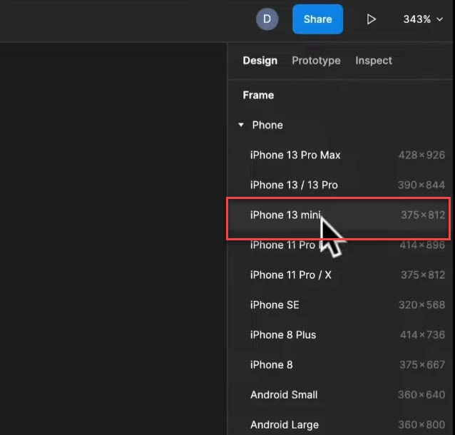
I click the frame option and new templates appear in the right-hand-side toolbar.
I then click on the iPhone mini option.
This then loads that frame onto the canvas, and I can move it around and interact with it.
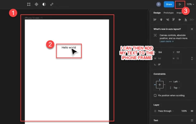
I’ve dragged my text from before onto there and changed it to a black font.
Now I can simply press the play button, and a new tab will load up with this ‘design’ on the iPhone prototype, and we can see what it would look like.
Pretty cool right!?
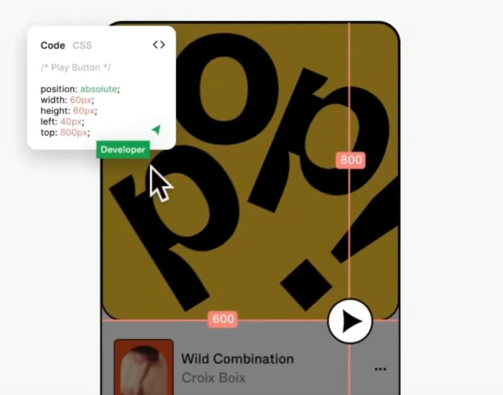
The Inspect panel
Finally we have the inspect panel.
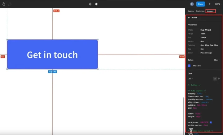
By selecting an element while having the inspect panel open, we can see unique information around that element. This information can be helpful for developers who will then create your design from code.
And that covers all the canvas UI features.
With that out of the way, let’s get into actually working with Figma.
Using Basic shapes and Boolean operations
OK, let’s look at some quick tips on basic shapes, and then how we can edit them with specific features to that shape, or with Boolean operations.
Rectangles and Squares
You can select this from the shapes menu in the toolbar, or with the shortcut R.
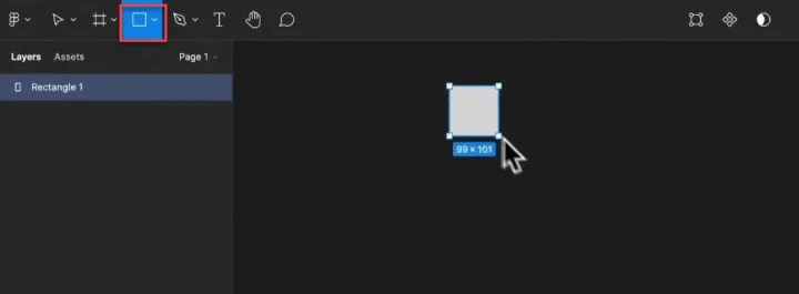
If you drag, you can make a rectangle of any size.
However, if you hold shift while dragging, it will then ensure that the horizontal and vertical are equal, creating a square shape.
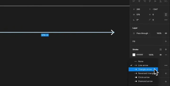
Lines and Arrows
Again, you can select this from the toolbar or with the shortcut L.
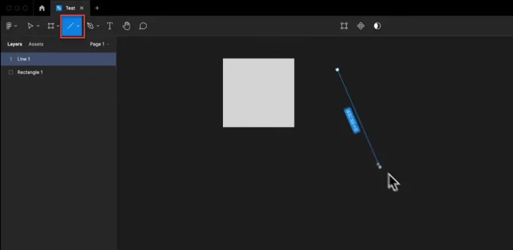
Just like with the rectangle, you can either drag a line at any angle, or if you hold shift and drag, you can make either a horizontal or vertical line.
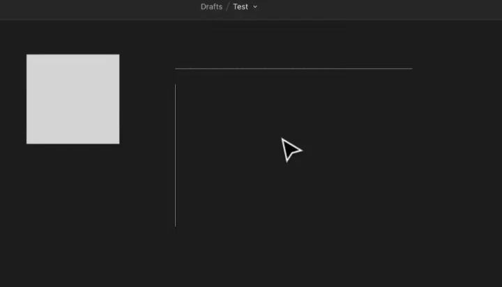
You can also click on any line and adjust its properties and give it an arrowhead if needed.
Ellipses and Circles
Again, you can select this from the toolbar or with shortcut O.
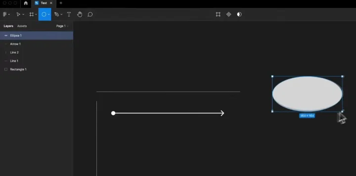
If you click and drag you can make an ellipsis, or if you hold shift, you can make a circle.
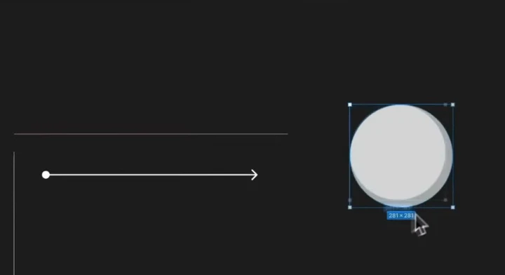
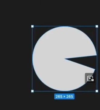
The cool thing about circles is that you can manipulate them to make custom curved shapes.
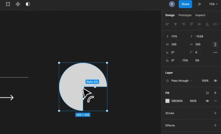
It's easy to do. When you mouse over the circle, you’ll see a dot named Arc.
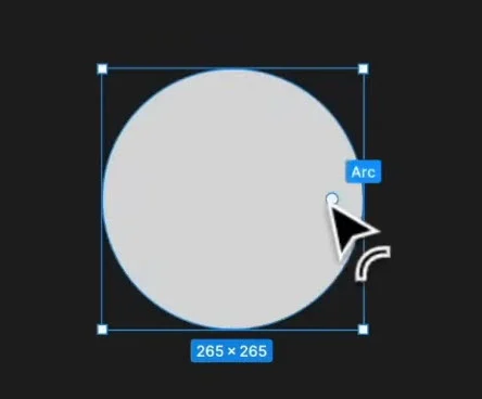
Click and drag that around to make different shapes.
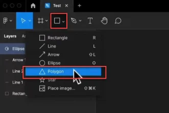
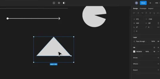
Custom Polygons
This tool does not have a shortcut, so you have to select it from the toolbar if you want to use it.
We can do some really cool things with this tool, as it allows you to create an enclosed shape that is made up of any number or straight lines.
When you first click on it, it will always be a triangle shape, like so:
Notice that they are two dots on this tool:
- Radius, and
- Count
The radius allows us to add curves to each point, and adjust the shape, while the count allows us to add or remove lines, creating new geometric shapes.
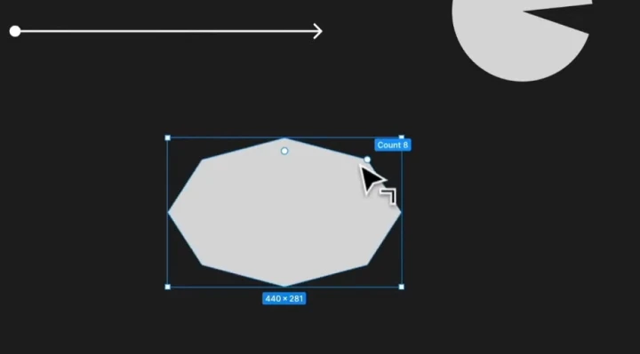
This was the same original polygon, with an increase to 8 enclosed lines versus the original 3 for a triangle.
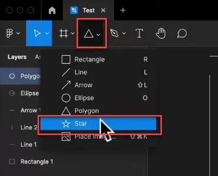
The Star tool
The final shape is the star tool, which you can select from the toolbar.
This tool functions a lot like the previous polygon tool, although it now adds a 3rd customization option.
- Radius
- Count, and
- Ratio
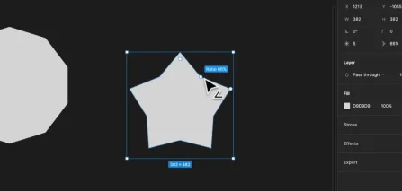
Here I’ve added a radius, increased the ratio to make the star chunkier, and also increased the count.
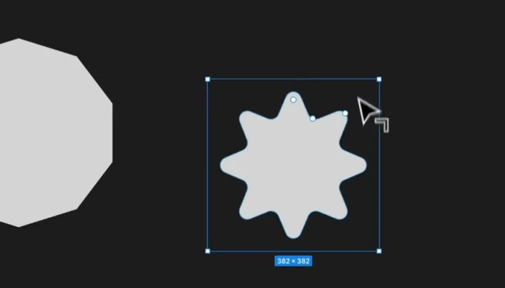
It almost looks like a certification badge, which is something we might want to add if we were designing a web page for a trust factor, but that’s a topic for another time.
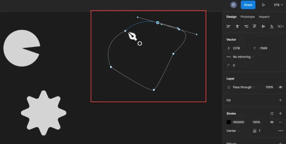
Custom shapes using the Pen tool
If you want to create your own custom shapes, then the pen tool is the best option.
You can then click on the canvas multiple times to create initial points for your custom shape, before refining it after.
Boolean operations
We can also create custom designs using Boolean operations. (Top middle of the toolbar).
We can use these to create a custom shape, by adding or subtracting other shapes.
For example
Imagine if we have 2 circles, one light and one dark, like so:
If we select both of these shapes, and then click on the Boolean operations option in the toolbar, we then get a dropdown menu of what we can do to edit these two shapes.
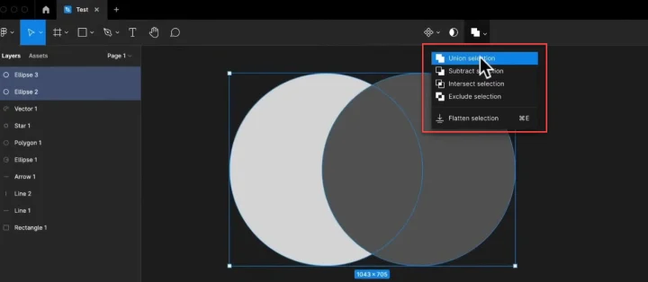
The image next to the text gives hints of what each option will do, but for clarity:
- Union selection will merge them into a single shape. In this case, like an infinity symbol
- Subtract would remove the top item from the bottom. In this case, giving a half moon shape
- Intersect selection would remove everything apart from where the two layers intersect. This would remove both circles and just leave the center (like a Venn diagram)
- While the Exclude selection would do the opposite, and remove only the part where the 2 circles overlap
How to use images in Figma
Alright so let’s look at using images in Figma, as this is something you’ll be doing a lot of - regardless of what you’re designing.
For example
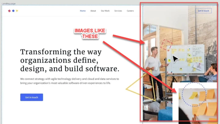
Maybe you need to design a product page or a landing page. This means that you’ll likely need to be able to bring in custom images (like people or a product shot) onto your canvas and then design with them.
Now, there are various ways we can add images to our file:
- Importing it from your PC
- Via plugins (more on this later)
- Or even copy and pasting into the canvas
That’s right. You can literally right click and copy on an image elsewhere on your pc or the internet, and then with an open canvas, just hit paste. Simple!
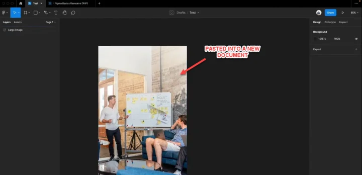
Fun fact: You can do this with any file in Figma that is already there. Just right click and copy, then paste into your own Figma document.
It will then import all the information, the frames, shapes, etc.
How to importing an image instead
Bizarrely, the import option is a dropdown option under the shapes tool.
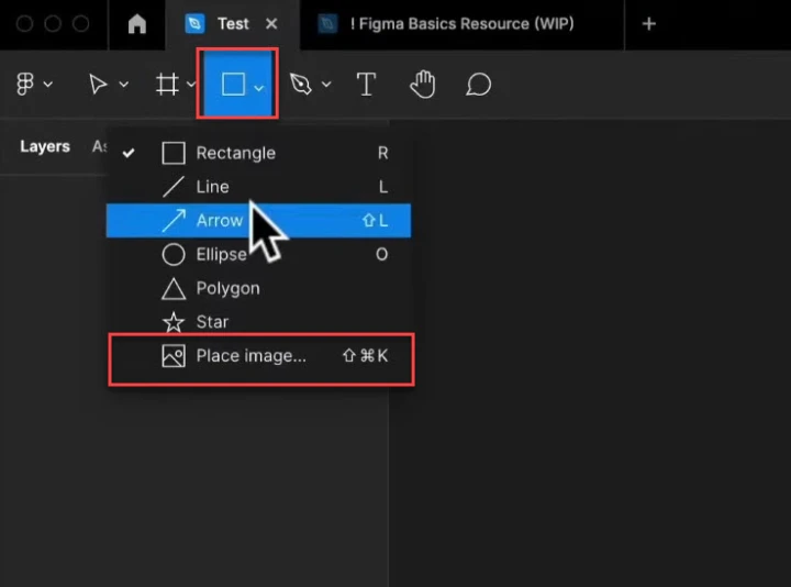
Click that, and then a menu will come up for you to search for the file on your computer.
Editing your image
There are a few options for editing your image.
With the image highlighted in your canvas, go across to the right-hand sidebar and look at the options in the Design panel.
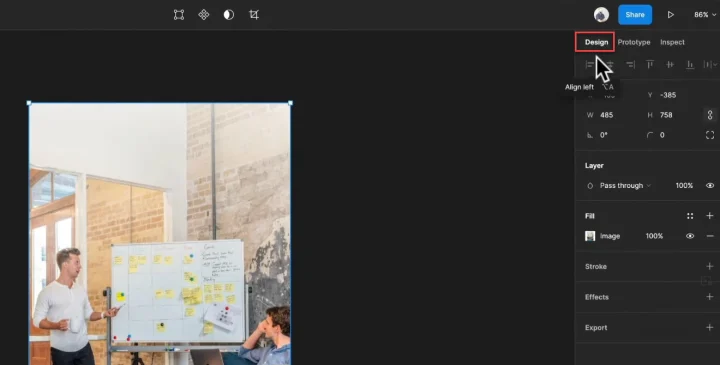
Size and placement
You can grab and drag to adjust the scale. Alternatively, hold shift while doing this and it will keep the ratio and focus while being adjusted. You can also simply move the image or rotate it to change the angle.
You can also add fit settings, so that it always fits the frame, as it’s moved or scaled.
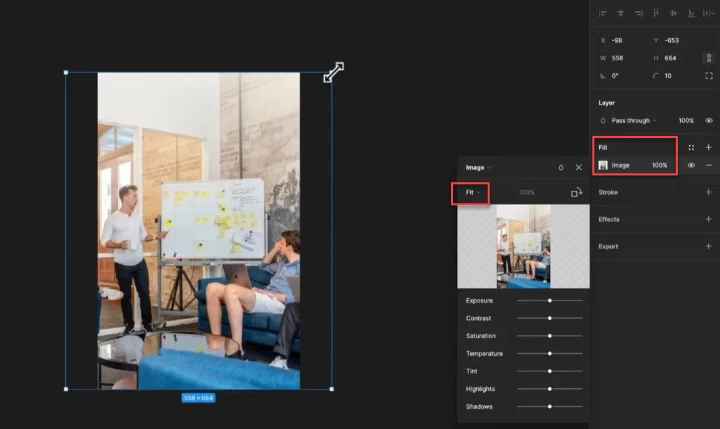
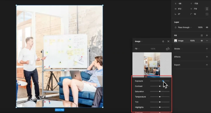
Image alterations
You can also adjust the image itself, such as the contrast or exposure, or add effects, like gradients.
Getting started with text in Figma
Alright, now let’s look at the basics of using text.
As you can imagine, it's fairly similar to any text editor or editing app you might have used before, but let’s cover this just in case.
In my example below, I’ve created a frame so it’s easy to see, and then clicked the text tool and started writing.
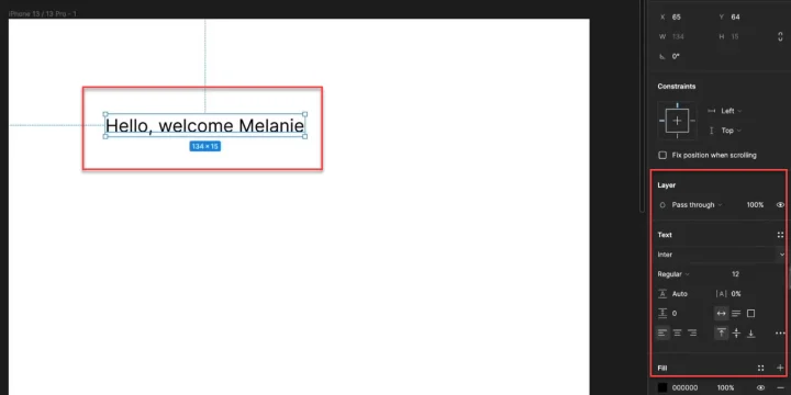
Super simple to do, but now let’s look at the properties for this text, and how to change them.
Changing size
With images or shapes, we can click and drag to change the scale. But with text, this won’t always work. Sometimes it will scale, other times it might change the layout from line to line, and just make a mess.
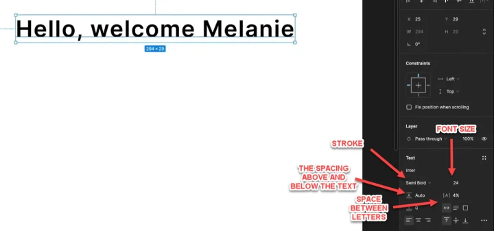
So instead we need to change the size inside of the properties section of the design panel. (RHS).
We can adjust a few things:
- The font style (Merriweather, Calibri, etc)
- The stroke (Bold, Thin, Italic, etc)
- The font size
- The line height (the spacing above and below each letter)
- The spacing between each letter
- Paragraph spacing
- The text box size (the frame that contains the text)
- The text alignment (Horizontal and vertical)
Like I said, it’s fairly intuitive and you can pick it up quite quickly.
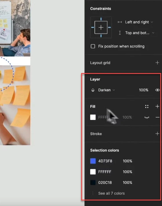
How to use Figma constraints
Constraints are incredibly important if you’re going to be using regular frames, as they allow us to create responsive designs.
How?
Well, constraints basically tell Figma how a layer should respond when you resize a frame.
For example
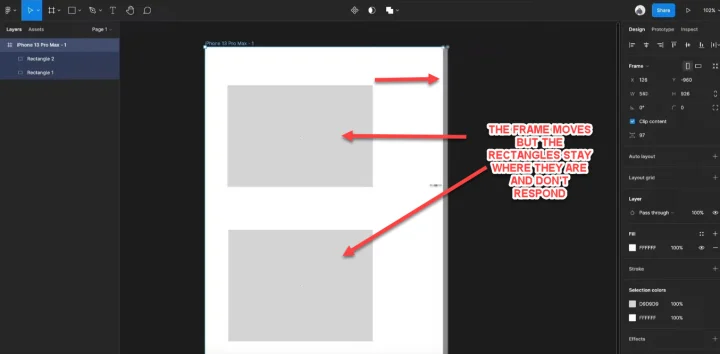
Imagine that I have an iPhone 13 frame, and inside of that, I’ve added 2 rectangles.
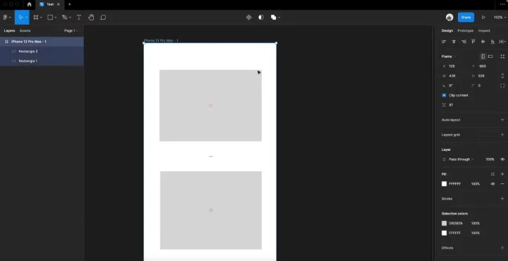
If I was to adjust the frame size right now, the rectangles on top of the frame would stay where they are and not respond to the frame changes.
Obviously, if we are building this for a prototype frame size, we would want them to respond.
So, there are two types of constraints that we can add:
- Horizontal constraints, and
- Vertical constraints
We can add these in the right-sidebar.
First, we click on the element that we want to edit, and then the constraint options will appear on the right hand side.
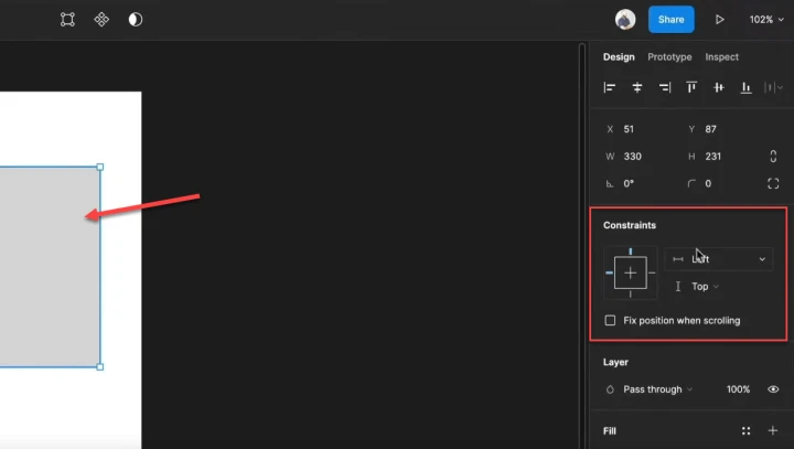
Currently the horizontal constraint on this element is set to ‘Left’, while the vertical constraint is set to ‘Top’.
This means that the rectangle is constrained, but it will only respond by keeping a set distance from the left side of the frame, and the top. That’s why if we dragged the right side of the frame, nothing happened to the rectangle.
So, if we want to adjust this so that it would scale with the frame, we can click on this and choose from the drop down menu.
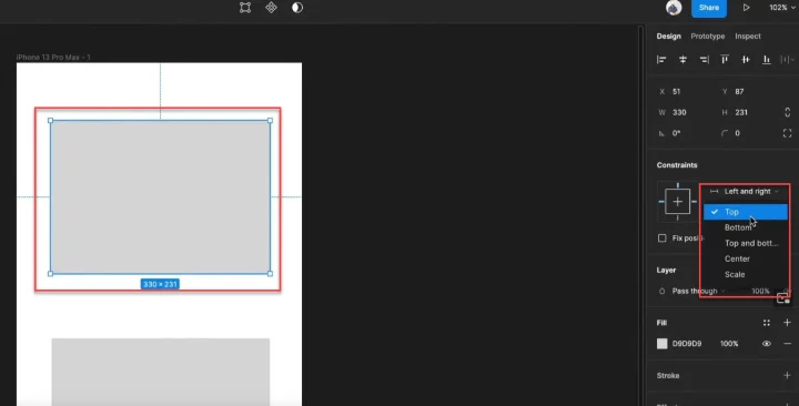
‘Left and Right’ would ensure it stays the same relative distance from the vertical edges. While keeping it as ‘Top’ will ensure it only keeps the same distance from the top edge of the frame.
Simple!
However, it’s important to remember that you can apply constraints to any layer that is inside a frame, but not outside of one.
This makes sense when you think about it, as the element needs a frame edge to be constrained against. It can’t respond to an edge change if it's not connected to any right?
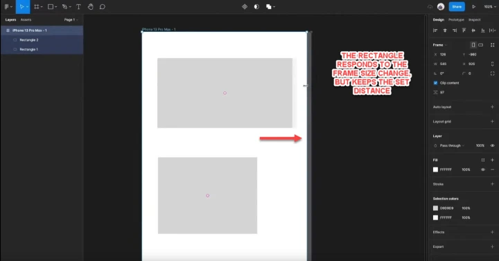
Also, we could in theory just hold down CMD or CTRL and drag the frame, and all items inside the frame would auto scale and respond.
However, this is only good for initial design changes or moving things on your canvas. You’re going to want to apply constraints so that devs can see how the elements should respond when the page is built.
How to use Figma auto-layout
Auto-layout is a feature that’s essentially part of a regular frame, but with a few extra things happening.
To explain how it works best, let’s walk through an example. Imagine I have 2 frames, with 2 identical rectangles in them.
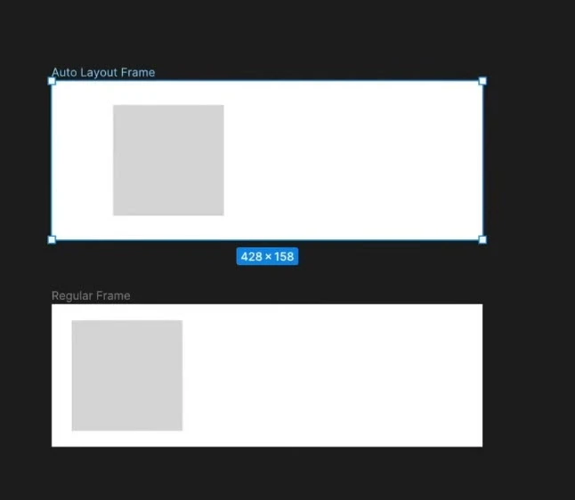
I’ve labeled one regular and one auto-layout, but other than the name, they’re currently just regular frames for now. To change that, I’m going to set the ‘auto-layout’ version to an autolayout frame and then we can see the differences.
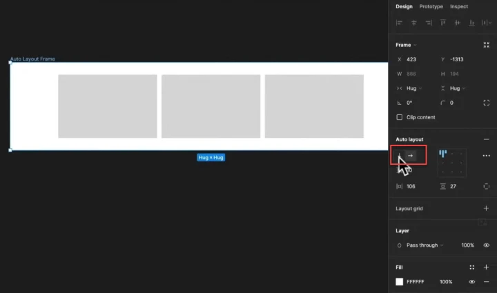
So, with the one frame selected, I’m going to click the + button next to the auto-layout option in the right-hand design panel.
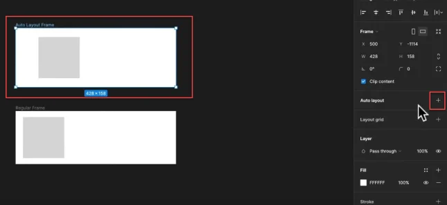
As soon as I do this, notice how the frame automatically changes to fit the rectangle.
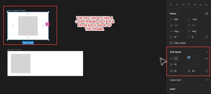
Notice also how there are now new design options for this auto layout, so we can adjust the alignment, the padding, and more.
One thing that’s really interesting is that the frame will adjust and respond to whatever elements are placed inside of it. So, if I copy and paste the rectangle a few times, the frame auto adjusts with the layout of the contents.
Pretty cool right?
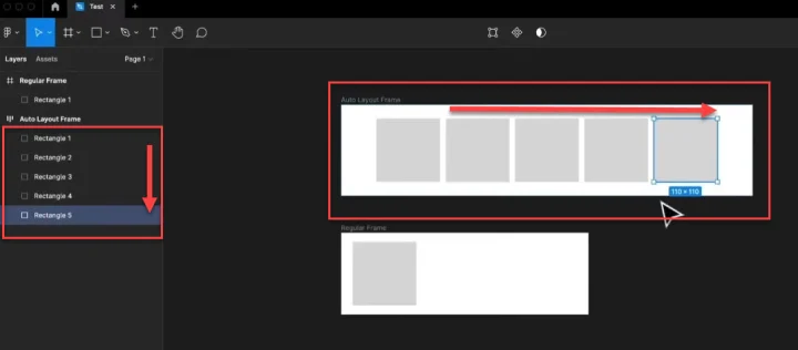
It gets better, as you can even nest auto layout frames within other auto layout frames.
For example
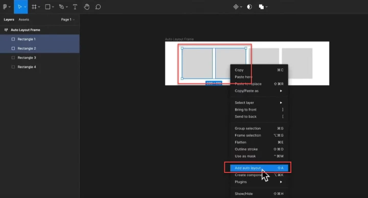
Let’s say that I were to reduce the number of rectangles inside the original auto layout frame to four.
Then, I highlight two of them and turn them into an auto layout, and then do the same to the other two, so we now have two autolayouts containing two rectangles each, both inside the original autolayout frame.
Why would we do this? Well, this can then use these layouts to help us to set how our page elements will respond on smaller screens.
As you can see, if we now changed the layout to be vertical instead of horizontal, instead of one long line of 4 individual rectangles, we could get a column of 2x2 instead.
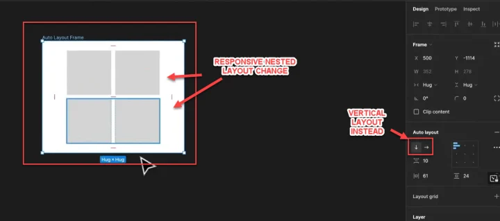
If we look over on the left-hand panel, we can see these are now nested under each other.
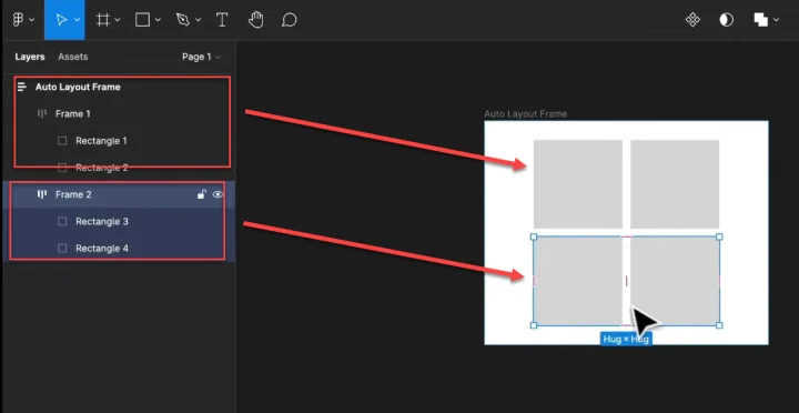
We could even nest more frames inside of these frames if we needed to - Heck, we can even reorder these frames.
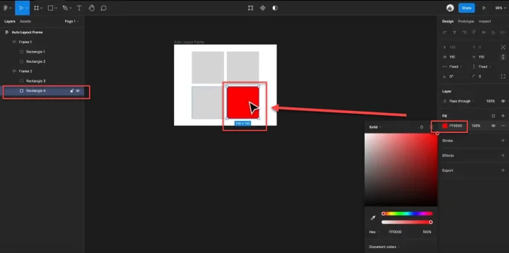
For example
I can highlight just a single rectangle inside one of the autolayouts, and then change its coloring so we can help it stand out.
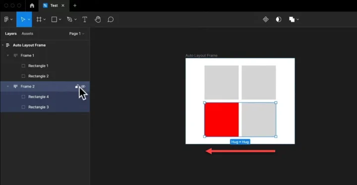
You can then click and drag, or even just use your arrow keys to move the selected frame around in the layout.
Auto-layouts are great because they adapt as you add or remove, and you can apply nested layouts to make it responsive, and build entire interfaces.
You could have lists that expand as new items are added. You can even combine multiple different autolayout frames to build a checkout cart, with text, buttons, plugins, etc.
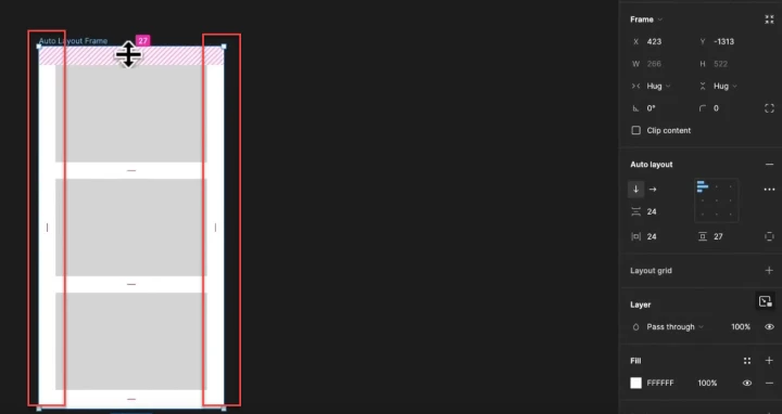
How to adjust auto-layout properties
We’ve adjusted the location of a frame, but let’s get into some of the properties we can adjust with autolayout.
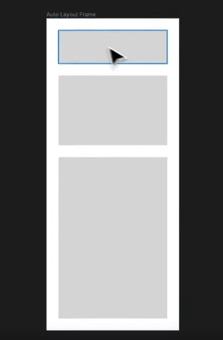
To do this, I’m going to create a new frame, add a rectangle inside of it, and then turn it into an autolayout just like before.
Then we add two more rectangles, in a vertical layout, like so:
Simply highlight the original, and then CTRL +D to duplicate.
Now let’s go back across to the right-hand panel and adjust some properties.
Adjusting the horizontal and vertical alignment
We can click the vertical and horizontal arrows to quickly change the alignment.
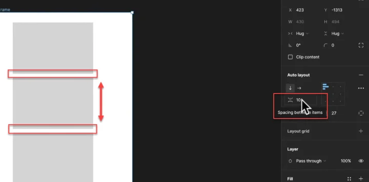
Adjusting the space between items
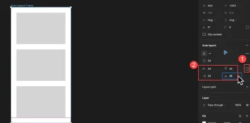
If we look at the next property below the alignment, we can click and adjust the space between the selected items inside the auto-layout.
Adjusting the padding
There are two options below the spacing, and each of these allows us to adjust the padding around the items. One adjusts the horizontal padding, while the other affects the vertical padding.
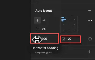
Here you can see that I've reduced the horizontal padding from 106, to just 24.
If you click the outlined square next to these options, you can then bring up the ability to set specific padding for each edge, so that you can customize it.
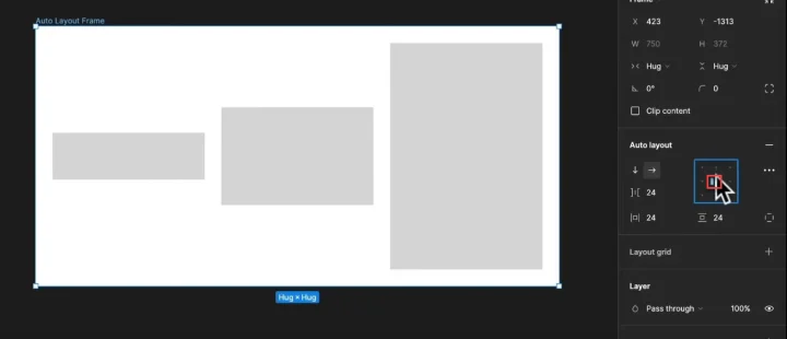
Adjusting the child object alignment
We’ve not talked about this yet, but in design terms, the frame is the ‘parent’, and the items inside that frame are referred to as ‘child’ items. (In this example, they are 3 gray rectangles).
One of the other settings that we can adjust inside of our auto-layout is the alignment of our child objects.
That being said, both the direction of the autolayout frame and the distribution (location) of the child objects inside the frame, will affect what current alignment options we have available, and will differ on each design.
For example
Let’s go ahead and adjust the size of each child object so you can see the difference easier as we adjust the child layouts.
As you can see there are 3 sizes: small, medium and large.
Now, if we select all these and change the alignment to horizontal, we can see the potential child alignment options available to us.
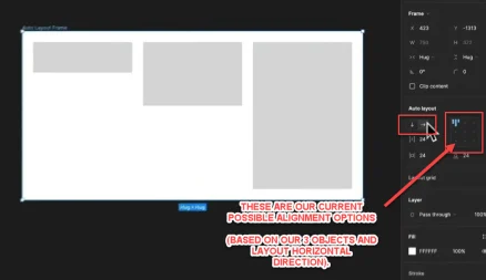
We can click this square and move our child objects around, simply by choosing a different alignment, like so:
Here I’ve aligned them all to the middle of the frame.
Resizing
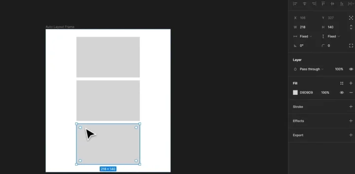
One of the most powerful functions we can use is the resize properties options:
- Fixed
- Hug, and
- Fill
For example
Here we can see that one of our objects is currently set to a fixed width of 218 pixels.
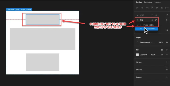
If we change that from fixed to fill, it will now expand to fill the set width of the current container.
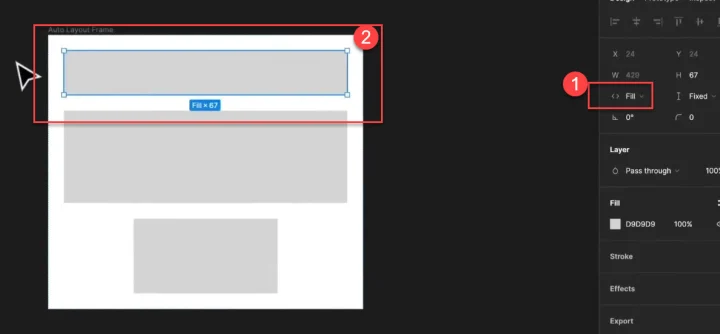
This is a great option when you want to create frames that are responsive.
We can also use the hug option, which basically makes the outer padding stay constrained to the child object so that as it adjusts, it’s always a set small distance away from it.
Sidenote: Although we’re currently using auto-layouts, we could also add further manual constraints if we want to. Figma is great in that we can combine regular and auto-layout frames, and still keep them responsive by adding in constraints.
How to use Figma community files
A really cool part of Figma is its community of designers because they love to share files and resources!
This means you can then import these files and make your life a whole lot easier.
To find files, go ahead and click on the community option in the left-hand sidebar.
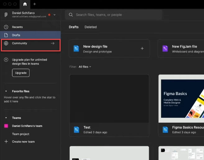
This will then load the Figma community website inside a new window in Figma:
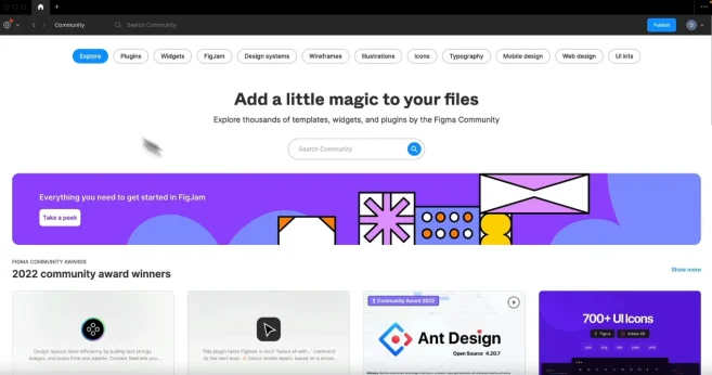
Even Figma shares new resources here so I highly recommend that you check it out. You can get files, plugins, resources, and more all in this one location.
All you need to do to use these is to first click on the file in the community.
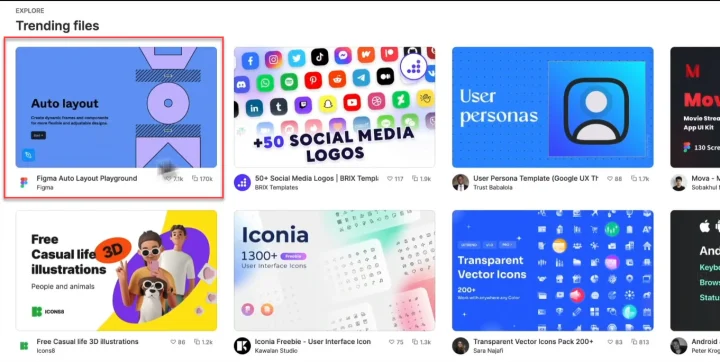
This will then load up the file page with more information, so you can check it out in more detail.
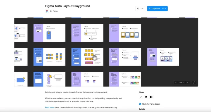
This particular example is a heap of different auto-layout designs that we can use for ourselves.
So, if the file looks good and you want to use it, all you need to do is click on the blue ‘Duplicate’ button at the top of the screen.
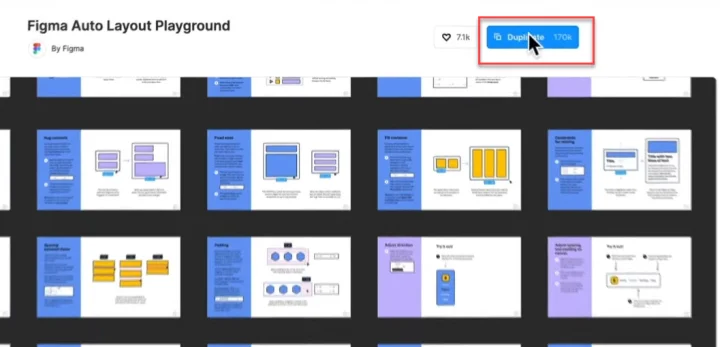
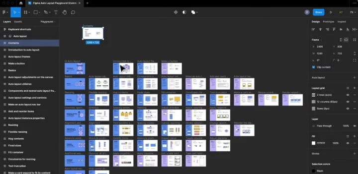
This will then open up that file inside of a new tab in Figma for you, with all the different frames and assets ready to be used.
Then you can simply click and copy, and then paste into your working canvas. Simple!
How to use Figma community plugins
We can also download plug-ins from the Figma community, to further help us save time when creating. Basically, they give us added functionality above the normal Figma install.
You can use them to help customize your experience or create a more efficient workflow, so you don’t have to worry about specifics and can focus on the design instead.
For example
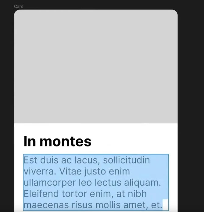
Here’s a design that I made earlier.
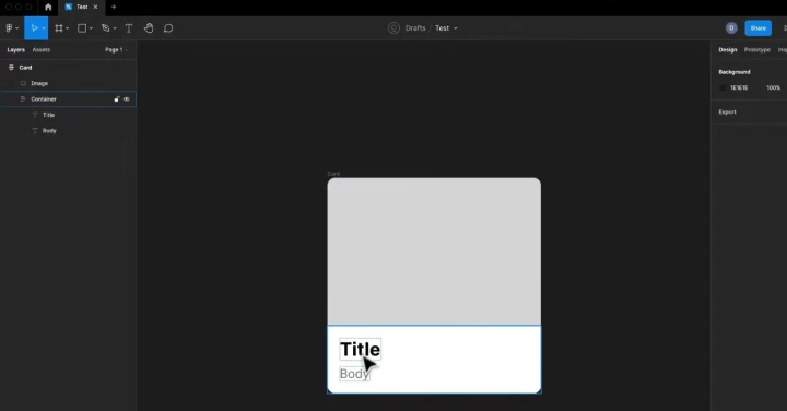
It needs an image, a title, and some body copy, to fill out my card.
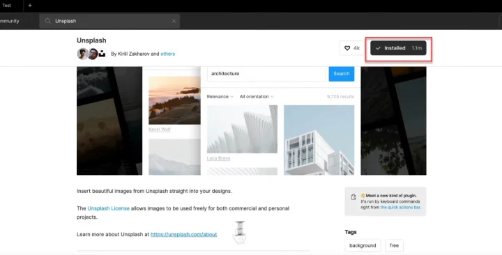
So to help me out, I’m going to go grab an image plugin called Unsplash, that allows me to choose from a library of images.
I head back to the community and can either search via plugins, or if I know what I want to use, I can search by name or goal (images, etc).
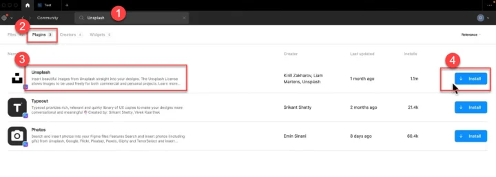
Here you can see that I’ve searched by name, and bypassed the details page for the plugin (as I’ve used it before and know that I want it), then narrowed it down to plugins only in the search results.
Then it’s as easy as just clicking the blue install button and waiting for it to install. Simple!
I could have also gone to the plugin page itself to learn more, and then clicked the blue download button there if I wanted to.
How to use your newly downloaded image plugin
All we have to do now is go back to the file we want to use the plugin on, right-click it, and then select ‘plugins’ from the drop-down menu, and then the plugin we want to use.
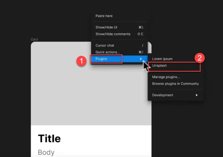
Each plugin will work a little differently based on what its function is. This particular one is designed to allow us access to licensed images to use in designs.
So when I click on Unsplash from the options, a new pop-up window will appear that allows me to search images.
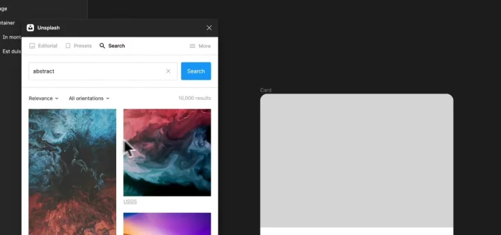
To use this, we want to first click on the image frame that we want to add the image to.
Then, we can scroll through and find the image we want, and click on it to send it across to our image frame.
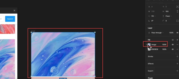
Easy right?
Using the Lorem Ipsum plugin
You may have noticed that I have another plugin installed called ‘Lorem Ipsum’.
This is just a basic text generator that will write in random language so we can see how the text will look on the design before we add in the specific text that the client wants.
We simply select the text (in this example the Title), and then right-click and select the ‘Lorem Ipsum’ plugin.
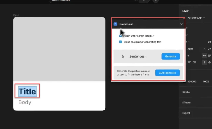
Notice how the menu UI is different from the one we just used before.
With this plugin, we can adjust the number of words generated, and even select the number of sentences or paragraphs.
Plugins are incredibly useful for shortcutting a lot of downtime in your work, so you can just focus on the design aspects instead.
It’s time to put this knowledge into practice!
So there you have it - a complete beginner's guide to the basics you need to know to get started with Figma.
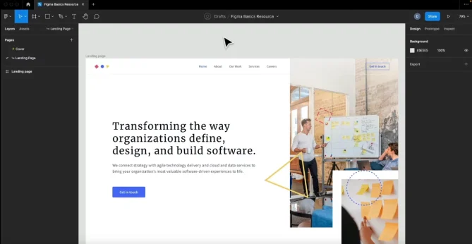
We’ve covered a lot of the basics of Figma so far in this guide, however, the best way to truly understand and learn is to put this information into practice and build something.
That’s why I’m going to walk you through how I created this landing page:
You can grab the resources for this page here.
However, if I were to write up all the steps and instructions for this tutorial, it would be 4 times as long, so for this project, I’ve included the video version of this article again below - starting at the exact time that we jump into this project.
If you haven’t already, get a free Figma account, grab the resources above, and then work along as you watch this video.
In this section of the video tutorial, we’ll use everything so far, as well as:
- Creating a loop using basic shapes
- Auto-layout buttons
- Creating a responsive navigation
- How to add responsive text
- How to add imagery and gradients
- Strokes and shapes
- Layout and responsiveness
- And more!
P.S.
Alternatively, you can join my Design Bootcamp course right now and not only learn to master Figma but also how to truly become a Designer and get hired from scratch this year.
I'm not sure when you're reading this post but I'm constantly updating my courses (definitely more often than this post or YouTube videos 😉).
You’ll not only work through this basic landing page project above, but many more, so that you get a complete understanding of Figma and become comfortable creating your own designs.
I guarantee that it's the most comprehensive Design course online and takes you from total beginner to getting hired.
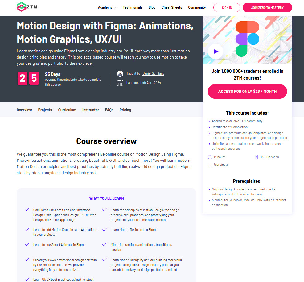
Or if you're already a Figma Pro but want to take your skills to the next level, then check out my Motion Design course.
You’ll learn micro-interactions, animations, creating beautiful UX/UI, and so much more, as well as modern Motion Design principles and best practices.
The best part?
You’ll get access to me, other design students, and working design professionals all inside our private Discord community!
Not only that, when you join Zero To Mastery, you have access to every course in our library including all my design courses as well as this advanced project where you'll design a full airbnb clone website!


