


Throughout the last few years, design software has undergone significant advancements, especially when it comes to arranging and resizing elements to fit different screen sizes, aka the bane of any designers life.
And one of the game-changers in this realm is Figma.
This incredible tool has made UI design a breeze, streamlining our workflows and saving us precious time. It's truly remarkable how far we've come!
In this article, we're going to take a comprehensive look at Figma's Auto Layout, which allows us to create dynamic and responsive UI elements effortlessly, without the hassle of manual adjustments.
Heck, with Auto Layout, we can even define rules that dictate how elements should behave when resized or rearranged. This means that we can maintain consistency in our designs across various screen sizes and devices, ensuring a seamless user experience.
It's like having a trusty assistant that takes care of all the nitty-gritty details for us. Pretty cool, right?

The top 4 benefits of using Auto Layout for designing UI elements
#1. Time savings
Auto Layout eliminates the need for manual adjustments, allowing designers to create complex designs in a fraction of the time.
#2. Consistency
Elements can be arranged consistently across different screen sizes and device types, creating a seamless user experience.
#3. Flexibility
Create dynamic designs that can adapt to different content and device sizes, making it easy to accommodate different user needs.
#4. Reusability
Auto Layout allows designers to create reusable components, making it easy to update designs and maintain consistency throughout a project.
Sounds good right!? So let's take a look at how to use it...
Getting started with Figma's Auto Layout
If you're new to Figma's Auto Layout feature, it can be a bit overwhelming at first, but with a little bit of practice, you'll soon learn how to use it to create dynamic and responsive UI elements.
How to enable Auto Layout in Figma
Enabling Auto Layout in Figma is simple. To do so, select a frame or group of elements, then click on the "Auto Layout" button in the properties panel.
Once enabled, you can start using Auto Layout to create dynamic designs.
Understanding the different directions of Auto Layout
Figma's Auto Layout feature comes with two different types of directions, each with its own set of rules and behaviours.
The two directions are:
Horizontal
Horizontal Auto Layout arranges elements from left to right, with each element aligned vertically.
Vertical
Vertical Auto Layout arranges elements from top to bottom, with each element aligned horizontally.
Understanding the different directions of Auto Layout is important, as it will help you choose the right layout for your specific design needs.
Overview of the Auto Layout properties panel
When it comes to customizing your Auto Layout designs in Figma, the Auto Layout properties panel is your go-to hub.
This handy panel houses all the options and settings you need to make your designs truly shine. Whether you want to adjust spacing, alignment, or resizing behavior, the properties panel has got you covered.
It's like a control center where you can fine-tune every aspect of your Auto Layout elements with ease. In the properties panel, you can set rules for spacing, resizing, and alignment, as well as adjust other settings like padding and overflow behavior.
Spacing

Alignment
Padding
Overflow behaviour
In this next section, we'll uncover tips, tricks, and techniques that will elevate your design game and help you create stunning and responsive UI elements.
Best practices for designing UI elements with Figma's Auto Layout
While Figma's Auto Layout feature undoubtedly simplifies the process of designing UI elements and boosts efficiency, it's crucial to adhere to best practices to ensure that your designs are not only visually appealing but also effective and maintainable in the long run.
By following these guidelines, you can maximize the benefits of Auto Layout and create designs that truly stand out.
So, let's explore some of these best practices together and pave the way for exceptional, well-crafted UI elements that leave a lasting impact.
Tips for creating efficient and effective Auto Layout designs
Here are some tips to keep in mind when creating Auto Layout designs:
Tip #1: Plan ahead
Before diving headfirst into the design process, it's essential to take a moment and plan out your layout strategically. By doing so, you can anticipate how various elements will need to adapt and adjust to different screen sizes. This proactive approach will save you time and effort down the road.
Also, consider the responsive nature of your design and how different elements will behave on various devices.
By carefully thinking through these aspects, you can ensure that your design remains visually pleasing and functional across the board. So, let's put on our thinking caps and lay the foundation for a seamless and adaptable layout!

Tip #2: Utilize horizontal and vertical resizing
When it comes to maintaining consistency in your designs across different screen sizes and device types, horizontal and vertical resizing are your secret weapons within an Auto Layout frame.
These powerful tools allow you to control how elements resize and behave.
By leveraging horizontal and vertical resizing, you can ensure that your design elements adapt gracefully without losing their intended look and feel. This ensures a seamless user experience regardless of the device being used.
Tip #3: Be mindful of padding and spacing
Never underestimate the impact of proper padding and spacing in your designs. These seemingly small details can make a significant difference in the overall look and feel of your work.
By utilizing appropriate padding and spacing, you can create a clear visual hierarchy and enhance readability. Giving your elements room to breathe, allowing them to stand out and grab the viewer's attention.
Strike a balance between elements, ensuring they are visually harmonious and easy to navigate. Remember, thoughtful and well-executed padding and spacing can elevate your design from good to exceptional.
Tip #4: Don't overcomplicate designs
While Auto Layout offers incredible flexibility to create complex designs, it's crucial to strike a balance and avoid going overboard.
Remember, simplicity is key, and the user experience should always be at the forefront of your design approach.
Keep your designs clean, intuitive, and focused on delivering a seamless user experience. Avoid overwhelming your users with unnecessary complexity or cluttered interfaces.
Tip #5: Readability is key
Ensure that your designs are easy to read and understand, allowing users to navigate and comprehend the content effortlessly.
Use legible fonts, appropriate contrast, and intuitive layout structures to enhance readability.
How to ensure consistency and maintainability in Auto Layout designs
To ensure that your Auto Layout designs are consistent and maintainable, here are some best practices to follow:
1) Use reusable components
Auto Layout makes it easy to create reusable components that can be used throughout your design. This can help ensure consistency and save time in the long run.
Instead of recreating similar elements from scratch, you can simply drop in the component and customize it as needed. This speeds up your design workflow and increases productivity.
2) Use naming conventions
Clear and consistent naming conventions play a vital role in organizing and maintaining your Auto Layout designs effectively.
When you establish a naming system for your components, frames, and groups, it becomes easier to locate and manage them within your design files, especially as the complexity of your project grows.
3) Stay organized
Proper organization is key to maintaining a tidy and easily navigable set of Auto Layout designs. By utilizing frames, groups, and layers effectively, you can keep your elements structured and accessible.
Tl;dr
By embracing these best practices, you're well on your way to creating Auto Layout designs that are not only visually appealing but also effective and maintainable.
Consistency, readability, thoughtful planning, and organized structure are all key elements in achieving design excellence.
Designing UI Elements with Figma's Auto Layout
Get ready for some exciting hands-on learning! We are about to delve into a series of quick tutorials that demonstrate how to effectively utilize Auto Layout for various UI elements. From buttons and to card layouts, we'll cover it all.
Each tutorial will provide step-by-step instructions, helpful tips, and practical examples to ensure you grasp the concepts and master the art of Auto Layout. So let's dive into these tutorials to take your Auto Layout skills to the next level!
Before we begin, make sure to create a fresh new design file so we can practice in.
Sidenote: Still figuring out Figma + design? Check out my Figma bootcamp course. It takes you from absolute beginner to pro, with a protfolio that will get you hired. This is the only design bootcamp you need to learn and master web design, mobile design, Figma, UI & UX, and HTML + CSS.
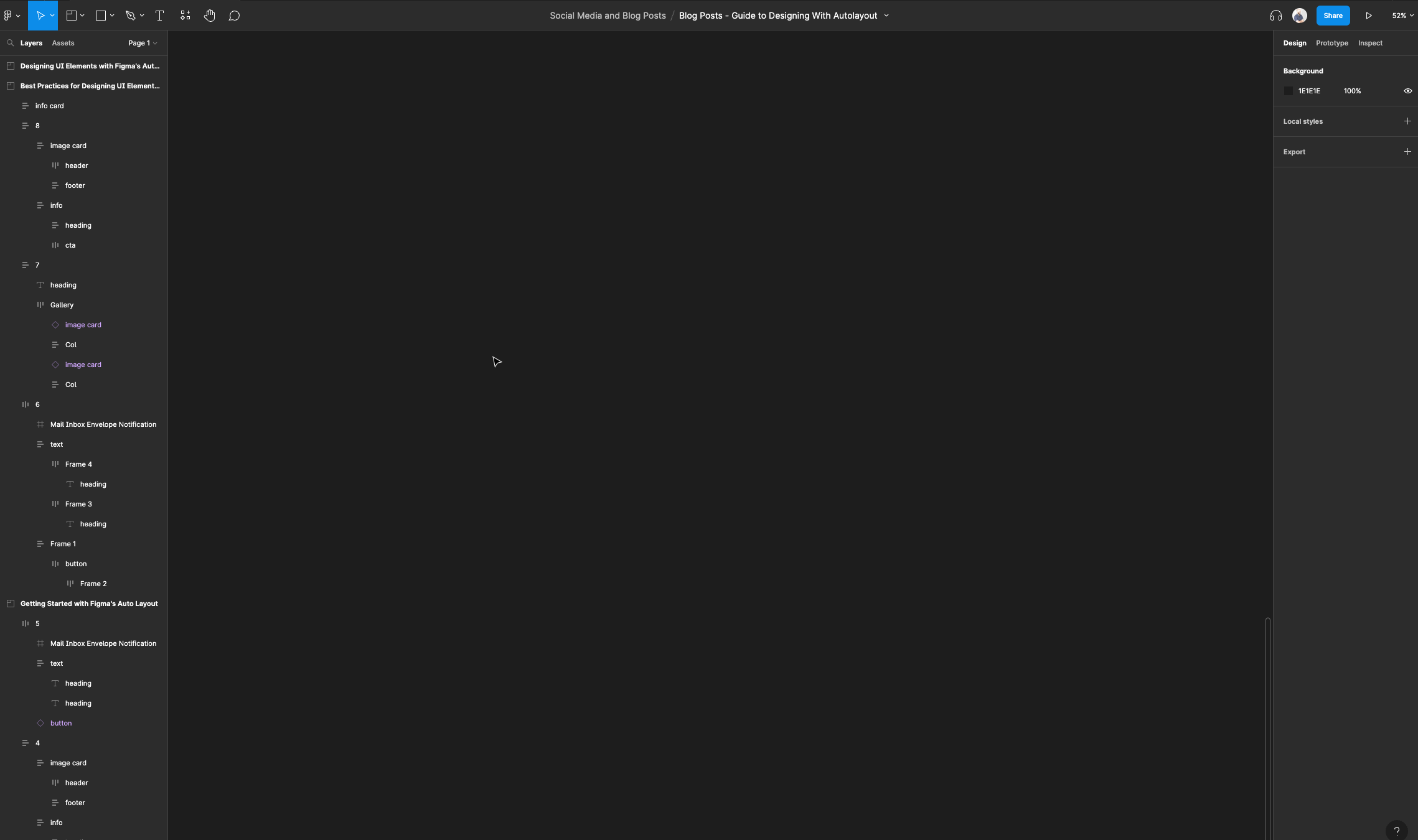
How to set up auto layout text
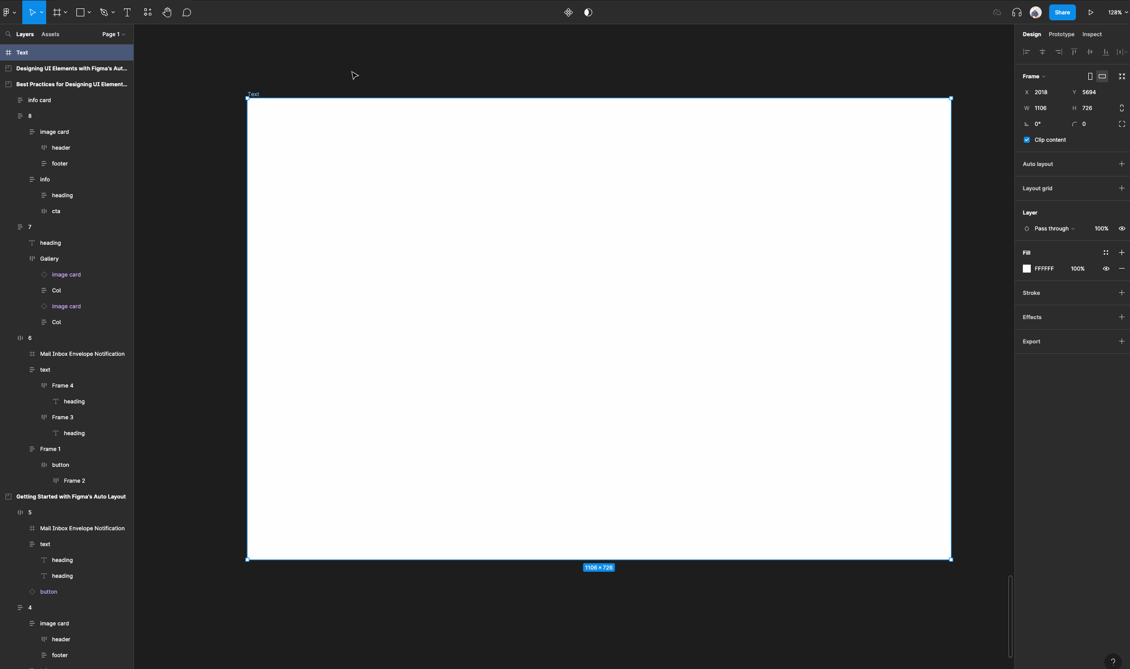
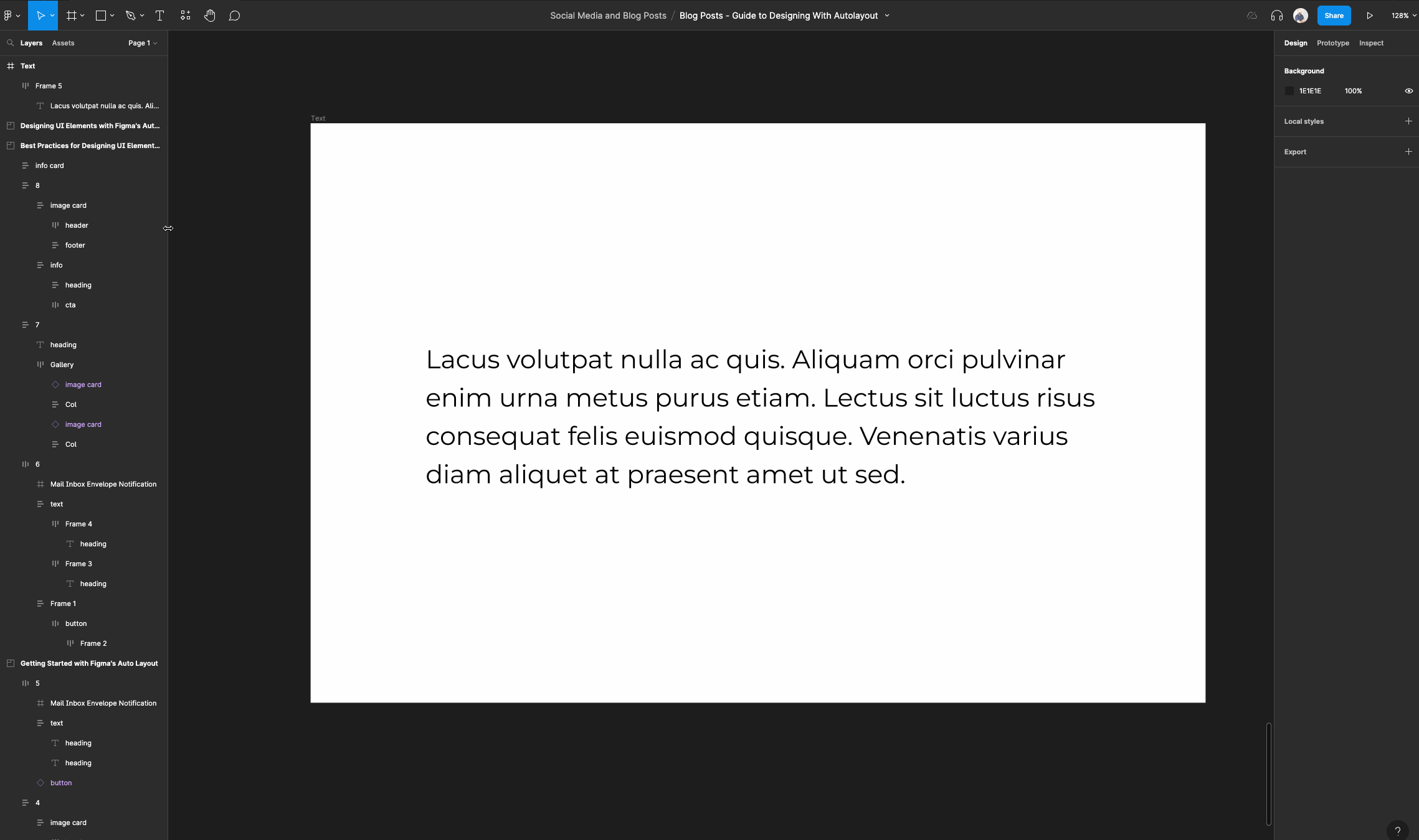
Create a frame and name it text. This is going to serve as our main canvas.
(You can also check out a free preview of my course here which covers this topic).
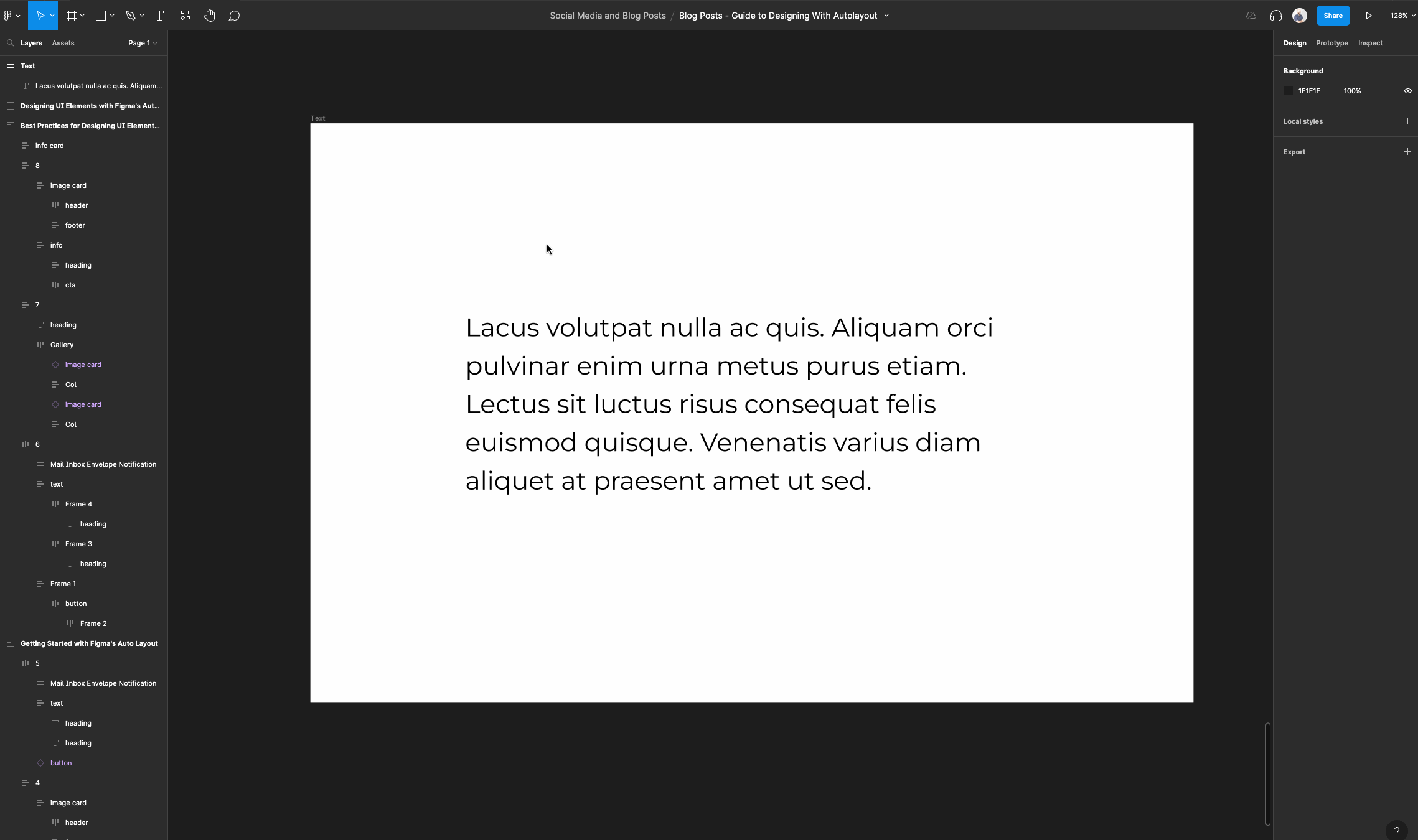
Select the text tool and put some placeholder text in there.
I am using a plugin called “Lorem Ipsom”. You can set your text to have any properties that you like for now.
Select your text layer, then right click.
Next, select “Add auto layout”. This will wrap your text layer in an auto layout frame.
Now set your text layer's horizontal resizing to “fill container” and leave its vertical resizing at “hug contents”. This allows your text layer to resize when we resize our auto layout frame.
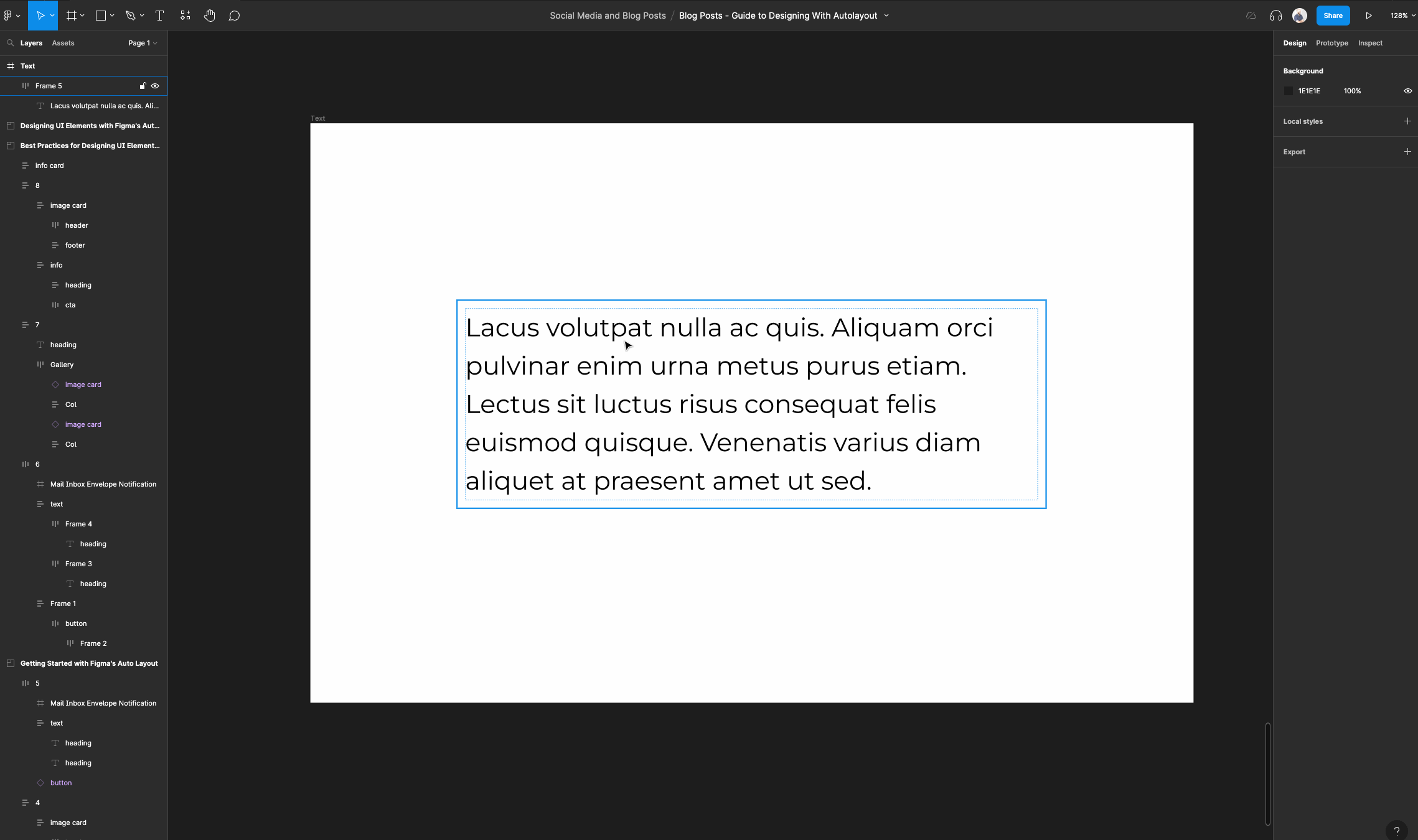
Select the auto layout frame and make sure its horizontal resizing is set to “fixed width”. Then set its horizontal constraints to “left and right”.
This ensures that when we resize the main frame called “text”, the auto layout frame will resize from the left and right side.
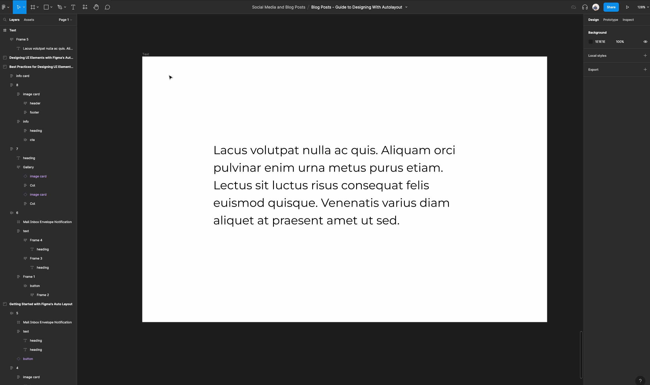
Now resize your main regular frame to see how the text resizes within the auto layout frame and the regular frame.
How to create auto layout buttons
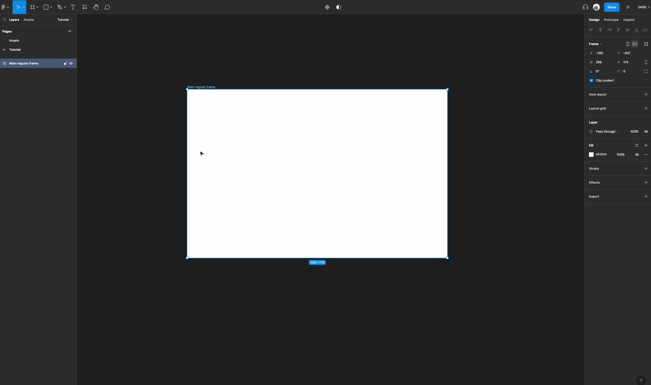
Create a frame and name it “Main regular frame”. This is going to serve as our main canvas.
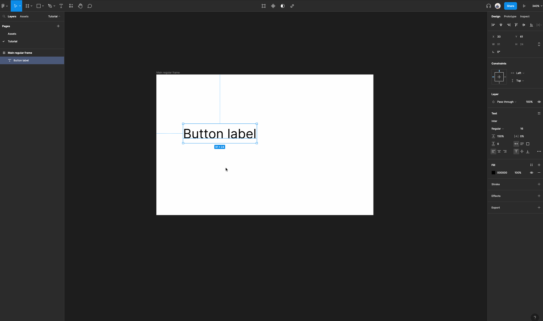
Select the text tool and add a text layer.
You can type something like “Button label”, and feel free to use whatever text properties you like for this tutorial.
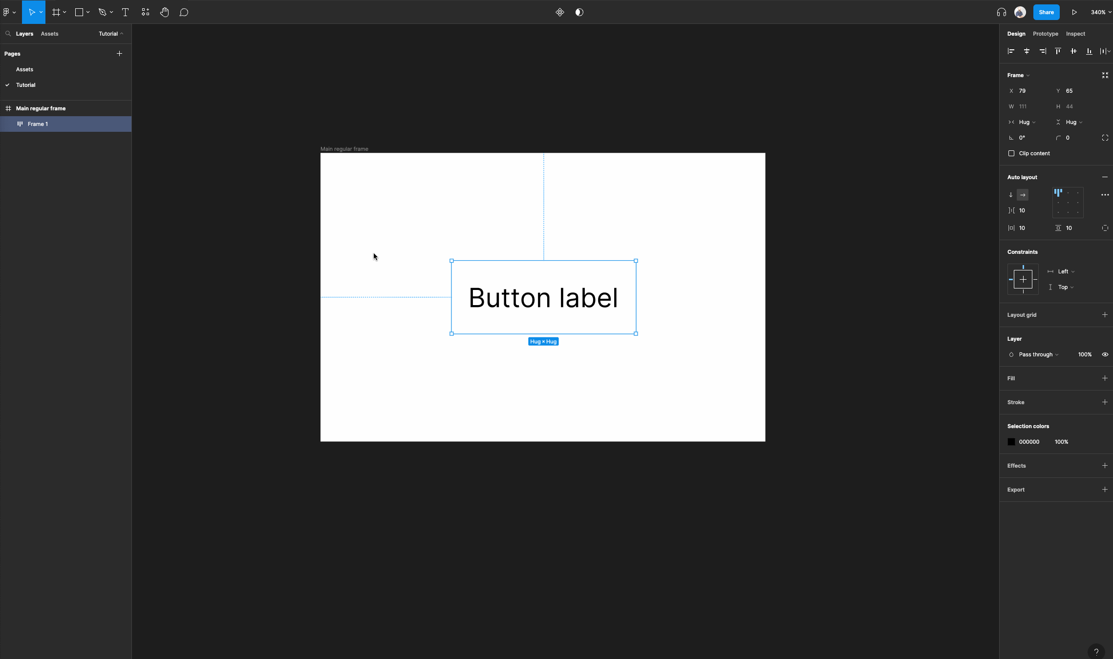
Select your text layer, then right click and select “Add auto layout”. This will wrap your text layer in an auto layout frame.
Select your auto layout frame that has the text layer inside and rename it to “Button”.
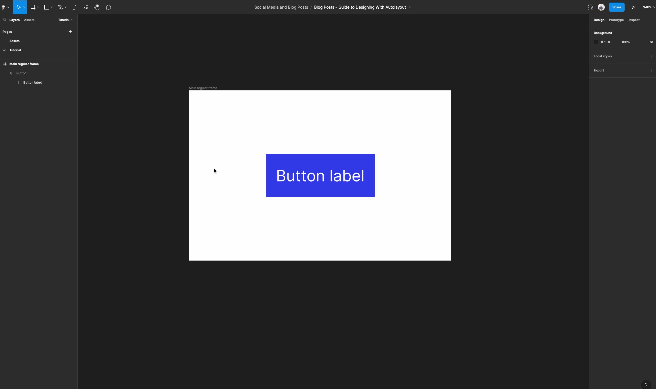
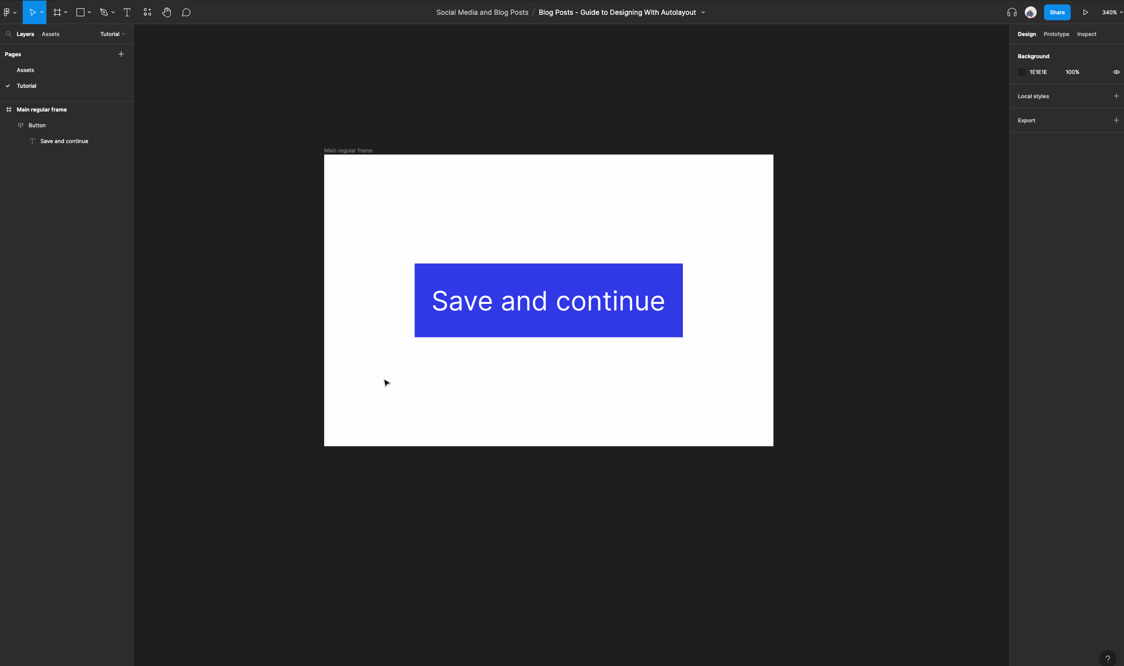
Now we can set the background color to the color of your choice. I chose “#3138E5”. Then select your text layer and set the color to “#ffffff”.
Let's make sure that our text layer has its horizontal resizing set to “Hug contents” or “Fill container”.
It won't really matter for a button like this. As long as we can modify the text and have enough room for larger labels like “Save and continue”.
Now we are going to add some polish to this button.
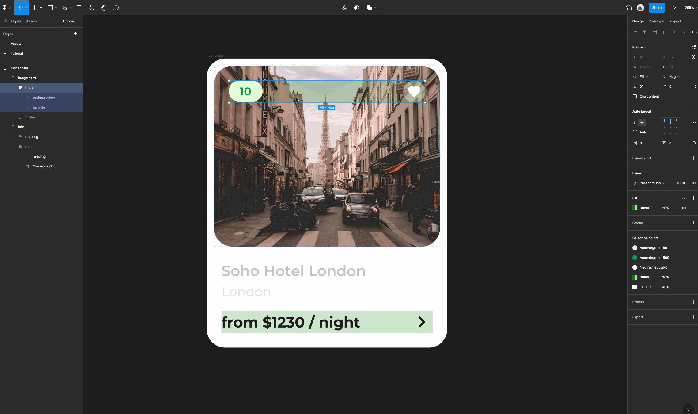
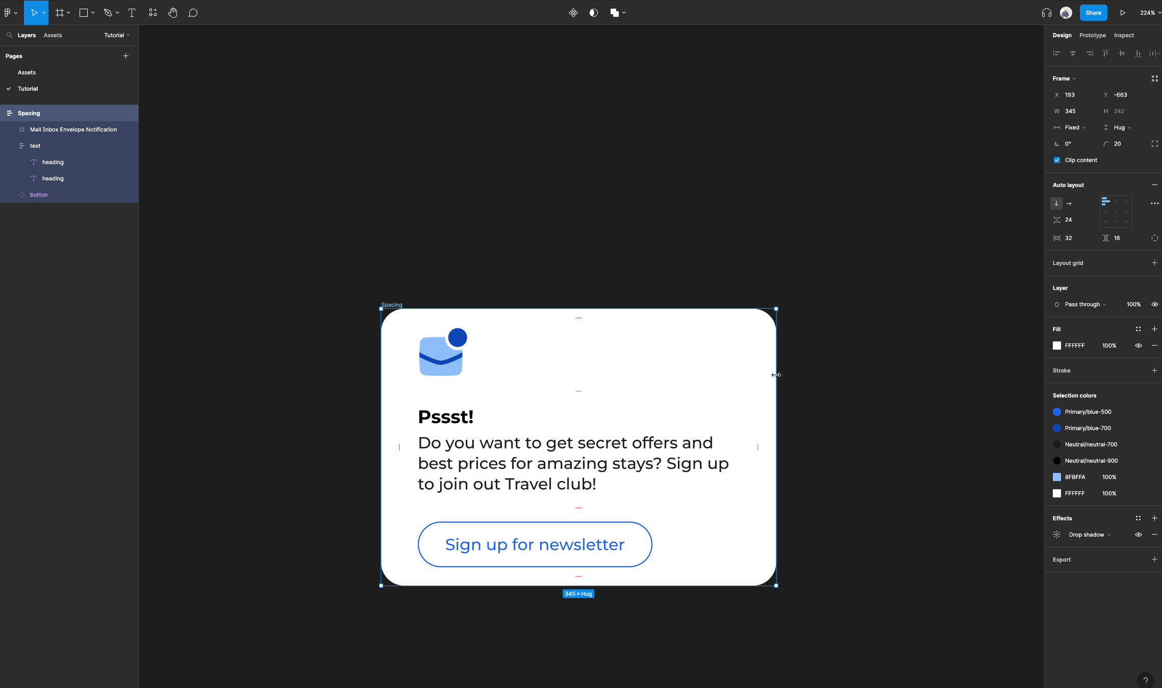
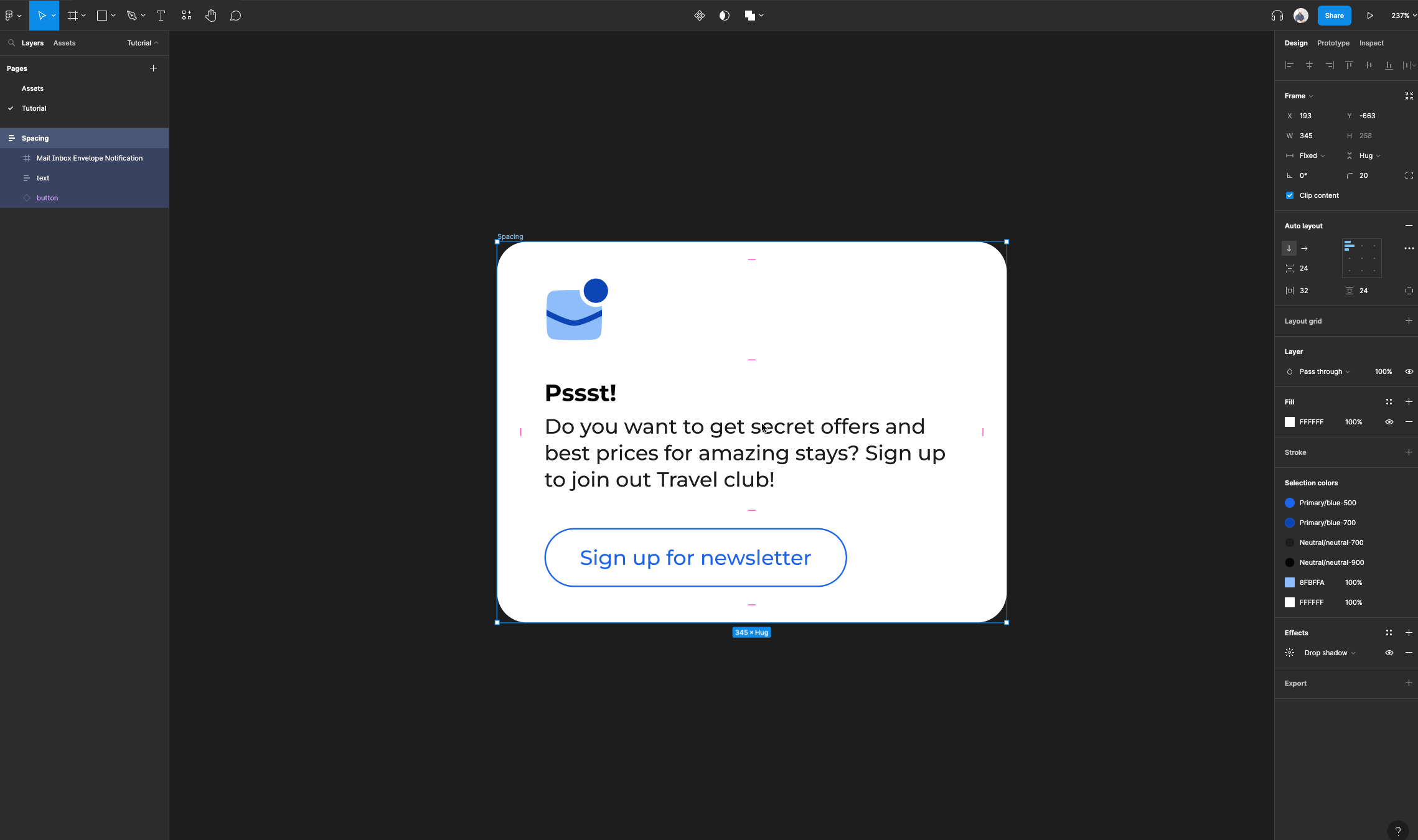
First, set the horizontal padding to “24”. Then set the vertical padding to “8”. When you have the padding set you can adjust the border radius to “100”.
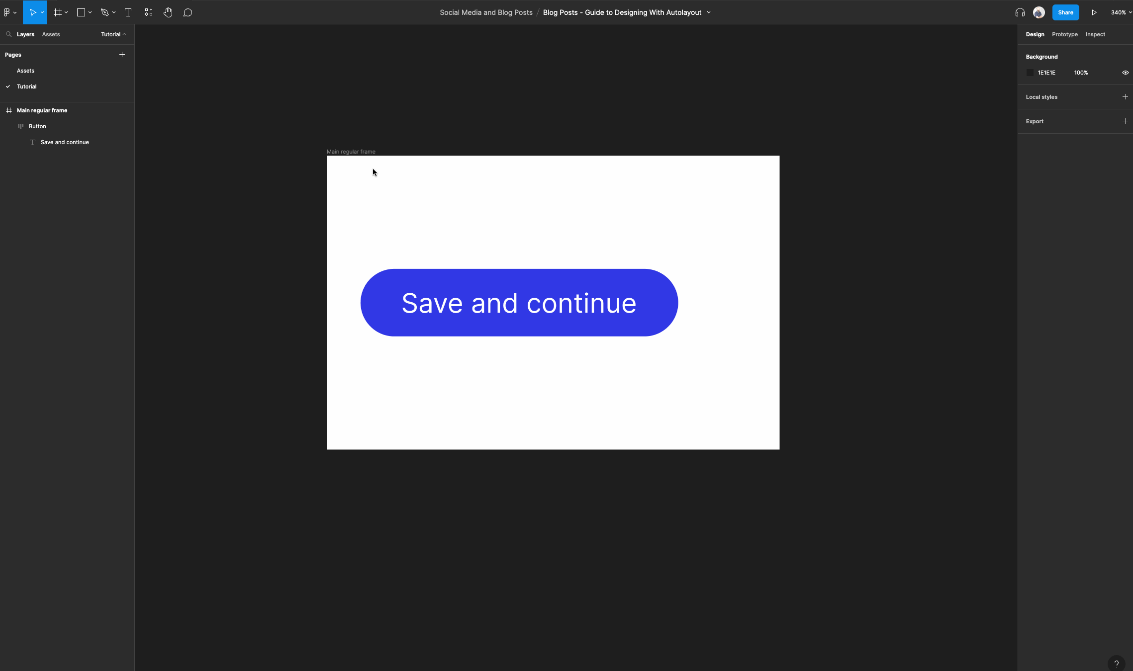
If you want to have a button that automatically resizes horizontally with the text within, then leave your button as is. Take a look at what it looks like when we add new text.
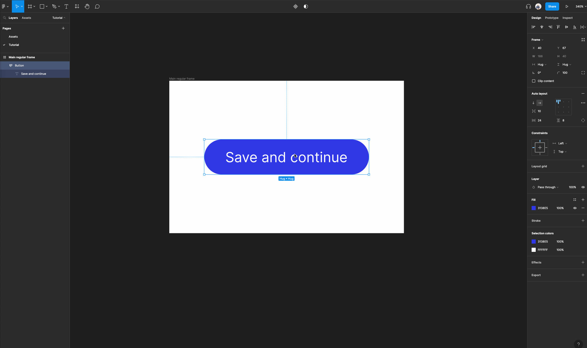
But, if you want a button that resizes horizontally with a regular frame, then you need to set its horizontal resizing to “Fixed width”.
Then access the auto layout properties and select the “align center” option. This ensures that your text layers stays in the middle while the button's width is resized. Lastly you must set its constraints to “left and right”.
💡 If your button was nested within another auto layout frame instead, then you would need to set its horizontal resizing to “fill container”.
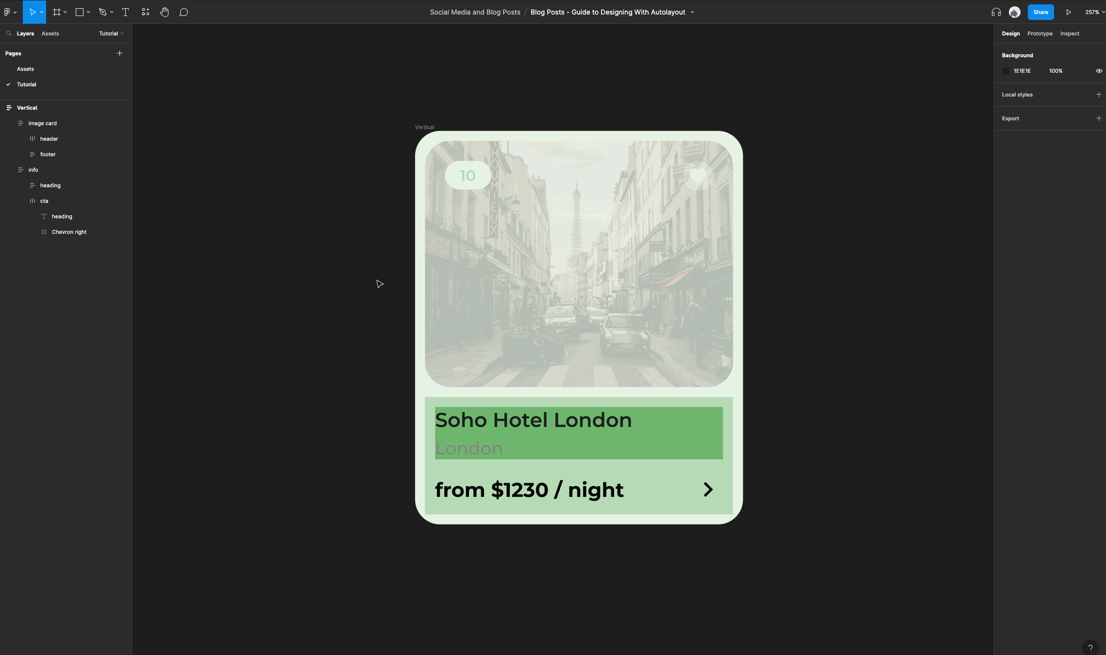
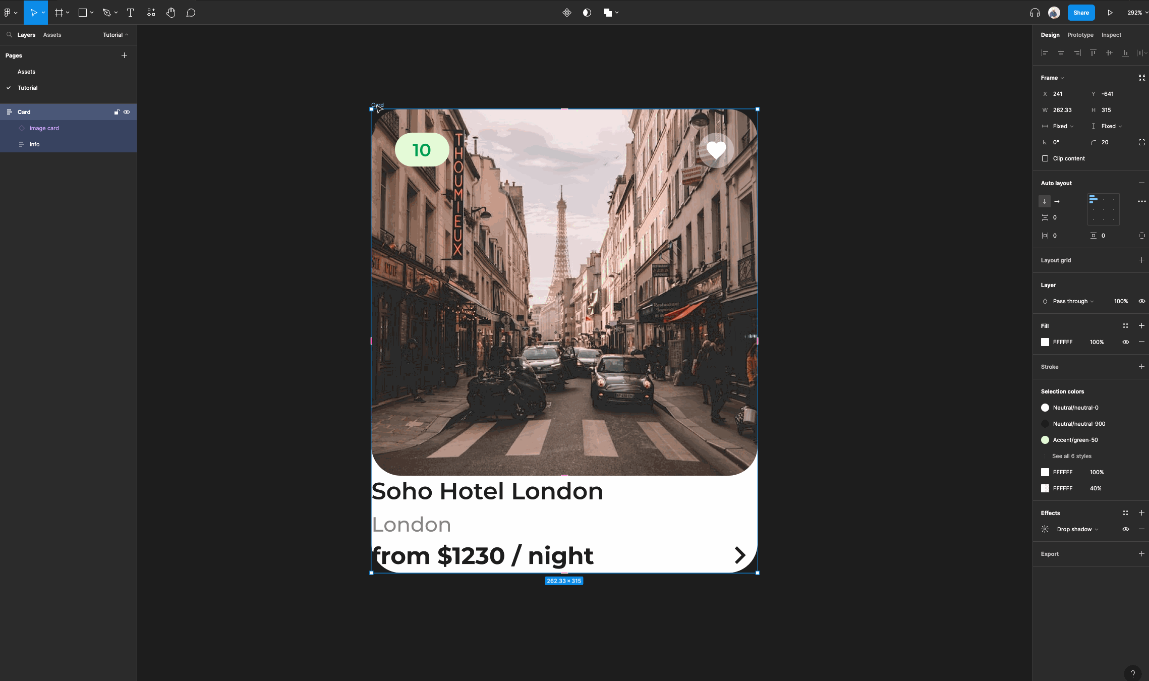
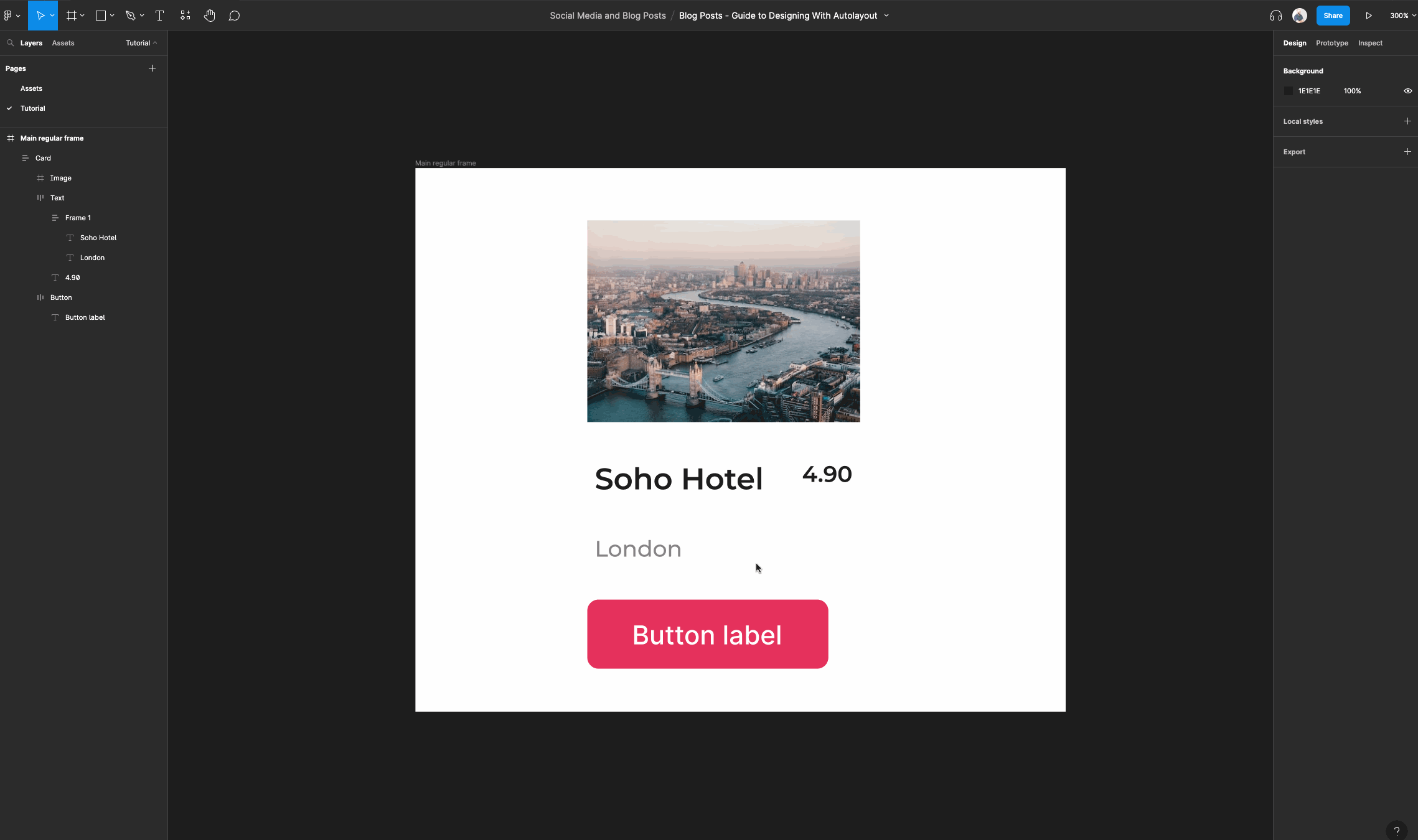
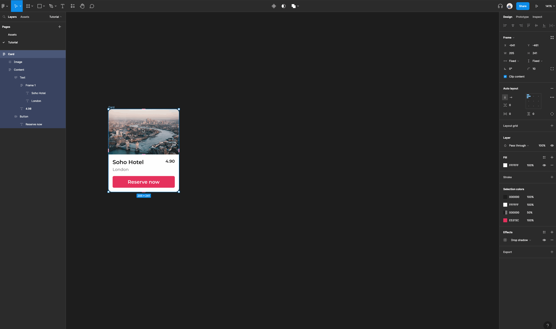
How to create auto layout cards
Create a frame and name it “Main regular frame”. This is going to serve as our main canvas.
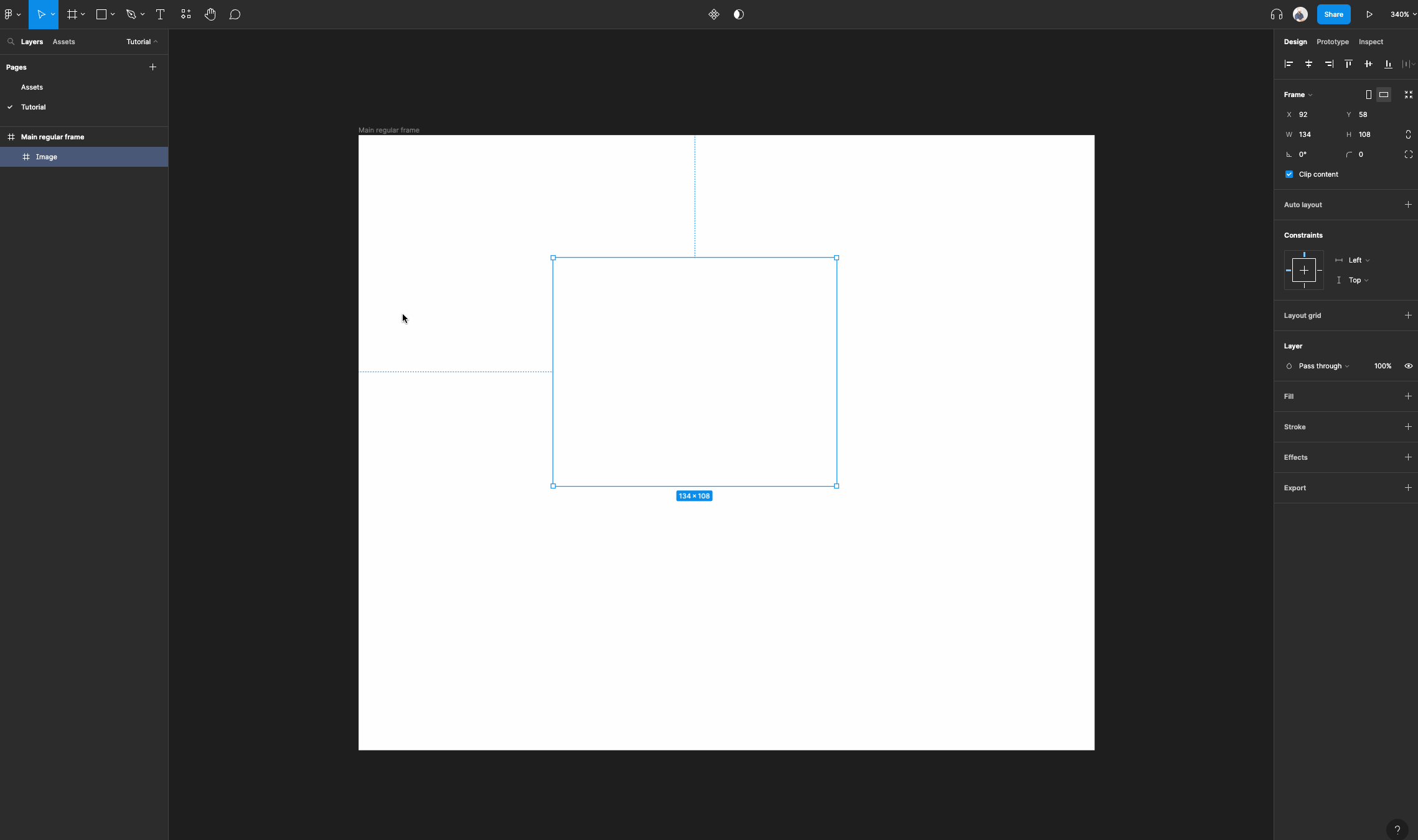
Then, create another frame within your main regular frame. This will serve as an image for your card.
You can name it “Image”.
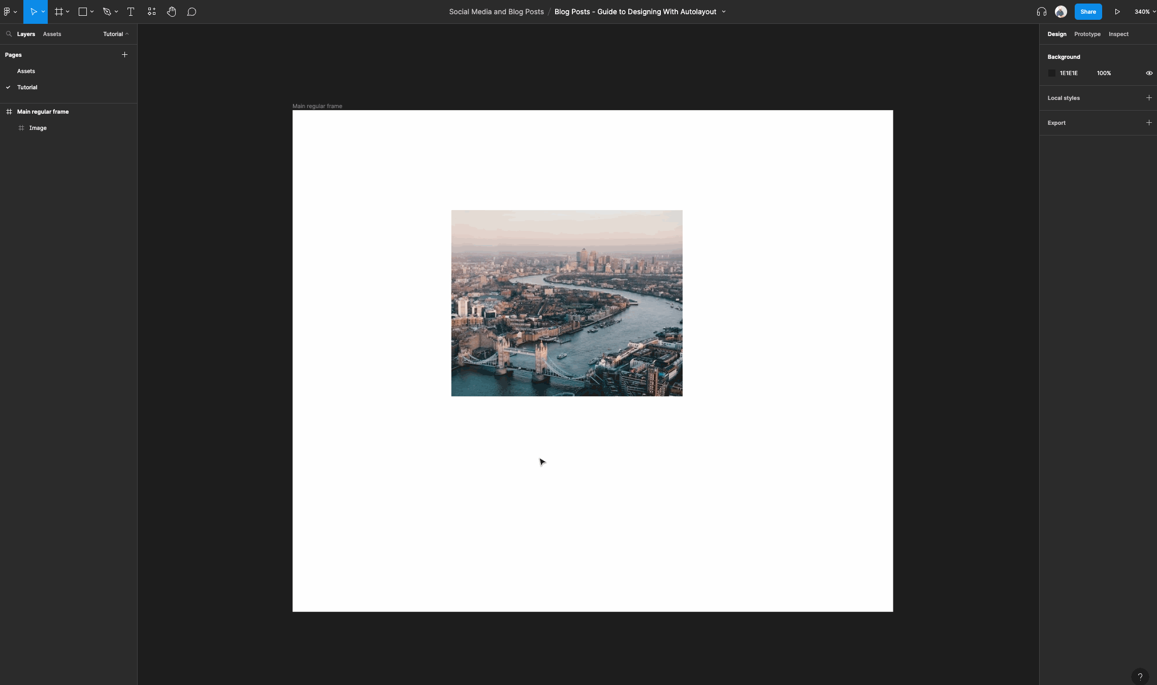
You can give the image a color fill or you can use a plugin like Unsplash to fill it with an image.
Once you are done, right click the image layer and select “Add auto layout”.
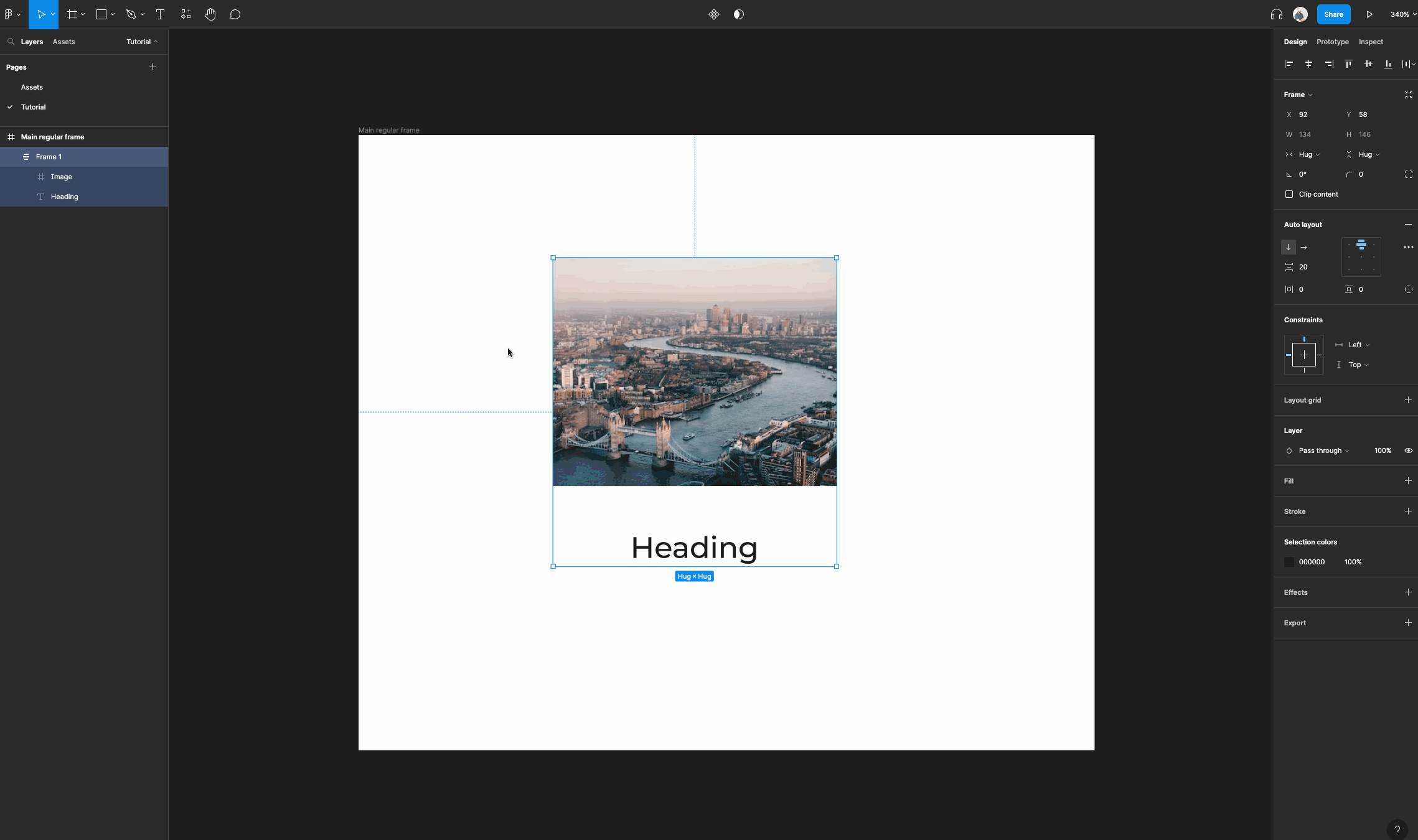
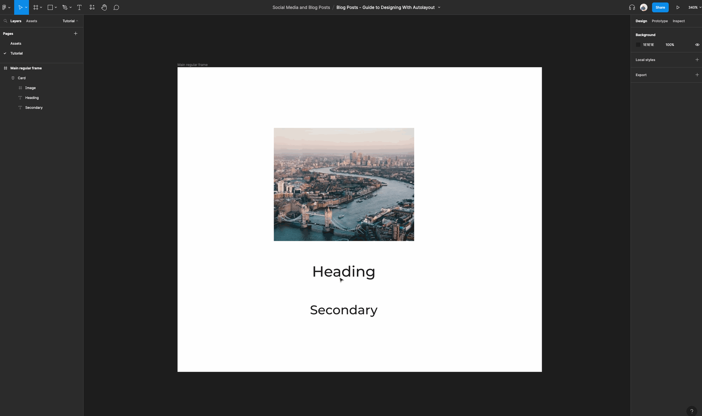
Next, add a text layer and type in something like “Title”.
Select the text layer and the image layer and right click. Then select “Add auto layout”. This frame will now serve as our card frame.
Rename the auto layout frame to “Card”.
Once you are done add another text layer and make it a bit smaller than the heading text layer. Now drag that text layer in the card auto layout frame.
Don't worry about making your text look great, we will handle that soon.
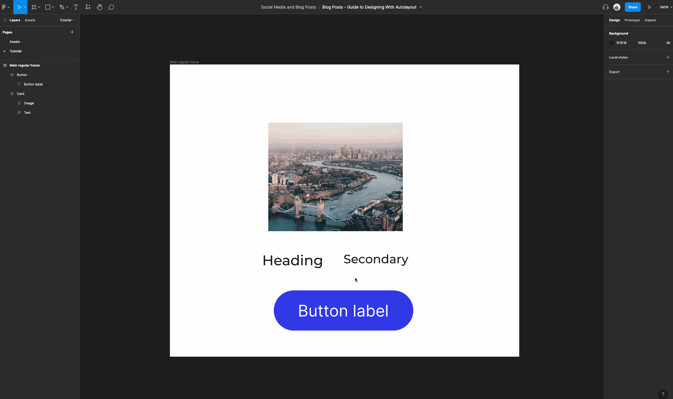
Now that we have some content in our card, we are going to group the two text layers in an auto layout frame.
Select both text layers, right click and then select “Add auto layout”. Then navigate to the auto layout properties panel and select the option to switch it to a horizontal layout.
You can rename the layer to something like “Text” for easy readability.
Next, we are going to create an auto layout button and place it within the main auto layout frame called “Card”.
If you haven't been following along, you can use the tutorial above to create an auto layout button. Feel free to style the button in any way you like but we can get to the polish later.
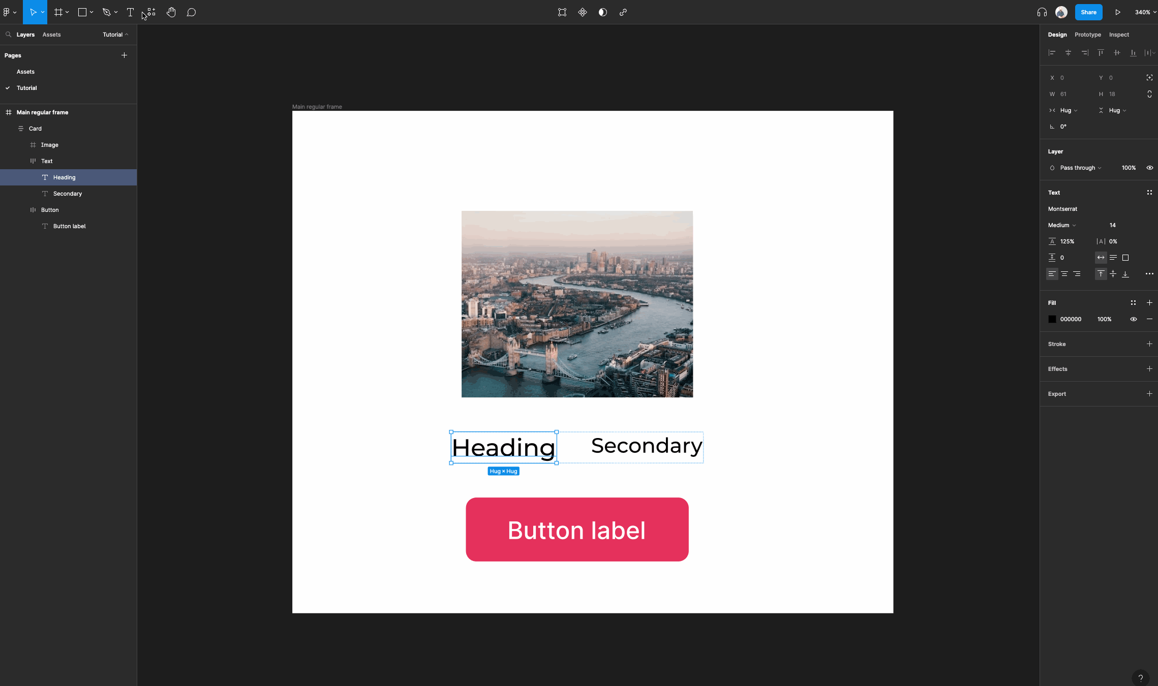
Let's add an additional smaller text layer and group it within an auto layout frame under the larger text.
Just remember to drag it into the frame named “Text” first. You can use the layers panel to do this since it is easier. Then, we're going to nest some auto layout frames in this step.
Now we can add a bit more polish. First, start by setting the image frame's horizontal resizing to “fill container”. Then we can do the same for the main text frame.
Ensure your card frame has horizontal resizing set to “fixed width”.
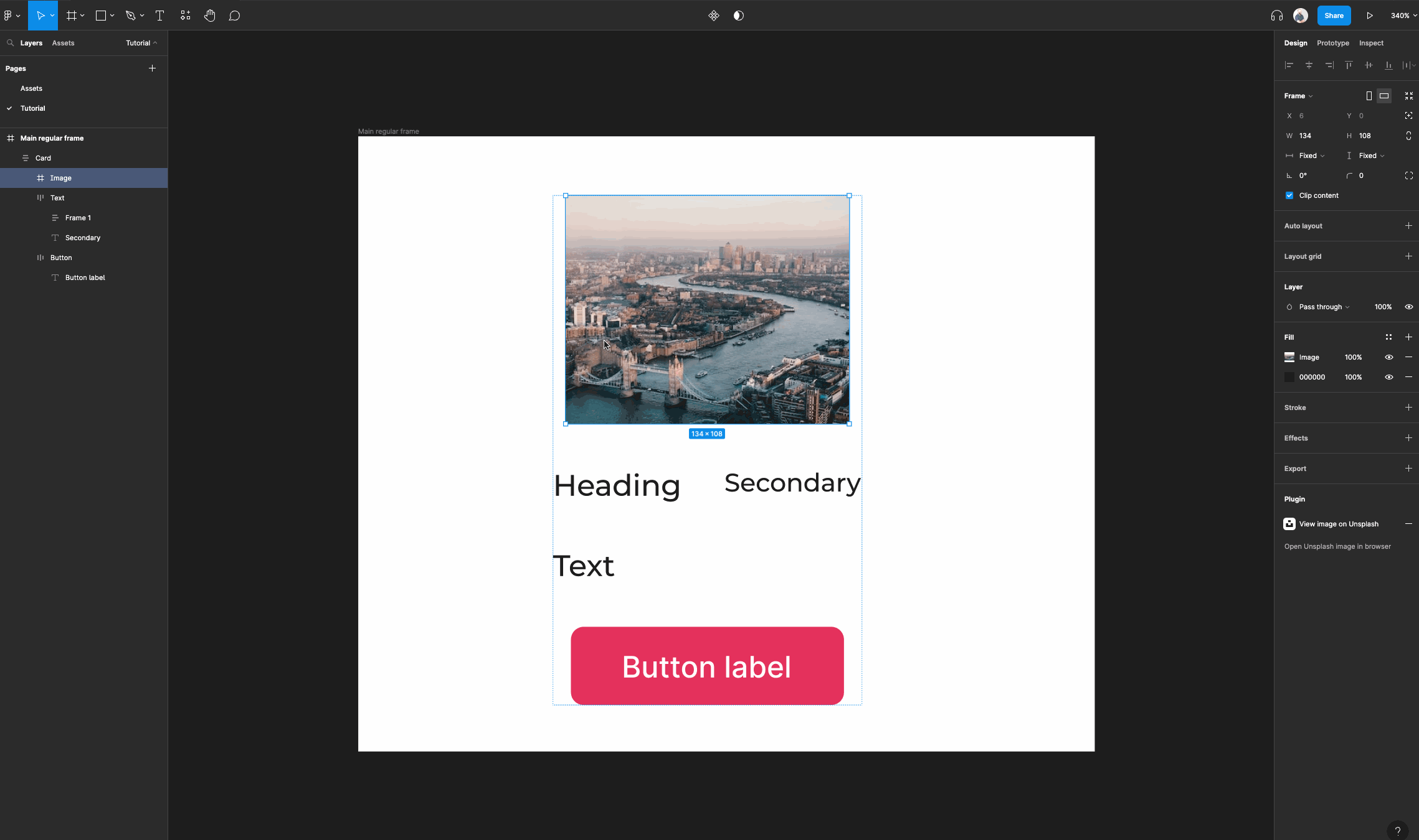
Time to clean up the spacing and padding of our text and add some content.
Feel free to begin styling your text as you see fit but focus on ensuring that your text is readable and has proper hierarchy.
Let's group our main text frame and button in an auto layout frame.
Name it “content”, and then give it a padding of 12 all around.
We want to do this so our image stretches the entire width of the card and still have our main content have some padding from the edges.
Ensure your frame named content has its horizontal resizing set to “fill container” and ensure the main text frame inside has its horizontal resizing set to “fill container”.
We do this to ensure that the content resizes when we resize our main card frame.
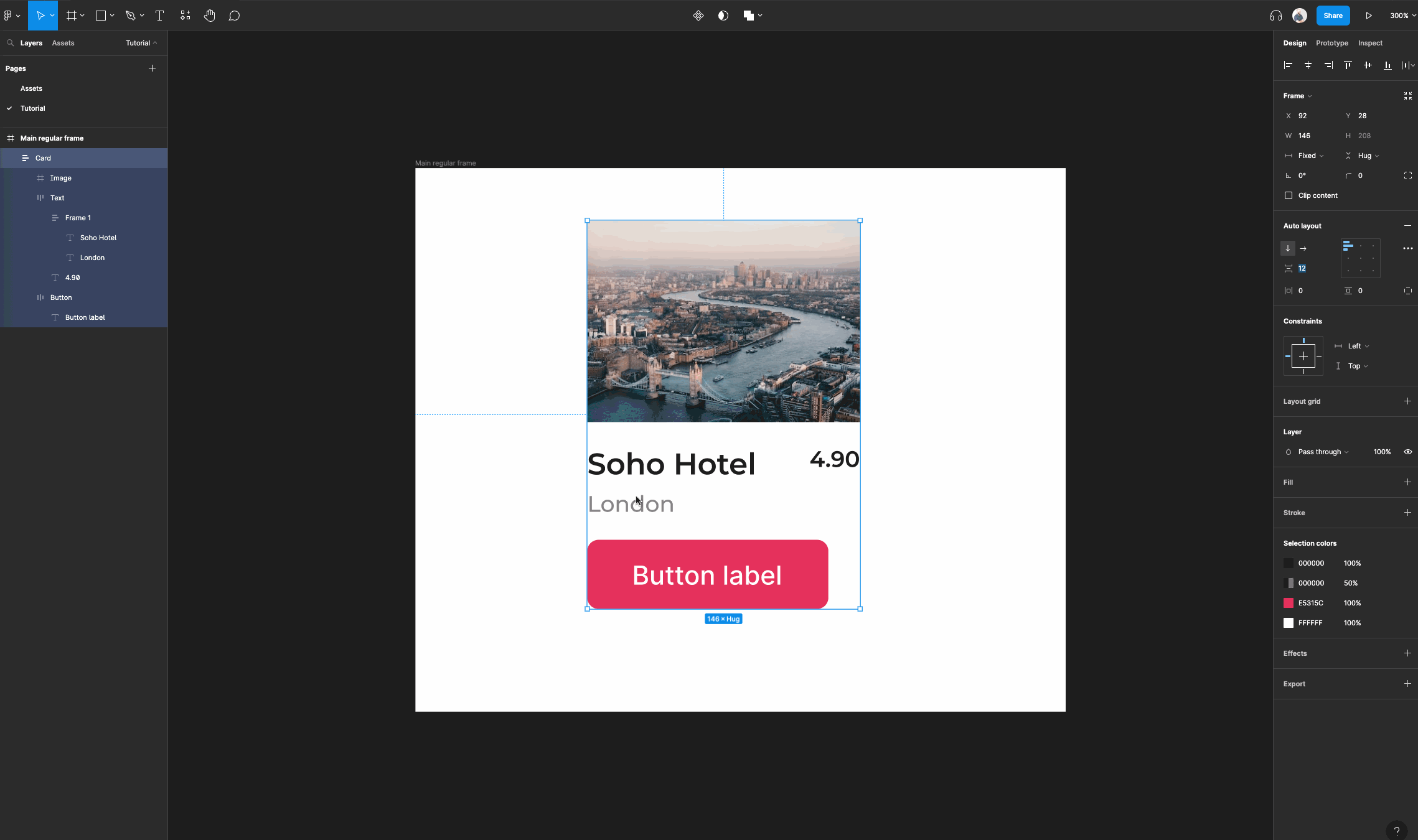
At this point you can start adding the content for your text and button like I have done, and put some finishing touches on your card. Don't forget to select “clip content” when you are focused on the main card frame.
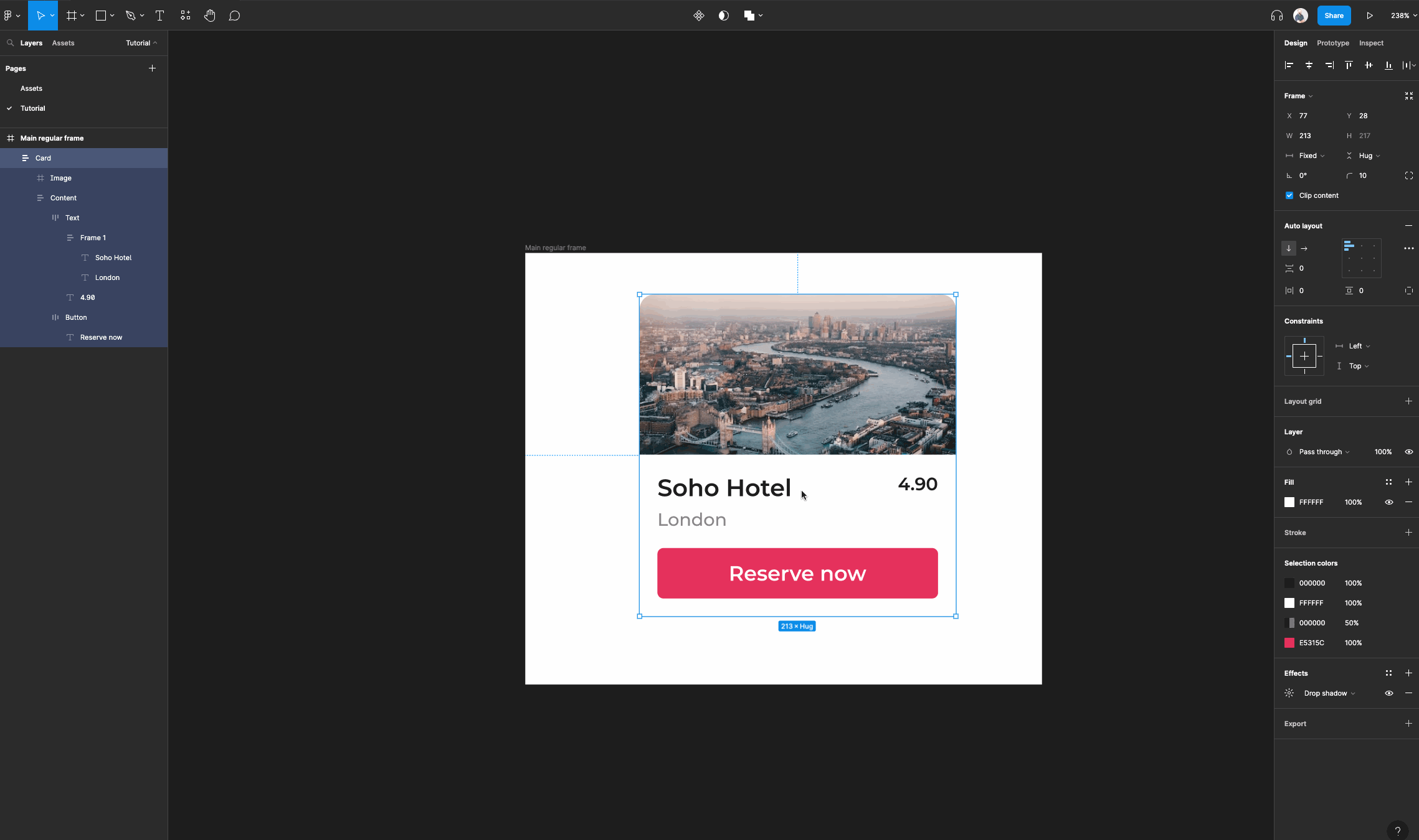
Personally, I am going to make a full width button, make my card a bit wider and add a border radius.
Lastly, let's add a subtle drop shadow to really make this pop! You can do this by selecting the card frame and navigating to the effects panel and clicking the little “+” icon, where drop shadow will already be selected.
For your drop shadow to work you need a background fill on your main card frame so don't forget to add it!
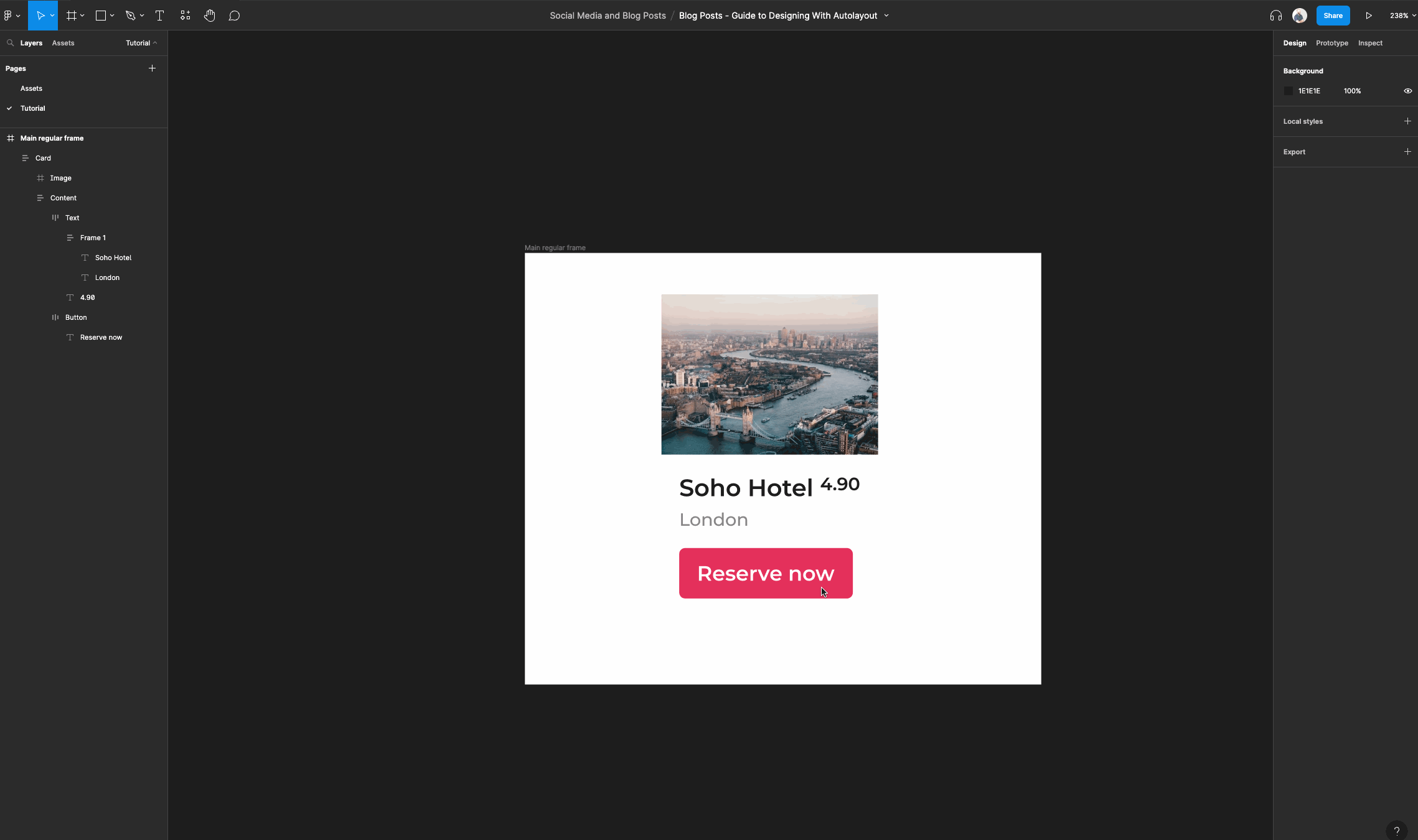
There you have it! We now have a responsive card that has content that automatically resizes.
If you want to go a step further, you can set your image frame's vertical resizing to “fill container” so that it will resize as you set the height of the main card frame.
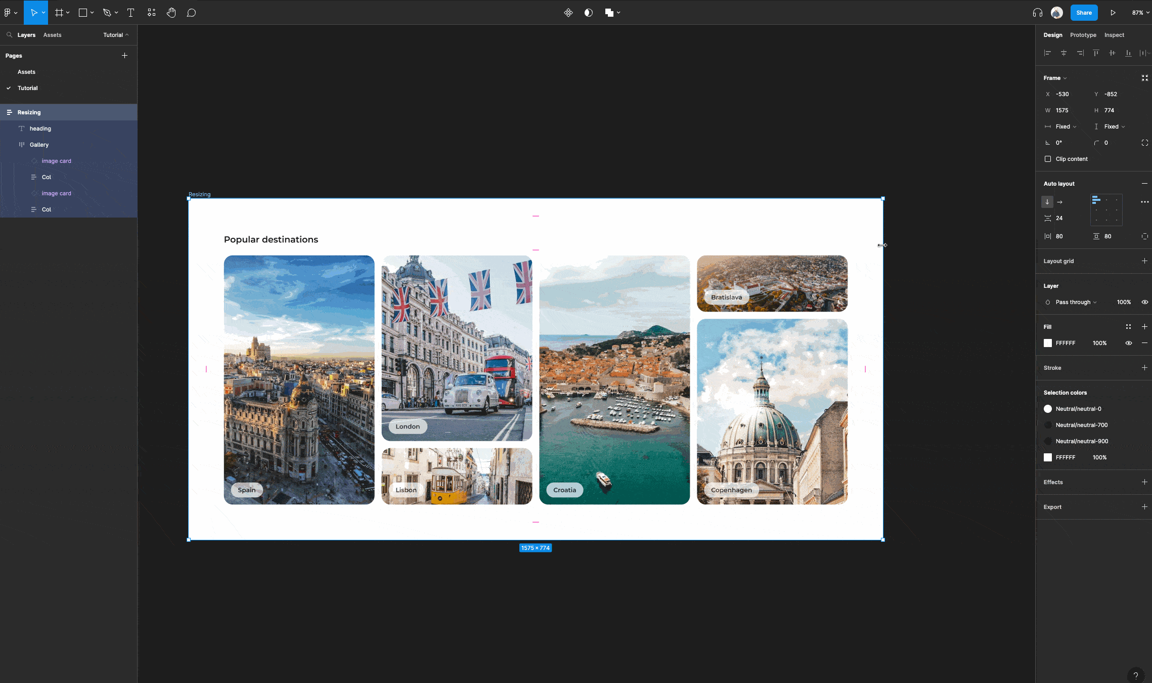
How to use auto layout to create dynamic layouts
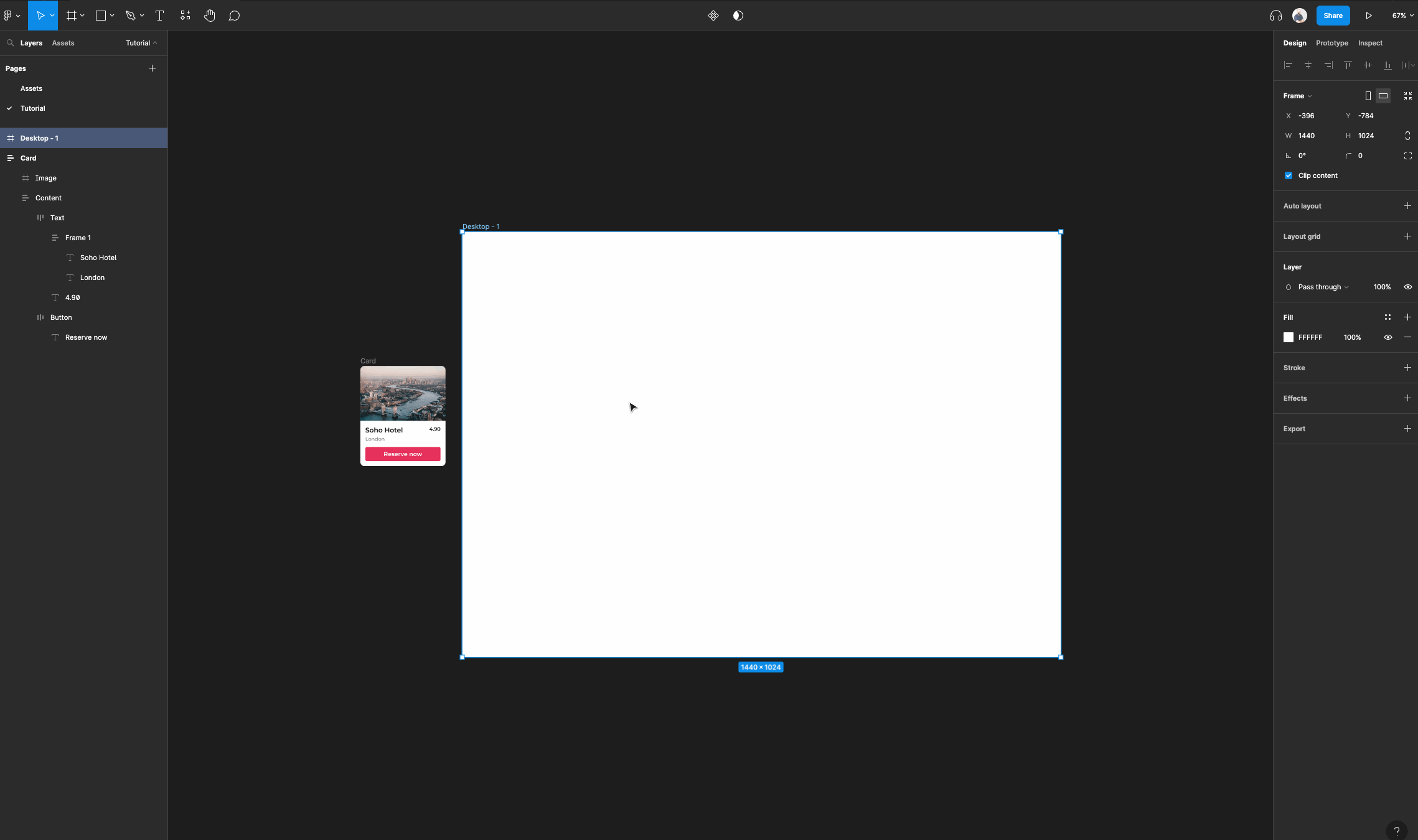
Start by selecting the frame tool and navigating to the right panel to the “Desktop” accordion, and select a desktop sized frame of your choice.
This will act as our main regular frame where we will create our quick card layout.
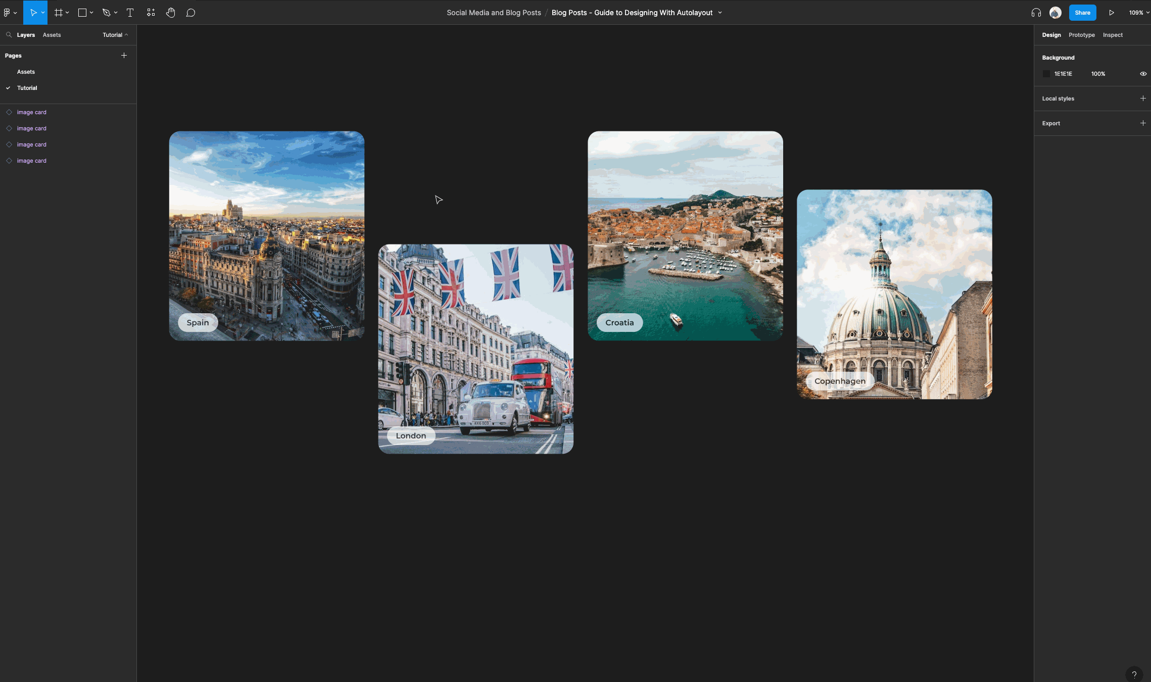
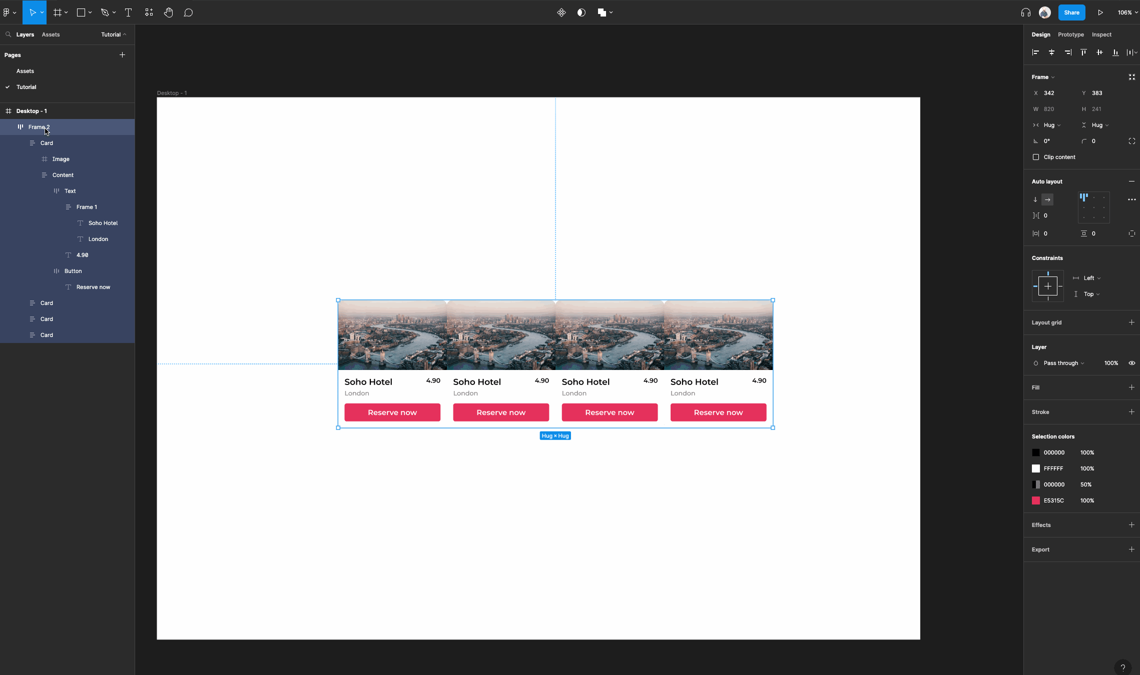
Next, we're going to place our card that we created in the last tutorial within the desktop frame we just created.
Copy and paste that card about 4-5 times and select them all. You can do this easily by selecting the card and using the shortcut CMD/CTRL + D to duplicate.
Right click, then select “Add auto layout”.
Rename the frame to “Gallery” and navigate to the auto layout properties panel to set spacing, and then set the spacing between items to be “16”.
Lastly, select all cards within your gallery frame and set their horizontal and vertical resizing to “Fill container”.
Note: You can select all the layers within a frame or group quickly by first selecting the parent frame and clicking the Enter key.
Now all cards should easily resize vertically and horizontally.
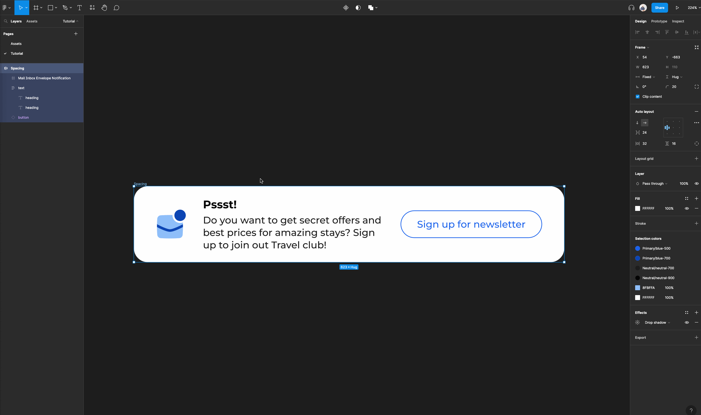
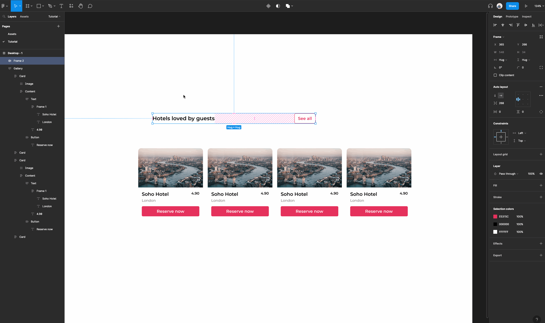
Now, let's add a heading and button bar. You can utilize one of your auto layout buttons to do this and create another version like I have done.
First, create a text layer and set whichever properties you would like for it. Then, select both the text layer and the button and tap “Shift + A”. This will create an auto layout frame automatically.
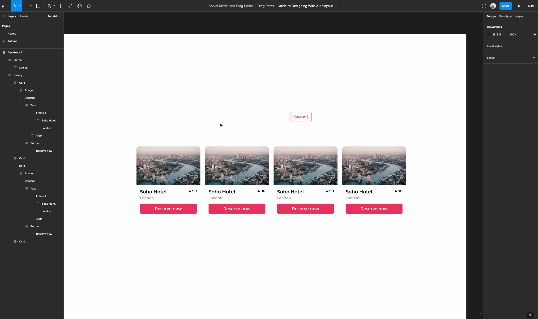
Rename the frame you just made to “Header”.
Then, go into our auto layout properties for this frame and select the advanced auto layout settings icon. (This is the icon with the 3 dots).
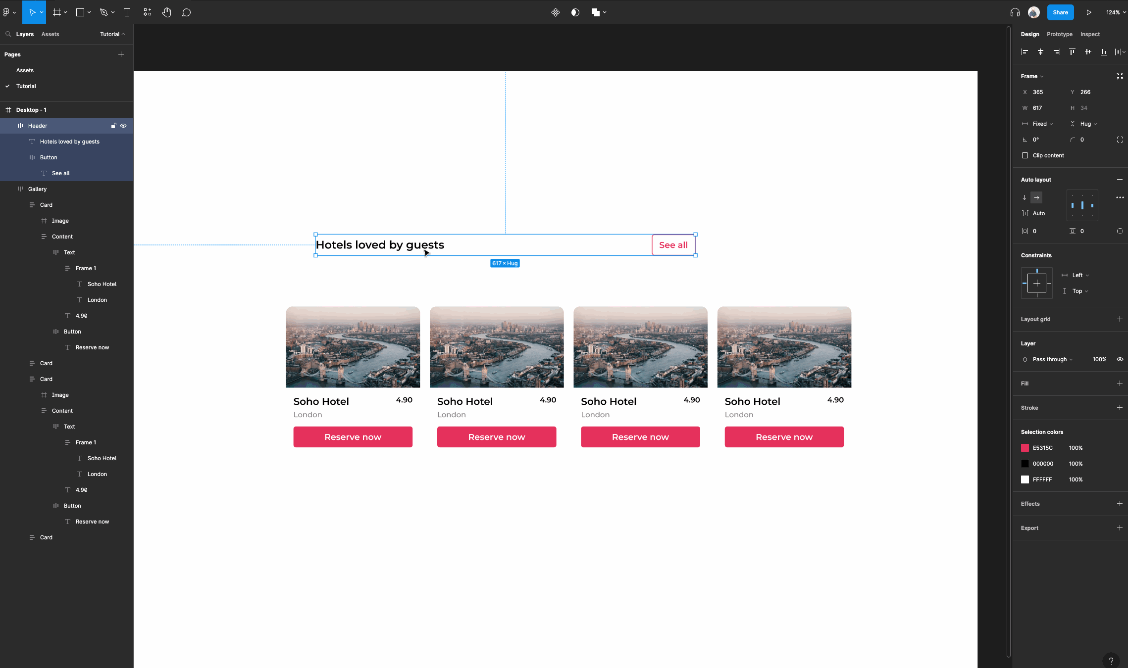
Then navigate to the first option “Spacing mode” and select “Space between”. This will allow our elements within this frame to automatically create space between one another when they have their horizontal resizing set to “Fixed Width” or Hug Contents”.
This is great if you don't want to manually set spacing or if your content needs to have a fixed width.
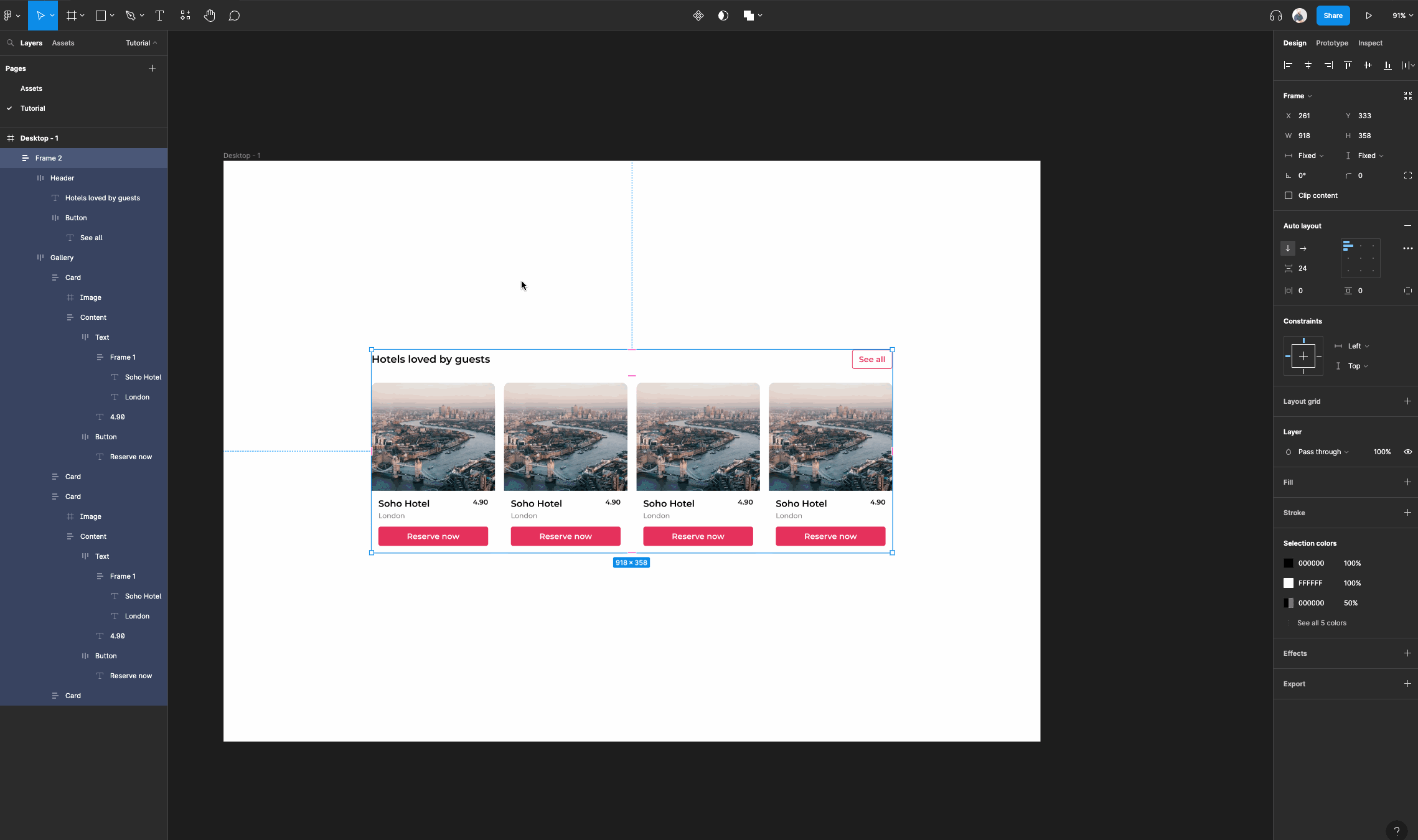
Next, let's group our header and gallery frames into another auto layout frame.
Set the spacing of the frame to “24”. Once you have done that, make sure you set both frames to have horizontal resizing of “Fill container”. Then set the gallery frame's vertical resizing to “Fill container”.
Now your content within will resize both horizontally and vertically where applicable.
Now for the responsive magic on your main desktop frame.
Since your new frame is within the regular desktop frame you need to set constraints on the auto layout frame for it to be responsive.
Select the frame you just created, you can rename it to anything you like, then navigate to the constraints panel. Set the horizontal constraints to “Left and Right”. Now resize!
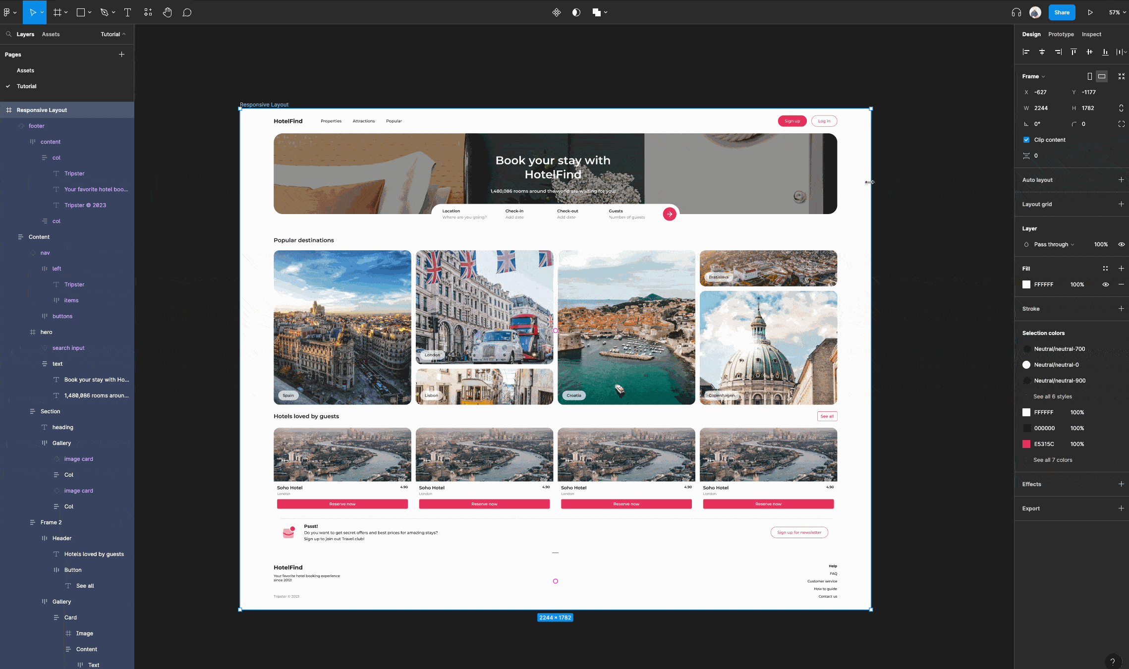
If you are feeling very ambitious you can start to string together multiple elements and auto layout frames to create your very own responsive layout like the one below!
Conclusion
Phew, that was a lot! We've covered the benefits, techniques, and best practices for designing UI elements with Figma's Auto Layout feature.
Let's quickly recap some of the key points we've explored:
- Auto Layout is a powerful tool that simplifies the design process and improves efficiency
- By using Auto Layout frames and customizing their properties, you can create dynamic and responsive designs
- Using Constraints in conjunction with Auto Layout and its properties, allows you to create complex and adaptive UI elements and layouts
- We've worked together to create various UI elements using Auto Layout, providing you with hands-on experience and practical examples to apply in your own designs
Looking to the future, it's evident that Figma's Auto Layout feature holds immense potential for further advancements and exciting possibilities. Especially when you realize that the Figma team is continuously working to enhance the tool's capabilities, and we can anticipate a host of new features and integrations on the horizon.
You're now well-equipped to leverage Auto Layout in your design projects. Remember to plan your layout, prioritize readability, use proper padding and spacing, and maintain simplicity while creating visually captivating designs.
Stay organized with clear naming conventions and take advantage of reusable components to ensure consistency so you can save time.
By following these best practices, you'll be able to create effective, maintainable, and user-friendly UI elements using Figma's Auto Layout feature.
Happy designing!
P.S.
If you want to learn how to use Figma more effectively, and design/build some awesome projects, then check out my complete Figma course.
This is the only design bootcamp you need to learn and master web design, mobile design, Figma, UI & UX, and HTML + CSS.


