


Welcome to part 4 in my 7-part introductory series on Machine Learning and Data Science.
Be sure to check out the other parts in the series, as they all lead into each other.
- Part 1: A 6-Step Framework To Tackle Machine Learning Projects
- Part 2: Introduction to NumPy + Python
- Part 3: Introduction to Pandas + Python
- Part 4: Introduction to Matplotlib (Which is what you're reading right now)
- Part 5: Introduction to Scikit-Learn
- Part 6: Introduction to Deep Learning with TensorFlow
- Part 7: Communicating & Sharing Your Work as a Machine Learning Engineer / Data Scientist
What is Matplotlib?
Matplotlib is a visualization library for Python.
If you want to display something in a chart or graph, matplotlib can help you do that programmatically. In fact, many of the graphics you'll see in machine learning research papers or presentations are made with matplotlib.
Chances are high that at some point, you’re going to need to present some of your own projects, which is why in this tutorial, I’m going to walk you through some of the basic features of matplotlib, such as:
- 2 of my favorite methods for creating plots
- Using matplotlib to create the most common types of plots: Line, Scatter, Bar, and Histogram
- Plotting data directly with pandas
- Plotting more advanced plots with a pandas Dataframe, and
- Customizing your plots so they look more awesome
Sidenote: If you want to deep dive into Machine Learning, then check out my complete Machine Learning and Data Science course or watch the first few videos for free.

It’s one of the most popular, highly rated Machine Learning and Data Science bootcamps online, as well as the most modern and up-to-date. Guaranteed.
You'll go from a complete beginner with no prior experience to getting hired as a Machine Learning Engineer this year, so it’s helpful for ML Engineers of all experience levels.
Want a sample of the course? Well check out the video below!:
Why listen to me?
My name is Daniel Bourke, and I'm the resident Machine Learning instructor here at Zero To Mastery.
Originally self-taught, I worked for one of Australia's fastest-growing artificial intelligence agencies, Max Kelsen, and have worked on Machine Learning and data problems across a wide range of industries including healthcare, eCommerce, finance, retail, and more.
I'm also the author of Machine Learning Monthly, write my own blog on my experiments in ML, and run my own YouTube channel - which has hit over 8 Million views.
Phew!
With all that out of the way, let’s get to visualizing some data!
Why use Matplotlib vs other options?
Matplotlib is part of the standard Python data stack (pandas, NumPy, matplotlib, and Jupyter).

This is mainly because it has terrific integration with many other Python libraries.
For example
pandas uses matplotlib as a backend to help visualize data in DataFrames.
If it’s good enough for pandas, then it’s good enough for me, so let’s show you how to use it.
How to import Matplotlib into Python
We'll start by importing matplotlib.pyplot.
Why pyplot?
Because pyplot is a submodule for creating interactive plots programmatically, and is often imported as the alias plt.
Note: In older tutorials of matplotlib, you may see the magic command
%matplotlib inline. This was required to view plots inside a notebook, however, as of 2020 it is mostly no longer required.
# Older versions of Jupyter Notebooks and matplotlib required this magic command
# %matplotlib inline

# Import matplotlib and matplotlib.pyplot
import matplotlib
import matplotlib.pyplot as plt

print(f"matplotlib version: {matplotlib.__version__}")

matplotlib version: 3.6.3
Two ways of creating plots
There are two main ways of creating plots in matplotlib:
matplotlib.pyplot.plot()- is recommended for simple plots (e.g. x and y)matplotlib.pyplot.XX(where XX can be one of many methods, this is known as the object-oriented API) - is recommended for more complex plots (for exampleplt.subplots()can be used to create multiple plots on the sameFigure, but we'll get to this later)
Both of these methods are still often created by building off import matplotlib.pyplot as plt as a base.
For example
Let's start simple.
# Create a simple plot, without the semi-colon
plt.plot()
You can also use:
# With the semi-colon
plt.plot();
or
# You could use also ```plt.show()``` if you want
plt.plot()
plt.show()
And they will also bring up an empty graph ready to be used. So many options!
OK, so we have the empty plot - now let’s add some data.
# Let's add some data
plt.plot([1, 2, 3, 4]);
# Create some data
x = [1, 2, 3, 4]
y = [11, 22, 33, 44]
Sidenote: A few quick things about a plot:
xis the horizontal axisyis the vertical axis- In a data point,
xusually comes first, e.g.(3, 4)would be(x=3, y=4) - The same happens in
matplotlib.pyplot.plot(), wherexcomes beforey, e.g.plt.plot(x, y)
OK, so let’s try adding a y-value now:
# Now a y-value too!
plt.plot(x, y);
Alright. Now let's try starting again from scratch using the object-oriented version.
We'll start by creating a figure with plt.figure(), and then we'll add an axes with add_subplot, like so:
# Creating a plot with the object-oriented version
fig = plt.figure() # create a figure
ax = fig.add_subplot() # add an axes
plt.show()
A quick note on the terminology:
- A
Figure(e.g.fig = plt.figure()) is the final image in matplotlib (and it may contain one or moreAxes). It's often shortened tofig - The
Axesare an individual plot (e.g.ax = fig.add_subplot()), and are often shortened toax - One
Figurecan contain one or moreAxes - The
Axisarex(horizontal),y(vertical), andz(depth)
With that out of the way, let's add some data to our previous plot.
# Add some data to our previous plot
fig = plt.figure()
ax = fig.add_axes([1, 1, 1, 1])
ax.plot(x, y)
plt.show()
However, there's an easier way to do this. We can use matplotlib.pyplot to help us create a Figure with multiple potential Axes.
And that's with plt.subplots().
# Create a Figure and multiple potential Axes and add some data
fig, ax = plt.subplots()
ax.plot(x, y);
Anatomy of a Matplotlib Figure
Matplotlib offers almost unlimited options for creating plots.
However, let's break down some of the main terms.
Figure- The base canvas of all matplotlib plots. The overall thing you're plotting is aFigure, often shortened tofigAxes- OneFigurecan have one or multipleAxes. For example, aFigurewith multiple subplots could have 4Axes(2 rows and 2 columns), and is often shortened toaxAxis- A particular dimension of anAxes, for example, the x-axis or y-axis

# This is where the object orientated name comes from
type(fig), type(ax)
Output
(matplotlib.figure.Figure, matplotlib.axes._subplots.AxesSubplot)An example Matplotlib workflow
The following workflow is a standard practice when creating a matplotlib plot:
- Import
matplotlib- For example,import matplotlib.pyplot as plt - Prepare data - This may be from an existing dataset (data analysis) or from the outputs of a machine learning model (data science)
- Setup the plot - In other words, create the
Figureand variousAxes - Plot data to the
Axes- Send the relevant data to the targetAxes - Customize the plot - Add a title, decorate the colors, label each
Axis - Save and show - See what your masterpiece looks like and save it to file if necessary
# A matplotlib workflow

# 0. Import and get matplotlib ready
# %matplotlib inline # Not necessary in newer versions of Jupyter (e.g. 2022 onwards)
import matplotlib.pyplot as plt

# 1. Prepare data
x = [1, 2, 3, 4]
y = [11, 22, 33, 44]

# 2. Setup plot (Figure and Axes)
fig, ax = plt.subplots(figsize=(10,10))

# 3. Plot data
ax.plot(x, y)

# 4. Customize plot
ax.set(title="Sample Simple Plot", xlabel="x-axis", ylabel="y-axis")

# 5. Save & show
fig.savefig("../images/simple-plot.png")
Making the most common type of plots using NumPy arrays
Matplotlib visualizations are built on NumPy arrays, so in this section, we'll build some of the most common types of plots using NumPy arrays.
- Line plot -
ax.plot()(this is the default plot in matplotlib) - Scatter plot -
ax.scatter() - Bar plot -
ax.bar() - Histogram plot -
ax.hist()
We'll see how all of these can be created as a method from matplotlob.pyplot.subplots().
Resource: Remember you can see many of the different kinds of matplotlib plot types in the documentation.
To make sure we have access to NumPy, we'll import it as np.
import numpy as npCreating a line plot with Matplotlib
Line plots are great for seeing trends over time, and line is the default type of visualization in Matplotlib.
Usually, unless specified otherwise, your plots will start out as lines.
Input
# Create an array
x = np.linspace(0, 10, 100)
X[:10]
Output
array([0., 0.1010101 , 0.2020202 , 0.3030303 , 0.4040404 ,
       0.50505051, 0.60606061, 0.70707071, 0.80808081, 0.90909091])
Input
# The default plot is line
fig, ax = plt.subplots()
ax.plot(x, x**2);
Creating a scatter plot with Matplotlib
Scatter plots can be great for when you've got many different individual data points and you'd like to see how they interact with each other without being connected.
# Need to recreate our figure and axis instances when we want a new figure
fig, ax = plt.subplots()
ax.scatter(x, np.exp(x));
fig, ax = plt.subplots()
ax.scatter(x, np.sin(x));
Creating bar plots with Matplotlib
Bar plots are great for visualizing different amounts of similar-themed items.
For example
We could use it to track the sales of items at a Nut Butter Store.
You can create vertical bar plots with ax.bar() and horizontal bar plots with ax.barh().
# You can make plots from a dictionary
nut_butter_prices = {"Almond butter": 10,
                     "Peanut butter": 8,
                     "Cashew butter": 12}
fig, ax = plt.subplots()
ax.bar(nut_butter_prices.keys(), nut_butter_prices.values())
ax.set(title="Dan's Nut Butter Store", ylabel="Price ($)");
fig, ax = plt.subplots()
ax.barh(list(nut_butter_prices.keys()), list(nut_butter_prices.values()));
Creating a histogram plot with Matplotlib
Histogram plots are excellent for showing the distribution of data.
For example
You might want to show the distribution of ages of a population, or wages of a city.
# Make some data from a normal distribution
x = np.random.randn(1000) # pulls data from a normal distribution

fig, ax = plt.subplots()
ax.hist(x);
x = np.random.random(1000) # random data from random distribution

fig, ax = plt.subplots()
ax.hist(x);
Creating Figures with multiple Axes (with Subplots)
Subplots allow you to create multiple Axes on the same Figure (multiple plots within the same plot).
Subplots are helpful because you start with one plot per Figure, but can scale it up to more when necessary.
For example
Let's create a subplot that shows how many of the above datasets on the same Figure.
We can do so by creating multiple Axes with plt.subplots() and setting the nrows (number of rows) and ncols (number of columns) parameters to reflect how many Axes we'd like.
nrows and ncols parameters are multiplicative, meaning plt.subplots(nrows=2, ncols=2) will create 2*2=4 total Axes.
Resource: You can see a sensational number of examples for creating Subplots in the matplotlib documentation.
# Option 1: Create 4 subplots with each Axes having its own variable name
fig, ((ax1, ax2), (ax3, ax4)) = plt.subplots(nrows=2,
                                             ncols=2,
                                             figsize=(10, 5))

# Plot data to each axis
ax1.plot(x, x/2);
ax2.scatter(np.random.random(10), np.random.random(10));
ax3.bar(nut_butter_prices.keys(), nut_butter_prices.values());
ax4.hist(np.random.randn(1000));
# Option 2: Create 4 subplots with a single ax variable
fig, ax = plt.subplots(nrows=2, ncols=2, figsize=(10, 5))

# Index the ax variable to plot data
ax[0, 0].plot(x, x/2);
ax[0, 1].scatter(np.random.random(10), np.random.random(10));
ax[1, 0].bar(nut_butter_prices.keys(), nut_butter_prices.values());
ax[1, 1].hist(np.random.randn(1000));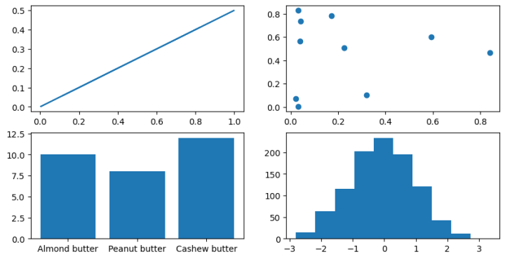
Plotting data directly with pandas
Matplotlib has a tight integration with pandas too, and you can directly plot from a pandas DataFrame with DataFrame.plot().
Let's see the following plots directly from a pandas DataFrame:
- Line
- Scatter
- Bar
- Hist
To plot data with pandas, we first have to import it as pd.
import pandas as pdNow we need some data to check out.
# Let's import the car_sales dataset
car_sales = pd.read_csv("../data/car-sales.csv")
Car_sales
Line plot from a pandas DataFrame
To help understand examples, I often find I have to repeat them (code them myself), rather than just read them.
To begin understanding plotting with pandas, let's recreate a section of the pandas Chart visualization documents.
# Start with some dummy data
ts = pd.Series(np.random.randn(1000),
               index=pd.date_range('1/1/2024', periods=1000))

# Note: ts = short for time series (data over time)
Ts
Output
2024-01-01   -0.195994
2024-01-02   -1.022610
2024-01-03   -0.202821
2024-01-04    0.640333
2024-01-05   -0.999877
                ...
2026-09-22    0.096283
2026-09-23    1.466828
2026-09-24   -0.149209
2026-09-25   -0.161122
2026-09-26   -0.168698
Freq: D, Length: 1000, dtype: float64
Great! We've got some random values across time.
Now let's add up the data cumulatively over time with DataFrame.cumsum().
cumsumis short for cumulative sum or continually adding one thing to the next and so on.
# Add up the values cumulatively
ts.cumsum()
Output
2024-01-01   -0.195994
2024-01-02   -1.218604
2024-01-03   -1.421425
2024-01-04   -0.781092
2024-01-05   -1.780968
                ...
2026-09-22   -1.518964
2026-09-23   -0.052136
2026-09-24   -0.201345
2026-09-25   -0.362467
2026-09-26   -0.531165
Freq: D, Length: 1000, dtype: float64
We can now visualize the values by calling the plot() method on the DataFrame and specifying the kind of plot we'd like with the kind parameter.
In our case, the kind we'd like is a line plot, hence kind="line" (this is the default for the plot() method).
# Plot the values over time with a line plot (Note: Both of these will return the same thing)
# ts.cumsum().plot() # kind="line" is set by default
ts.cumsum().plot(kind="line");
Working with actual data
Let's do a little data manipulation on our car_sales DataFrame.
# Import the car sales data
car_sales = pd.read_csv("../data/car-sales.csv")

# Remove price column symbols
car_sales["Price"] = car_sales["Price"].str.replace('[\$\,\.]', '',
                                                    regex=True) # Tell pandas to replace using regex
Car_sales
Output

# Remove last two zeros
car_sales["Price"] = car_sales["Price"].str[:-2]
Car_sales
Output

# Add a date column
car_sales["Sale Date"] = pd.date_range("1/1/2024", periods=len(car_sales))
Car_sales
# Make total sales column (doesn't work, adds as string)
#car_sales["Total Sales"] = car_sales["Price"].cumsum()

# Oops... want them as int's, not strings
car_sales["Total Sales"] = car_sales["Price"].astype(int).cumsum()
Car_sales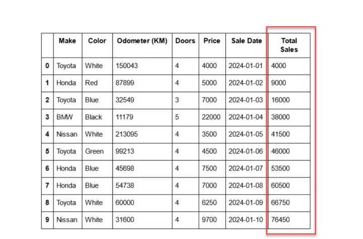
car_sales.plot(x='Sale Date', y='Total Sales');
Scatter plot from a pandas DataFrame
You can also create scatter plots from a pandas DataFrame by using the kind="scatter" parameter.
However, you'll often find that certain plots require certain kinds of data (e.g. some plots require certain columns to be numeric).
# Note: In previous versions of matplotlib and pandas, have the "Price" column as a string would
# return an error
car_sales["Price"] = car_sales["Price"].astype(str)

# Plot a scatter plot
car_sales.plot(x="Odometer (KM)", y="Price", kind="scatter");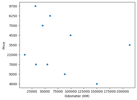
Here we can see that by having the Price column as an int, it returns a much better looking y-axis.
# Convert Price to int
car_sales["Price"] = car_sales["Price"].astype(int)

# Plot a scatter plot
car_sales.plot(x="Odometer (KM)", y="Price", kind='scatter');
Bar plot from a pandas DataFrame
Let's see how we can plot a bar plot from a pandas DataFrame.
First, we'll create some data, like so:
# Create 10 random samples across 4 columns
x = np.random.rand(10, 4)
X
Output
array([[0.65745479, 0.42745471, 0.61990211, 0.01218935],
       [0.10699156, 0.6546944 , 0.5915984 , 0.55011077],
       [0.50720269, 0.2725063 , 0.95817204, 0.67309876],
       [0.33016817, 0.85921522, 0.02778741, 0.36043001],
       [0.8850031 , 0.82582603, 0.58275893, 0.10393635],
       [0.70596769, 0.15698541, 0.43727796, 0.03307697],
       [0.55611843, 0.86959028, 0.49525034, 0.06849191],
       [0.19340766, 0.69988787, 0.89546643, 0.368045  ],
       [0.01834179, 0.74501467, 0.06589424, 0.58463789],
       [0.31159084, 0.4001198 , 0.59601375, 0.64712406]])
And then turn it into a dataframe
# Turn the data into a DataFrame
df = pd.DataFrame(x, columns=['a', 'b', 'c', 'd'])
Df
We can plot a bar chart directly with the bar() method on the DataFrame.
# Plot a bar chart
df.plot.bar();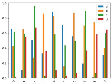
And we can also do the same thing by passing the kind="bar" parameter to DataFrame.plot().
# Plot a bar chart with the kind parameter
df.plot(kind='bar');
Let's try a bar plot on the car_sales DataFrame.
Although this time, we'll specify the x and y axis values.
# Plot a bar chart from car_sales DataFrame
car_sales.plot(x="Make",
               y="Odometer (KM)",
               kind="bar");
Histogram plot from a pandas DataFrame
Histograms are great for seeing the distribution or the spread of data.
We can plot a histogram plot from our car_sales DataFrame using DataFrame.plot.hist() or DataFrame.plot(kind="hist").
car_sales["Odometer (KM)"].plot.hist();
Changing the bins parameter, we can put our data into different numbers of collections.
For example
By default bins=10 (10 groups of data), so let's see what happens when we change it to bins=20.
# Default number of bins is 10
car_sales["Odometer (KM)"].plot.hist(bins=20);
To practice, let's create a histogram of the Price column.
# Create a histogram of the Price column
car_sales["Price"].plot.hist(bins=10);
And to practice even further, how about we try another dataset?
Namely, let's create some plots using the heart disease dataset we've worked on before, in other articles in this series.
# Import the heart disease dataset
heart_disease = pd.read_csv("../data/heart-disease.csv")
heart_disease.head()
# Create a histogram of the age column
heart_disease["age"].plot.hist(bins=50);
What does this tell you about the spread of heart disease data across different ages?
Looks like it’s highest amongst people who are 55-65 right?
Creating a plot with multiple Axes from a pandas DataFrame
We can also create a series of plots (multiple Axes on one Figure) from a DataFrame using the subplots=True parameter.
First, let's remind ourselves what the data looks like.
# Inspect the data
heart_disease.head()
Since all of our columns are numeric in value, let's try and create a histogram of each column.
heart_disease.plot.hist(figsize=(5, 20),
                        subplots=True);
Hmmm... is this a very helpful plot? Perhaps not.
Sometimes you can visualize too much on the one plot and it becomes confusing, so it’s best to start with less and gradually increase the information.
Plotting more advanced plots from a pandas DataFrame
It's also possible to achieve far more complicated and detailed plots from a pandas DataFrame.
For example
Let's practice using the heart_disease DataFrame again. This time, let's do some analysis on people over 50 years of age.
To do so, let's start by creating a plot directly from pandas and then using the object-oriented API (plt.subplots()) to build upon it.
# Perform data analysis on patients over 50
over_50 = heart_disease[heart_disease["age"] > 50]
Over_50
Now let's create a scatter plot directly from the pandas DataFrame. This is quite easy to do but is a bit limited in terms of customization.
For example
Let's look at patients over 50 and their cholesterol levels, to see if there's any correlation.
We can visualize which patients have or don't have heart disease by coloring the samples to be in line with the target column (e.g. 0 = no heart disease, 1 = heart disease).
# Create a scatter plot directly from the pandas DataFrame
over_50.plot(kind="scatter",
             x="age",
             y="chol",
             c="target", # color the dots by target value
             figsize=(10, 6));
We can recreate the same plot using plt.subplots() and then passing the Axes variable (ax) to the pandas plot() method.
# Create a Figure and Axes instance
fig, ax = plt.subplots(figsize=(10, 6))

# Plot data from the DataFrame to the ax object
over_50.plot(kind="scatter",
             x="age",
             y="chol",
             c="target",
             ax=ax); # set the target Axes

# Customize the x-axis limits (to be within our target age ranges)
ax.set_xlim([45, 100]);
Now instead of plotting directly from the pandas DataFrame, we can make a bit more of a comprehensive plot by plotting data directly to a target Axes instance.
# Create Figure and Axes instance
fig, ax = plt.subplots(figsize=(10, 6))

# Plot data directly to the Axes instance
scatter = ax.scatter(over_50["age"],
                     over_50["chol"],
                     c=over_50["target"]) # Color the data with the "target" column

# Customize the plot parameters
ax.set(title="Heart Disease and Cholesterol Levels",
       xlabel="Age",
       ylabel="Cholesterol");

# Setup the legend
ax.legend(*scatter.legend_elements(),
          title="Target");
What if we wanted a horizontal line going across with the mean of heart_disease["chol"]?
We do so with the Axes.axhline() method, like so:
# Create the plot
fig, ax = plt.subplots(figsize=(10, 6))

# Plot the data
scatter = ax.scatter(over_50["age"],
                     over_50["chol"],
                     c=over_50["target"])

# Customize the plot
ax.set(title="Heart Disease and Cholesterol Levels",
       xlabel="Age",
       ylabel="Cholesterol");

# Add a legend
ax.legend(*scatter.legend_elements(),
          title="Target")

# Add a meanline
ax.axhline(over_50["chol"].mean(),
           linestyle="--"); # style the line to make it look nice
Plotting multiple plots on the same figure (adding another plot to an existing one)
Sometimes you'll want to visualize multiple features of a dataset, or multiple results of a model in one Figure.
You can achieve this by adding data to multiple Axes on the same Figure.
The plt.subplots() method helps you create Figures with a desired number of Axes in a desired figuration.
Using nrows (number of rows) and ncols (number of columns) parameters you can control the number of Axes on the Figure.
For example:
nrows=2,ncols=1= 2x1 = aFigurewith 2Axesnrows=5,ncols=5= 5x5 = aFigurewith 25Axes
Let's create a plot with 2 Axes.
- On the first
Axes(Axes 0), we'll plot heart disease against cholesterol levels (chol) - On the second
Axes(Axes 1), we'll plot heart disease against max heart rate levels (thalach)
# Setup plot (2 rows, 1 column)
fig, (ax0, ax1) = plt.subplots(nrows=2, # 2 rows
                               ncols=1, # 1 column
                               sharex=True, # both plots should use the same x-axis
                               figsize=(10, 8))

# ---------- Axis 0: Heart Disease and Cholesterol Levels ----------

# Add data for ax0
scatter = ax0.scatter(over_50["age"],
                      over_50["chol"],
                      c=over_50["target"])
# Customize ax0
ax0.set(title="Heart Disease and Cholesterol Levels",
        ylabel="Cholesterol")
ax0.legend(*scatter.legend_elements(), title="Target")

# Setup a mean line
ax0.axhline(y=over_50["chol"].mean(),
            color='b',
            linestyle='--',
            label="Average")

# ---------- Axis 1: Heart Disease and Max Heart Rate Levels ----------

# Add data for ax1
scatter = ax1.scatter(over_50["age"],
                      over_50["thalach"],
                      c=over_50["target"])

# Customize ax1
ax1.set(title="Heart Disease and Max Heart Rate Levels",
        xlabel="Age",
        ylabel="Max Heart Rate")
ax1.legend(*scatter.legend_elements(), title="Target")

# Setup a mean line
ax1.axhline(y=over_50["thalach"].mean(),
            color='b',
            linestyle='--',
            label="Average")

# Title the figure
fig.suptitle('Heart Disease Analysis',
             fontsize=16,
             fontweight='bold');
Customizing your plots and making them look pretty
If you're not a fan of the default matplotlib styling, there are plenty of ways to make your plots look prettier.
Why care?
Well, the more visually appealing your plot, the higher the chance people are going to want to look at them. However, be careful not to overdo the customizations, as they may hinder the information being conveyed.
Some of the things you can customize include:
- Axis limits - Edit the range in which your data is displayed
- Colors - Adjust the colors that appear on the plot to represent different data
- Overall style - Matplotlib has several different styles built-in which offer different overall themes for your plots, you can see examples of these in the matplotlib style sheets reference documentation
- Legend - One of the most informative pieces of information on a
Figurecan be the legend. You can modify the legend of anAxeswith theplt.legend()method
Let's start by exploring different styles built into matplotlib.
Customizing the style of plots
Matplotlib comes with several built-in styles that are all created with an overall theme.
You can see what styles are available by using plt.style.available.
Resources:
- To see what many of the available styles look like, you can refer to the matplotlib style sheets reference documentation
- For a deeper guide on customizing, refer to the Customizing Matplotlib with style sheets and rcParams tutorial
# Check the available styles
plt.style.available

['Solarize_Light2',
 '_classic_test_patch',
 '_mpl-gallery',
 '_mpl-gallery-nogrid',
 'bmh',
 'classic',
 'dark_background',
 'fast',
 'fivethirtyeight',
 'ggplot',
 'grayscale',
 'seaborn-v0_8',
 'seaborn-v0_8-bright',
 'seaborn-v0_8-colorblind',
 'seaborn-v0_8-dark',
 'seaborn-v0_8-dark-palette',
 'seaborn-v0_8-darkgrid',
 'seaborn-v0_8-deep',
 'seaborn-v0_8-muted',
 'seaborn-v0_8-notebook',
 'seaborn-v0_8-paper',
 'seaborn-v0_8-pastel',
 'seaborn-v0_8-poster',
 'seaborn-v0_8-talk',
 'seaborn-v0_8-ticks',
 'seaborn-v0_8-white',
 'seaborn-v0_8-whitegrid',
 'Tableau-colorblind10']
Before we change the style of a plot, let's remind ourselves what the default plot style looks like.
# Plot before changing style
car_sales["Price"].plot();
Wonderful!
Now let's change the style of our future plots using the plt.style.use(style) method.
Where the style parameter is one of the available matplotlib styles.
How about we try seaborn-v0_8-whitegrid? (Seaborn is another common visualization library built on top of matplotlib).
# Change the style of our future plots
plt.style.use("seaborn-v0_8-whitegrid")

# Plot the same plot as before
car_sales["Price"].plot();
Wonderful!
Notice the slightly different styling of the plot? Some styles change more than others.
Let’s try the fivethirtyeight style instead, and see what that looks like.
# Change the plot style
plt.style.use("fivethirtyeight")

car_sales["Price"].plot();
Ohhh that's a nice looking plot!
I wonder if the style carries over for another type of plot?
Well, let’s find out and try a scatter plot, like so:
car_sales.plot(x="Odometer (KM)",
               y="Price",
               kind="scatter");
It does! (Although it looks like we may need to adjust the spacing on our x-axis slightly).
What about another style?
Let's try ggplot instead.
# Change the plot style
plt.style.use("ggplot")

car_sales["Price"].plot.hist();
Cool!
Now how can we go back to the default style?
Hint: We can use default.
# Change the plot style back to the default
plt.style.use("default")

car_sales["Price"].plot.hist();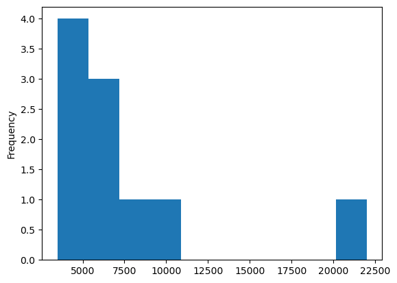
Customizing the title, legend and axis labels
When you have a matplotlib Figure or Axes object, you can customize many of the attributes by using the Axes.set() method.
For example, you can change the:
xlabel- Labels on the x-axisylim- Limits of the y-axisxticks- Style of the x-ticks- And much more
Be sure to check out the documentation for more options.
Rather than just talking about customization though, let's practice!
First, we'll create some random data and then put it into a DataFrame. Then we'll make a plot from that DataFrame and see how to customize it.
# Create random data
x = np.random.randn(10, 4)
X
Output
array([[ 1.32609318, -1.17914432, -1.22877557,  0.3207647 ],
       [-0.47354665, -0.22667084, -0.78442964,  0.19245061],
       [ 2.28860662, -1.09092006, -0.20431235,  0.48607205],
       [ 1.59194535,  0.32007245,  2.94967405, -1.30600011],
       [-1.87358324,  1.13277017,  1.42390128,  0.92874349],
       [-1.12128117, -0.64094816, -0.52728296,  0.24245977],
       [ 1.30247519, -0.29532163,  3.14183048,  0.55853199],
       [-1.66392559,  1.76755595, -0.55892306,  0.75076739],
       [-0.65860121,  0.27802076,  0.85426195,  0.01204296],
       [-0.73415989, -1.01101698,  0.84280402, -0.00881896]])
# Turn data into DataFrame with simple column names
df = pd.DataFrame(x,
columns=['a', 'b', 'c', 'd'])
Df
Now let's plot the data from the DataFrame into a bar chart.
This time we'll save the plot to a variable called ax (short for Axes).
# Create a bar plot
ax = df.plot(kind="bar")

# Check the type of the ax variable
type(ax)
Output
matplotlib.axes._subplots.AxesSubplot
Excellent!
We can see the type of our ax variable is of AxesSubplot which allows us to use all of the methods available in matplotlib for Axes.
Now let's set a few attributes of the plot with the set() method. Namely, we'll change the title, xlabel and ylabel to communicate what's being displayed.
# Recreate the ax object
ax = df.plot(kind="bar")

# Set various attributes
ax.set(title="Random Number Bar Graph from DataFrame",
       xlabel="Row number",
       ylabel="Random number");
Notice how the legend is up in the top right corner?
We can change that if we like with the loc parameter of the legend() method.
loc can be set as a string to reflect where the legend should be. By default it is set to loc="best" which means matplotlib will try to figure out the best positioning for it, but let's try changing it to "loc="upper left".
# Recreate the ax object
ax = df.plot(kind="bar")

# Set various attributes
ax.set(title="Random Number Bar Graph from DataFrame",
       xlabel="Row number",
       ylabel="Random number")

# Change the legend position
ax.legend(loc="upper left");
Customizing the colors of plots with colormaps (cmap)
Colour is one of the most important features of a plot, as it can help to separate different kinds of information.
With the right colors, plots can be fun to look at and try to learn more, and matplotlib provides many different color options through matplotlib.colormaps.
Let's see how we can change the colors of a matplotlib plot via the cmap parameter (cmap is short for colormaps).
We'll start by creating a scatter plot with the default cmap value (cmap="viridis").
# Setup the Figure and Axes
fig, ax = plt.subplots(figsize=(10, 6))

# Create a scatter plot with no cmap change (use default colormap)
scatter = ax.scatter(over_50["age"],
                     over_50["chol"],
                     c=over_50["target"],
                     cmap="viridis") # default cmap value

# Add attributes to the plot
ax.set(title="Heart Disease and Cholesterol Levels",
       xlabel="Age",
       ylabel="Cholesterol");
ax.axhline(y=over_50["chol"].mean(),
           c='b',
           linestyle='--',
           label="Average");
ax.legend(*scatter.legend_elements(),
          title="Target");
Wonderful! That plot doesn't look too bad. But what if we wanted to change the colors?
There are many different cmap parameter options available in the colormap reference.
How about we try cmap="winter"?
We can also try changing the color of the horizontal line using the color parameter and setting it to a string of the color we'd like (e.g. color="r" for red).
fig, ax = plt.subplots(figsize=(10, 6))

# Setup scatter plot with different cmap
scatter = ax.scatter(over_50["age"],
                     over_50["chol"],
                     c=over_50["target"],
                     cmap="winter") # Change cmap value

# Add attributes to the plot with different color line
ax.set(title="Heart Disease and Cholesterol Levels",
       xlabel="Age",
       ylabel="Cholesterol")
ax.axhline(y=over_50["chol"].mean(),
           color="r", # Change color of line to "r" (for red)
           linestyle='--',
           label="Average");
ax.legend(*scatter.legend_elements(),
          title="Target");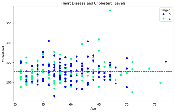
Woohoo!
The first plot looked nice, but I think I prefer the colors of this new plot much more.
For more on choosing colormaps in matplotlib, there's a sensational and in-depth tutorial in the matplotlib documentation.
Customizing the xlim & ylim
Matplotlib is also pretty good at setting the ranges of values on the x-axis and the y-axis. But as you might've guessed, you can also customize these to suit your needs.
You can change the ranges of different axis values using the xlim and ylim parameters inside of the set() method.
For example
To practice, let's recreate our double Axes plot from before with the default x-axis and y-axis values.
We'll also add in the color updates from the previous section too.
# Recreate double Axes plot from above with color updates
fig, (ax0, ax1) = plt.subplots(nrows=2,
                               ncols=1,
                               sharex=True,
                               figsize=(10, 7))

# ---------- Axis 0 ----------
scatter = ax0.scatter(over_50["age"],
                      over_50["chol"],
                      c=over_50["target"],
                      cmap="winter")
ax0.set(title="Heart Disease and Cholesterol Levels",
        ylabel="Cholesterol")

# Setup a mean line
ax0.axhline(y=over_50["chol"].mean(),
            color="r",
            linestyle="--",
            label="Average");
ax0.legend(*scatter.legend_elements(), title="Target")

# ---------- Axis 1 ----------
scatter = ax1.scatter(over_50["age"],
                      over_50["thalach"],
                      c=over_50["target"],
                      cmap="winter")
ax1.set(title="Heart Disease and Max Heart Rate Levels",
        xlabel="Age",
        ylabel="Max Heart Rate")

# Setup a mean line
ax1.axhline(y=over_50["thalach"].mean(),
            color="r",
            linestyle="--",
            label="Average");
ax1.legend(*scatter.legend_elements(),
           title="Target")

# Title the figure
fig.suptitle("Heart Disease Analysis",
             fontsize=16,
             fontweight="bold");
Now let's recreate the plot from above, but this time we'll change the axis limits.
We can do so by using Axes.set(xlim=[50, 80]) or Axes.set(ylim=[60, 220]) where the inputs to xlim and ylim are a list of integers defining a range of values.
For example
xlim=[50, 80] will set the x-axis values to start at 50 and end at 80.
# Recreate the plot from above with custom x and y axis ranges
fig, (ax0, ax1) = plt.subplots(nrows=2,
                               ncols=1,
                               sharex=True,
                               figsize=(10, 7))
scatter = ax0.scatter(over_50["age"],
                      over_50["chol"],
                      c=over_50["target"],
                      cmap='winter')
ax0.set(title="Heart Disease and Cholesterol Levels",
        ylabel="Cholesterol",
        xlim=[50, 80]) # set the x-axis ranges

# Setup a mean line
ax0.axhline(y=over_50["chol"].mean(),
            color="r",
            linestyle="--",
            label="Average");
ax0.legend(*scatter.legend_elements(), title="Target")

# Axis 1, 1 (row 1, column 1)
scatter = ax1.scatter(over_50["age"],
                      over_50["thalach"],
                      c=over_50["target"],
                      cmap='winter')
ax1.set(title="Heart Disease and Max Heart Rate Levels",
        xlabel="Age",
        ylabel="Max Heart Rate",
        ylim=[60, 220]) # change the y-axis range

# Setup a mean line
ax1.axhline(y=over_50["thalach"].mean(),
            color="r",
            linestyle="--",
            label="Average");
ax1.legend(*scatter.legend_elements(),
           title="Target")

# Title the figure
fig.suptitle("Heart Disease Analysis",
             fontsize=16,
             fontweight="bold");
Now that's a nice looking plot!
The last thing we would want is to lose that, so let’s look at how we'd save it.
Saving plots in Matlibplot
You can save matplotlib Figures with plt.savefig(fname="your_plot_file_name") where fname is the target filename you'd like to save the plot to.
We can also save our plots to several different kinds of file types, and then check these filetypes with fig.canvas.get_supported_filetypes().
# Check the supported file types
fig.canvas.get_supported_filetypes()

{'eps': 'Encapsulated Postscript',
 'jpg': 'Joint Photographic Experts Group',
 'jpeg': 'Joint Photographic Experts Group',
 'pdf': 'Portable Document Format',
 'pgf': 'PGF code for LaTeX',
 'png': 'Portable Network Graphics',
 'ps': 'Postscript',
 'raw': 'Raw RGBA bitmap',
 'rgba': 'Raw RGBA bitmap',
 'svg': 'Scalable Vector Graphics',
 'svgz': 'Scalable Vector Graphics',
 'tif': 'Tagged Image File Format',
 'tiff': 'Tagged Image File Format',
 'webp': 'WebP Image Format'}
Resetting plots
Finally, if we wanted to start making more and different Figures, we can reset our fig variable by creating another plot.
# Resets figure
fig, ax = plt.subplots()
If you're creating plots and saving them like this often, to save writing excess code, you might want to put it into a function, which follows the Matplotlib workflow.
# Potential matplotlib workflow function

def plotting_workflow(data):
    # 1. Manipulate data

    # 2. Create plot

    # 3. Plot data

    # 4. Customize plot

    # 5. Save plot

    # 6. Return plot

    return plot
It’s time to get visual!
Phew, that was a lot of info!
Don’t worry if you didn’t understand it all right away. Just be sure to test out each of the different plots and see how they work, as it’s the fastest way to get some experience and skill up, and then show off your awesome data 😉.
P.S.
We've covered a fair bit here, but really we've only scratched the surface of what's possible with matplotlib.
If you want to learn more about this tool and others that are vital to ML, then check out my complete Machine Learning and Data Science course or watch the first few videos for free.
Like I said earlier, it’s one of the most popular, highly rated Machine Learning and Data Science bootcamps online, as well as the most modern and up-to-date. Guaranteed.
You can easily go from a complete beginner with no prior experience, to getting hired as a Machine Learning Engineer, so it’s helpful for ML Engineers of all experience levels. Even total beginners or current ML professionals.
Even better? If you have any questions at all, you can ask me directly in our private Discord! There’s a great community of students and working professionals in there, who are happy to help and share their knowledge.


