Don’t you just hate it when you’re hunting through a spreadsheet trying to find key numbers, but everything blends together? Maybe you're checking which projects are overdue or trying to spot unusually high costs, but nothing jumps out.
You shouldn’t have to squint to figure out what’s going on, and the good news is, you don’t have to!
Excel has a built-in feature that can instantly flag the stuff you care about, and in this guide I’ll break down how it works, how to use it, and the 5 common mistakes to avoid.
Sidenote: If you want to take your Excel skills to the next level, check out my Complete Excel course.
You’ll learn Excel from scratch including advanced topics like data analysis & modeling, pivot tables, and VBA. You'll build your own professional spreadsheets and charts, and have the skills to get hired as a Data Analyst!
All online, and updated every year.
With that out of the way, let’s get into this 5-minute tutorial.
What is Conditional Formatting and why should you use it?
Conditional formatting is one of those Excel features that’s easy to overlook but ends up saving you more time than you expect.
It doesn’t actually change your data itself - it simply changes how your data looks, so the important parts stand out automatically.
You set it up with specific rules, and then Excel highlights the cells that match those rules. That might mean color-coding dates that have passed, flagging values over a limit, or calling out duplicates.
This means no more manual checking - Excel does it for you! Better still, these formatting rules update automatically as your data changes, so you don’t need to go back and redo them manually.
For example
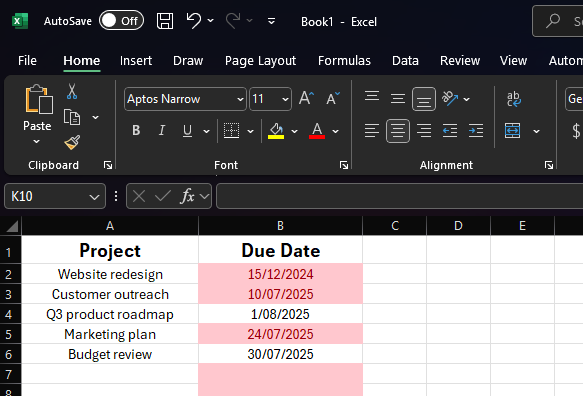
Let’s say you’re managing a spreadsheet of project deadlines, and you want anything overdue to stand out in red so you know where to focus your attention.
Well, instead of manually scanning the list each day, you can set a rule once and let Excel keep things updated as time goes on, like so:
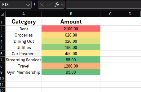
Or maybe you’re reviewing a list of monthly expenses, and you want to see at a glance which items are unusually high?
With a few clicks, you can apply a color scale that shifts from green (within range) to red (abnormally high), helping you spot outliers without reading every number.
Handy right?
It also helps with things that are easy to miss, like repeated names in a contact list, or test scores just below a pass mark.
You just need to set it up properly, so let’s break down how to use it, as well as the different options and custom rules you can use.
How to use Conditional Formatting in Excel
There are 6 main ways to use this tool, so let’s look at them one by one.
How to use the Highlight cells rules
This is one of the easiest ways to start using conditional formatting - and one of the most useful - because it lets you flag specific values in your spreadsheet so they stand out immediately.
Instead of you needing to scan for something manually, Excel does the checking for you, row by row, cell by cell.
For example
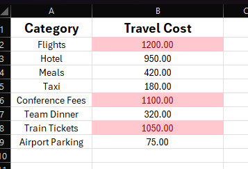
Let’s say you’re reviewing monthly expenses, your department has a spending limit of $1,000 for travel, and you want anything above that to be clearly marked so nothing slips through.
Instead of scrolling through the column trying to catch the high numbers, you can set up a conditional formatting rule that highlights anything over 1000 in red. Now, those outliers jump out the second you open the sheet.
Here’s how to set it up:
Start off by selecting the range of cells you want to format. Then, go to the Home tab, click Conditional Formatting, and hover over Highlight Cells Rules to open the drop down menu.
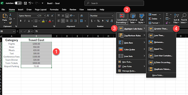
You can then choose a rule type like ‘Greater Than’, ‘Less Than’, or ‘Text that Contains’, and enter the value or text you want Excel to check for.
In our example, we’re going to look for expenses greater than $1,000, so we’ll specify that after we click. We’ll also pick a formatting style to help this stand out. (Here I’ve selected a light red fill with dark red text, as we’re looking for costly, urgent outliers).
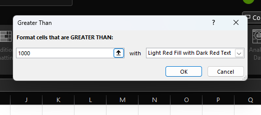
Then click ok, and that’s it. Excel applies the rule instantly and keeps it updated, so if someone changes a number, the formatting adjusts without you lifting a finger.
How to use Top and Bottom rules
This method is one of the easiest ways to spot your top performers, under-performers, or generally any value that stands out from the rest. Excel scans your range and highlights the highest or lowest entries based on the number or percentage you choose.
For example
Let’s say you’ve got a list of sales totals for your team, but instead of setting a specific threshold like “anyone who has made sales above $5,000,” you just want to see who’s in the top three. Perhaps these are the people you’ll recognize in your next team meeting!
Here’s how to set it up:
Just like before, you need to select your data, so in this instance we would select the column that contains our hypothetical sales totals.
Then, again just like before, we go to the Home tab and click Conditional Formatting. However, this time we’ve going to hover over Top/Bottom Rules and choose ‘Top 10 items’ from the menu:
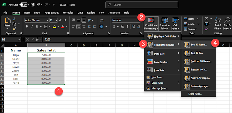
However, because we only want the top 3 best performers (for this example), we’re going to change the number in the box that pops up from 10 outliers to the top 3.
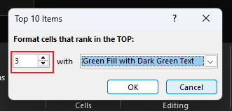
Next up, we need to choose a formatting style. Because we’re highlighting positive values in this case, something like green fill with bold text works well. And with that selection made, we’re ready to click ok.
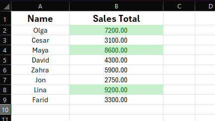
And just like that, Excel will now highlight the top three values in the column. And if someone’s sales total changes later to put them in the top 3, (maybe they closed a new deal!), the formatting will update automatically.
The bottom line is, the current top three will always be highlighted, even as the numbers shift around because different people pull ahead in sales.
How to use Color scales
Color scales are one of the fastest ways to turn a plain column of numbers into something visually appealing - and meaningful. With color scales, instead of just highlighting certain values, Excel uses a gradient of colors to show how each number compares to the rest.
It’s like turning your data into a heatmap without building one from scratch. And you don’t even need to define any rules or thresholds; Excel handles the logic behind the scenes. All you do is choose the color pattern you want, and the range of cells to apply it to.
This is especially helpful when the relative size of the number matters more than the number itself. Maybe you’re reviewing budget figures and want to see which departments are spending the most. Or you’re looking at test scores and want a quick sense of who’s doing well, who’s in the middle, and who might need extra help.
For example
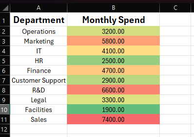
Let’s say you’re managing monthly spending across ten departments.
With a color scale applied, the cells with the highest spending might turn dark green, mid-range ones a soft yellow, and the lowest ones light red. Without even reading the numbers, you can instantly see how each department compares to the rest.
This works best when you’re trying to spot trends rather than exceptions. It gives you a quick way to scan a list and pick up patterns, especially in larger spreadsheets.
Here’s how to try it:
Just like before, select the range of cells you want to visualize and then go to the Home tab and click Conditional Formatting.
This time though, you’re going to select Color Scales from the dropdown.

Next, you need to pick a color gradient to help you identify the outliers.
In this example I’ve gone with red-yellow-green, (where red means high and green means low). Now, Excel will apply the gradient automatically based on your selection.
How to use Data bars
Data bars are a great way to turn numbers into quick, visual comparisons. They work like little bar charts inside your cells, filling up more or less based on the value. The higher the number, the longer the bar; the lower the number, the shorter it is.
This feature is really helpful when you want to get an intuitive sense of proportionality or progress about your dataset, without needing to juggle all the individual values in your head.
For example
Let’s say you’re tracking progress across several projects in a spreadsheet - using a column of values showing the percent of each project that has been completed - and you want a way to see which ones are nearly done and which ones have barely started.
By adding data bars, you can see this instantly, because a project at 90% will have a nearly full bar, while one at 10% will just show a small sliver. It’s a clean, visual way to compare progress side by side.
Here’s how to try it:
Just like before, select the range of cells you want to visualize and then go to the Home tab and click Conditional Formatting.
This time though, you’re going to select the Data Bars option from the dropdown.
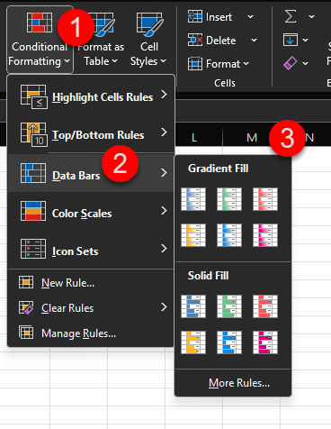
Then simply pick a style from the gradient or solid fill options, and Excel will fill each cell with a horizontal bar that matches the value.
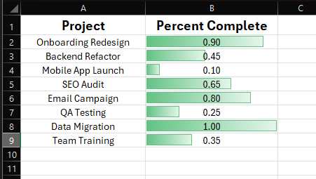
By default, Excel scales the bars relative to the highest and lowest values in the range, so they’re always easy to compare. And as with all conditional formatting, the bars update automatically whenever the data changes.
How to use Icon sets
Icon sets add small visual symbols to your cells - such as arrows, traffic lights, or check marks - to help you quickly interpret the values in those cells without needing to read every number.
This is especially useful when you want quick visual insights into the status of your data - like showing if some metric or KPI is improving, falling behind, or staying steady. You’re still keeping the original numbers in place, but the icons add context at a glance.
For example
Let’s say you’re tracking performance across different teams. Maybe you have a score for each one, and you want a quick way to show whether their results are considered high, medium, or low.
Instead of manually color-coding or labeling them, you can apply an icon set that does it for you, such as green check marks for strong scores, yellow dashes for average, and red crosses for low ones.
Here’s how to try it:
Just like before, select the range of cells you want to visualize and then go to the Home tab and click Conditional Formatting.
This time though, you’ll select Icon Sets from the dropdown.
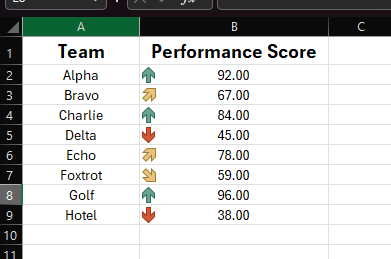
Then, pick a style such as arrows, flags, traffic lights, or shapes, and Excel will automatically assign the icons based on how the values rank within the range.
Each icon set follows its own built-in logic. For example, with the three-arrow set, green usually represents the top third, yellow the middle, and red the bottom. You can customize those rules later if needed, but the default behavior usually works well out of the box.
Icon sets are a great choice when you want to lend your data a dashboard-like feel, or when you want to scan a table and instantly spot what's going well and what needs attention.
How to create and use custom rules
We’ve seen a lot of great pre-built conditional formatting options so far, but sometimes you just want to customize.
And the good news, is you can!
For example
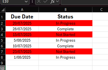
Let’s say you’ve got a list of tasks in Excel, with a due date in one column and a status in another, and you want to highlight any task that’s both overdue AND not marked as complete.
You’ve already seen how Excel’s built-in formatting rules can flag values based on logical conditions applied to those values. But in this case, you need Excel to check two conditions at once, across two different columns.
And that’s where custom rules come in.
Custom rules let you write your own logic using a formula. But unlike traditional formulas that return a value, these formulas’ job is to tell Excel exactly when to apply our specified formatting.
Here’s how to do it:
Make sure to highlight both data columns. Then go to the Home tab and once again click Conditional Formatting. This time though, you’re going to select Custom Rules from the dropdown.

Then you’ll select ‘Use a formula’ to logically specify which cells to format, along with how you want them formatted.
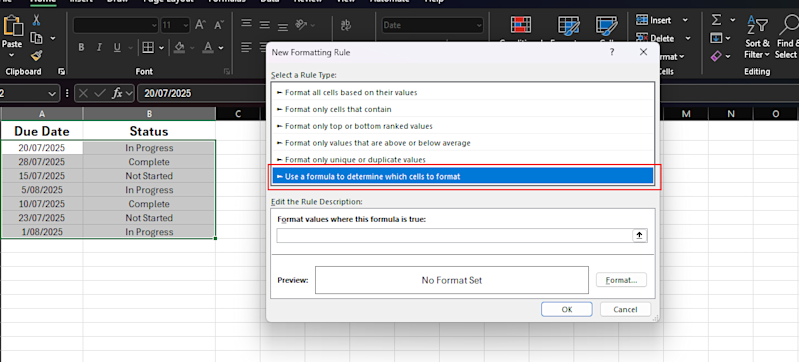
In our example, we’re going to write a formula that says:
“If the due date (A2) is earlier than today, and the status (B2) is anything other than 'Complete', go ahead and apply the formatting”.
Obviously we can’t just write that as is. We need to write it as a formula, so that would look something like this: =AND($A2<TODAY(), $B2<>"Complete")
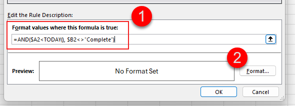
At this point, the rule is now added. However, there’s no formatting selected to tell Excel what to do when it finds data that meets this criteria.
So go ahead and click on Format, then choose your style (like red fill), and hit OK.
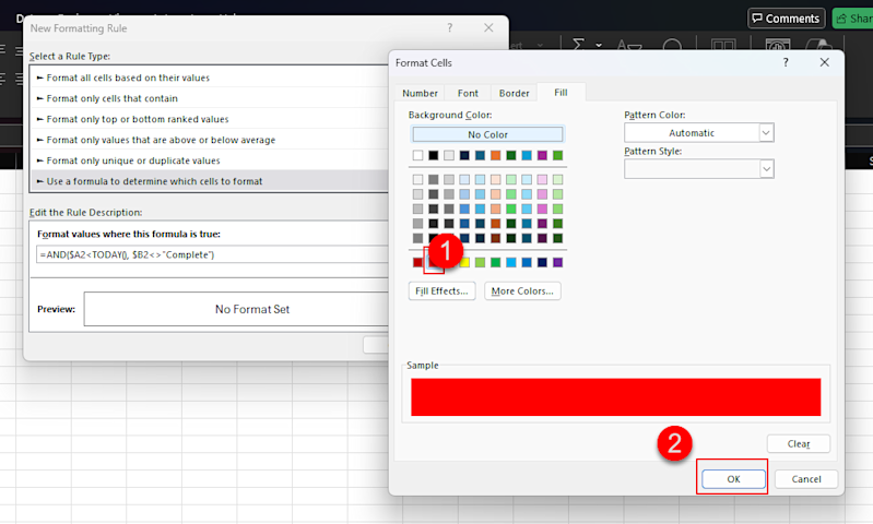
Then you’ll see the ‘no format set’ changed to red instead, after which you can simply hit ok to apply the new custom rule to your sheet.
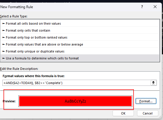
Now, as tasks get completed - or dates change - Excel updates the highlights automatically.
How to avoid common mistakes when using Conditional Formatting
Conditional formatting is easy to set up, but it’s just as easy to get unexpected results if something small goes wrong.
Here are the most common mistakes to watch out for, along with how to avoid them.
Mistake #1: Applying the rule to the wrong range
A super easy mistake to make: it's simply choosing the wrong data!
For example
Let’s say you write a custom formula to highlight tasks based on their due dates and statuses.
You want the rule to check column A and column B, but you accidentally apply the rule to only column A. And so now Excel is trying to evaluate the rule using only part of the data it needs. Best case, nothing happens. Worst case, the formatting shows up in the wrong rows.
The solution
Before you apply any conditional formatting (especially custom rules), take a second to ask: Which cells should this formatting apply to? That range should match the structure of the formula you’re using. For example, if your data starts on row 2, your formula should too.
And if your formula references data across multiple columns, you’ll usually want to apply the rule to entire rows, not just a single column.
Everyone's guilty of this one at some point!
Mistake #2: Using relative vs absolute references incorrectly
If you’re using a custom formula, Excel will adjust the cell references as it applies the rule across your selected range. That’s usually what you want, but not always.
This mistake happens when you assume Excel will evaluate your formula exactly as written, but Excel instead sees your reference as relative. So instead of checking the cell you intended, it shifts the formula for each row or column and ends up highlighting the wrong thing.
For example
Let’s say you want to highlight rows where the value in column B is over 100, and your formula is =B2>100 . That will work fine if your rule is applied to a vertical range, one row at a time. But if you apply the rule across multiple columns, Excel will shift the column reference too, and suddenly it's checking C2, D2, or beyond.
The solution
To fix that, you lock the column with a dollar sign: =$B2>100 . Now Excel will always check column B, even as it moves across columns.
Mistake #3: Overlapping rules that conflict with each other
Excel lets you apply more than one conditional formatting rule to the same cells. However, when the logic of those rules overlaps, things can get messy fast.
For example
Let’s say you have one rule that highlights overdue tasks in red, and another rule that highlights all “High Priority” tasks in yellow. If a task is both overdue and high priority, Excel has to decide which rule wins. And unless you’ve told it otherwise, the most recently created rule usually takes priority.
The result? You think the rule isn’t working, when in reality it’s just being overwritten.
The solution
To fix this, open the Manage Rules panel from the Conditional Formatting dropdown.
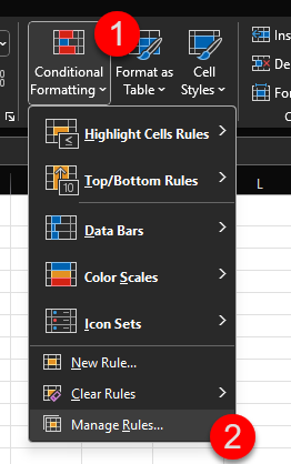
From there, you can see every rule in your sheet, what range it applies to, and which ones have higher precedence. You can then either:
Change the order of those rules to adjust the priority
Adjust ranges so they don’t overlap
Or use the ‘Stop If True’ option to tell Excel not to keep applying rules once one condition has been met
The key is to know when your rules are meant to layer, and when they’re meant to override - and to set them up accordingly.
Mistake #4: Forgetting to check how rules behave on new data
One of the easiest mistakes to make is assuming your rule will keep working as your data grows. The issue is that Excel only applies conditional formatting to the exact range you selected. So if you add new rows outside that range, the rule doesn’t apply to them unless you update it.
For example
Maybe you apply a rule to A2:A20 in a list of tasks. It works fine at first. But when you add row 21, that new task won’t get the same formatting, even if it meets the same condition.
The solution
To avoid this, make sure the range you apply the rule to includes enough room for future entries. You can extend it manually to something like A2:A1000 , or better yet, format the column as part of an Excel table. Tables expand automatically as new data is added, and the rules go with them.
Once your rule is in place, always test it by adding a new row to test whether the formatting behaves the way you expect. If it doesn’t, it usually means the range you specified was too small.
Mistake #5: Writing a formula that technically works, but gives the wrong result
Sometimes you write a formula that doesn’t show an error, but the formatting still doesn’t behave the way you expected. That’s often not a typo, but rather because Excel is evaluating the formula in a different way than you think.
For example
Let’s imagine that you have a list of support tickets, and you want to highlight the rows where the priority column says “Urgent.” So, you write a formula like =C2="Urgent" and apply it to rows 2 through 100.
But when you do that, some of the wrong rows get highlighted, or none at all. The formula looks fine, so what’s going on?
The issue is that Excel applies your formula relative to the top-left cell in your selected range. So if you apply the rule to full rows of data, (like A2:F100 for example), then Excel treats the formula as if it starts in cell A2. But your formula is checking C2, so it’s offset by two columns.
This means that as Excel moves row by row, it’s now checking the wrong cells.
The solution
To prevent this issue, always write the formula from the perspective of the top-left cell in your selection, locking down the column reference with a dollar sign just like we did to resolve Mistake #2.
So if your formatting starts in row 2 and column A, and you want to check values in column C, your formula should be =$C2="Urgent" and the rule should apply to the full row range.
This is one of the easiest mistakes to miss, especially when you’re using formulas to define custom rules. The main thing to remember is that if your rule behaves strangely, you should double-check that your formula lines up with the cell Excel is actually starting from.
Time to highlight what matters!
Conditional formatting might seem like a small feature relative to the massive application that is Microsoft Excel, but it can really change the way you work once you learn to leverage it. When you no longer need to carefully examine your data row by row just to glean some quick insights, it’s actually a pretty big deal!
Whether you’re flagging overdue tasks, catching outliers, or making patterns easier to see, conditional formatting helps you focus on decisions instead of hunting through your data. And now that you know how to use it and what mistakes to avoid, you’ll start noticing new ways to apply it every time you open a spreadsheet.
The mechanics of conditional formatting are fairly straightforward (as you’ve already seen), so try giving it a go today. Open one of your own files, set up a rule, and let Excel highlight what matters most!
P.S.
Remember, if you want to take your Excel skills to the next level, and even open up new career options, then check out my Complete Excel course.
You’ll learn Excel from scratch including advanced topics like data analysis & modeling, pivot tables, and VBA. You'll build your own professional spreadsheets and charts, and have the skills to get hired as a Data Analyst!
Plus, once you join, you'll have the opportunity to from me, other students, and working Data professionals.
Best articles. Best resources. Only for ZTM subscribers.
If you enjoyed this post and want to get more like it in the future, subscribe below. By joining the ZTM community of over 100,000 developers you’ll receive Web Developer Monthly (the fastest growing monthly newsletter for developers) and other exclusive ZTM posts, opportunities and offers.
No spam ever, unsubscribe anytime
More Excel Tutorials
Like this post? Then you'll love my other Excel guides and tutorials:
