


If you’ve ever used the Excel Data Model to analyze multiple different datasets in a single Pivot Table, you know that it affords us some tremendous advantages relative to traditional methods for creating Pivot Table reports.
But the Data Model is really only half the story.
Excel's upgraded business intelligence capabilities also includes an entirely new programming language called DAX, and this language gives us more power for performing calculations in the both Data Model and Power Pivot Tables - than we would have ever dreamed of before.
More specifically, DAX is a formula language expressly designed to work with the Data Model. That means it can work to understand tabular data sets with relationships between them.
Now, before you think I'm going off the deep end by introducing an entire programming language at the beginning of a blog post, let me reassure you. DAX is actually very similar to standard Excel formulas and functions, just with a Data Modeling twist, so to speak.
You'll actually find that many Excel functions you know will work in DAX pretty much unchanged. However, there are also many DAX-specific functions that only work in DAX, but more on that another time.
So there are two main ways to use DAX:
- One is to add new, derived columns to the tables in our Data Model
- The other is to create something called Measures
But what are measures and what do they do?
Well, let's dive into it.
Measures explained

The simple answer is that measures are formulas that you add to a Pivot Table, but with a lot more unique features than standard formulas.
What like?
Well, for one thing, measures are portable which means that you can define a measure in one place and then use it in multiple different Pivot Tables.
Handy right, but it gets better, because measures are incredibly powerful.
For example
Instead of the 'count', 'sum', or 'average' calculations that come “standard” in Pivot Tables, measures let you leverage this, as well as the power of the DAX formula language to add sophisticated, reusable calculations to the Values area of a Pivot.
This means that you can perform calculations that can go way beyond simple arithmetic.

How to create a measure in the Excel Data Model
So now that we know what measures are, let's walk through the process of actually creating one in the Excel Data Model.
To do this, we're going to need data to apply them to, so for this example, I’ll be using a dataset containing information around a fictional company’s call center.
(You can check out the dataset here to follow along during the article).
We'll be looking at things like call duration, wait time, and so on.
I’ve already fetched this data into the Data Model of my example Excel file using Power Query, and it looks like this:

So to create our first measure, I'll go to our “Power Pivot” tab on the Excel Ribbon, and then hit the “Measures” button:

This gives us two options:
- New Measure, and
- Manage Measures
Because this is our first measure, I’ll go with 'New Measure' option:

A new popup will appear, asking us to fill out specific information about our new measure, so let's walk through it.
The first thing we're prompted to input is a table name.

Every measure needs to be assigned to a specific table in the Excel Data Model, but the choice of that assignment is entirely up to you. However, I recommend that you assign the measure to whatever table contains the field that is being aggregated as part of the measure.
In this case, our measure is going to be the average of the “CallDuration” field from the “Service Calls” table in the Data Model.
Because we're averaging a field from that table (and because, incidentally, that is the only table in our Data Model currently!), I'll leave that table selected in the first dropdown list.
Next, we're prompted to give the measure a name, which should be meaningful, descriptive, and brief. I'll go with “Average Call Duration”:

You also have the option to enter a description for the measure, but for this simple measure I'll skip that step.
Writing the measures formula
And that finally brings us to the most important part, which is actually writing the formula.
You'll probably find this process quite similar to working with “normal” Excel formulas. We get all the goodies that come standard with writing formulas in Excel, from assistance with formula syntax to autocomplete for the fields we're referencing.
One thing that’s important to keep in mind, is that you must apply some sort of aggregation to any column from the Data Model that you reference in a measure.
Formulas are specifically designed to go into the Values area of a Pivot Table, which is of course where we traditionally did the counting, summing, or averaging of fields from our datasets. But with measures, we don't define the aggregation in the Pivot Table. Instead, we define everything from the name, formatting, and formula/business logic up front.
Now looping back to our current example, we should pretty clearly use an AVERAGE function to aggregate call duration.
So I'll start typing the name of that function, like so:

As you can, Excel suggests the very function that we're looking for!
It’s already highlighted too, so I can just hit the Tab key to select it.
And since the AVERAGE function - as applied to the Data Model - takes a single column as its argument, the measure window is smart enough to simply list all the columns from the one table in our Data Model:

We're interested in taking the average of the “CallDuration” field, so I'll arrow down to select that one and hit Tab to lock it in, then finally close the parentheses:

But before we click OK and officially add this measure to the Data Model, I'll first hit this “Check Formula” button to make sure there won't be any errors with our calculation.

After I click that, Excel confirms that there are no errors in our formula, so we should be good to go.

Now, as a final step, I can also add formatting to our measure, so that whenever I drop this calculation into whatever Pivot Table, the formatting I specify here will be retained.
That means you don't have to worry about formatting the measure wherever you choose to put it, which is pretty awesome.
Since “Average Call Duration” is going to be an average of numbers, I'll choose a decimal format, and elect to have one digit after the decimal place:

And at this point, I think we’re finally ready to officially create our measure by clicking OK.

So now that the measure exists, where is it, exactly?
First you need to switch over to the Data Model by hitting the “Manage” button on the “Power Pivot” tab of the Ribbon:

Looking at the Service Calls table - where I assigned the measure - you'll see that the “Average Call Duration” measure is listed in a cell below the very first column.
How to use our new measure
Now the obvious next step is to actually use our shiny new measure by adding it to a Pivot Table. But before we do that, I'll create a Pivot Table that summarizes average call duration “the old fashioned way”, just so we can see the results side by side, and show that it works.
So I'll close out of the Data Model, and then insert a Pivot Table to the worksheet, with the “EmployeeName” field - which lists the employees who took the individual customer calls - on Rows:

Then for the Values area, I'll drag in the “CallDuration” field and summarize that as an average, giving us a breakout of call duration by employee.

So now that we've crunched out average call duration the traditional way, let's throw our new measure into the Pivot Table and see how it compares.
Looking under the Service Calls table in the Pivot Table Field List, we see the name of our measure, preceded by this little “fx” symbol.

Because I assigned the “Average Call Duration” measure to the Service Calls table, it is listed as just another field available to us in that table.
(The “fx” symbol simply lets us know that this is a measure, and not a conventional field.)
So now we can grab that measure and drag it right into the Values area of our Pivot Table, just like we would any other field from a table.
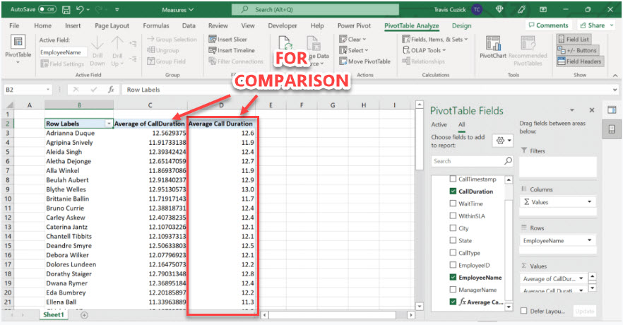
As you can see, we get the same results that we did with the raw “CallDuration” field, except rounded to a single decimal place - as per our settings that we decided on when we created the measure.
How easy was that?
The best part is that we did this without having to go to the additional trouble of specifying how the field should be summarized, or how it should be formatted, because we defined all of that stuff up front in the measure. We simply dragged it into the Pivot Table, and everything just worked!
Sidenote: It's worth noting that our existing calculation in the Pivot Table is technically also a measure, but it's what's known as an 'implicit' measure.
Basically, this means that whenever you summarize anything in the values area of a Pivot Table, you are, strictly speaking, creating a measure.
However, with an implicit measure, you:
- Don't have access to all the power of the DAX formula language
- You can't predefine the formatting of the measure
- You can't add it to multiple different Pivot Tables
For this reason, I highly recommend defining measures for any calculation that you do in your Pivot Tables. There's really just no downside.
You never know when you might want to add the same measure to a different Pivot Table, and having your calculations defined in one place doesn't just save time, but also enforces consistency and data integrity when creating multiple Pivot Tables.

For example
Just to underline the portability of measures, I'll create a whole new Pivot Table on this worksheet, and then add our new measure to it.
For this Pivot, I'll put the “CallType” field, which classifies customer calls into different categories, on Rows:

Then in the Values area, I'll add our new measure from the Service Calls table:

Boom!
In just a few seconds, I was able to create an entirely new Pivot Table with the exact same “Average Call Duration” logic and formatting, but broken out in an entirely different way. Again, highlighting just how powerful the portability of measures can be.
Added bonus: Cascading updates
Another advantage of measures, is that if we decide to change a measure in any way, that change will cascade down to any Pivot Table that we have already added that measure to, automatically.
For example
Let's say that we decided to change the formatting of our measure. We would simply need to do that in one place, as opposed to potentially needing to update multiple different Pivot Tables.
This allows us to follow one of the biggest commandments of programming and development, otherwise known as the DRY principle.
If you don't know it already, DRY stands for “Don't Repeat Yourself”, and the point is to make sure you're being the most efficient you can be. (You normally don't associate programming methodologies and paradigms with a spreadsheet, but that's how much power DAX and measures give us.)
Just to demo this cascading update, I’ll try editing our measure to display two numbers after the decimal place instead of one.
So we head back to the Power Pivot tab of the Ribbon, and I'll click the “Measures” button again. But this time, instead of selecting “New Measure”, I'll go with “Manage Measures”.

This brings up the “Manage Measures” dialog box:

We've only created one measure so far, so I'll select that and hit “Edit”:

And now under “Formatting Options” in the same “Measure” dialog box we saw before, I'll change the decimal places from “1” to “2”, and then click OK.

As you can see, the measure-generated values in both Pivot Tables have now updated automatically to 2 decimal places!

Add some measures to your own data!
Hopefully this guide has opened your eyes to just how powerful measures can be, and how easy they are to implement.
Remember that there is an absolutely enormous variety of DAX functions you can use in your measure calculations, and we just barely scratched the surface here.
If you want to learn more about this, and start adding to your Data Analysis skills, check out my Business Intelligence with Excel course, or watch the first few videos for free here.
It's the only course you need to launch your career as a Data Professional, or update your current skills. You'll learn to master Excel's built-in power tools, including Power Query, Power Pivot Tables, Data Modeling, the DAX formula language, and so much more, as well as have direct access to me and other BI analysts, via our private Discord server.
Ask questions, get answers, skill up, get hired or promoted. Easy!
More Excel Tutorials
Like this post? Then you'll love my other Excel guides and tutorials:


