Have you ever spaced things out perfectly in CSS, only to have it look completely off in the browser?
It usually comes down to how you’re using margin and padding and how they sometimes behave. But once you see how they actually work, everything clicks into place.
So in this guide, I’ll walk you through how margin and padding work, when to use each one, and how to fix the most common spacing mistakes when using these tools.
Sidenote: Want to take your web design to the next level? Check out my complete CSS course:
Learn everything from CSS basics to advanced CSS techniques by completing 100+ exercises and projects.
This will then teach you how to use CSS to create beautiful, responsive websites that wow users and employers. Become a CSS Pro and never create an ugly website again.
With that out of the way, let’s get into this 5-minute tutorial…
What are margins and padding, and how do they work?
When you’re trying to space things out in CSS, it’s not always clear what’s actually being spaced. Sometimes the content moves. Sometimes the whole element shifts. Other times, nothing happens at all.
This is because browsers treat every element on a web page like it’s a box.
And I mean everything - buttons, text, images, etc.
It does this so that it can apply restraints and dimensions to each of those elements - helping to create its size and spacing, and that’s where padding and margin come in.
Padding adds space inside the box, between the edge of the box and whatever is inside it. While margin adds space outside the box, between that element and the next thing on the page.
For example
Let’s imagine that you’re building a basic “card” component for a page on your website. Maybe something like a product listing or a blog article preview. It has a border, a headline, a bit of text, and maybe a button at the bottom.
Here’s what that might look like in HTML:
<div class="card">
    <h2>Card title</h2>
    <p>This is a short description inside the card.</p>
    <button>Read more</button>
</div>
And here's what it would look like on the website:
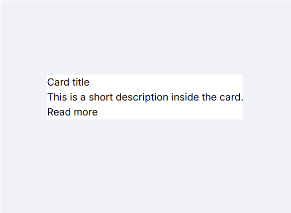
Super simple right?
But now let’s say you want to do two things:
You want to make the content inside the card feel less cramped
And you want to add some space between this card and any other cards nearby
For the first part and making the inside more readable, you’d use padding .
So let’s give it 20px of breathing room on all sides:
.card {
    padding: 20px;
    border: 1px solid #ccc;
}
Now the text and button won’t touch the edges of the card and it all feels cleaner and easier to read.
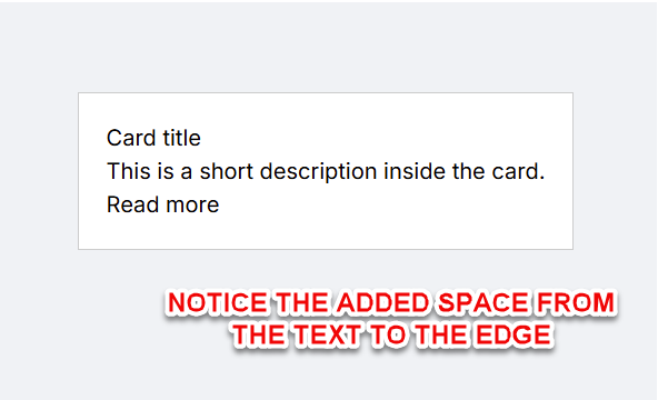
However, what if we’ve got multiple cards and they’re sitting too close together?
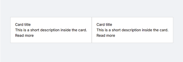
Well, now you would use margin to space them apart:
.card {
    padding: 20px;
    border: 1px solid #ccc;
    margin-right: 20px;
}
This pushes the entire card away from whatever comes above, below or to the side of it.

Easy enough so far right?
Of course, from there, I would probably add a bit more styling to make it look more modern as you can see below.
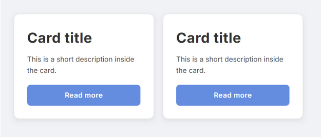
You can learn about how I’d make something like this within my CSS bootcamp.
But back to the topic:
Why is it that when we use these two tools, the browser version doesn’t always look like it should?
Well, let’s break it down…
Common mistakes and issues with using margins and padding
The major issues often come down to 2 things. Either how CSS handles margins and padding, or simply user error.
Here are the 6 most common issues and how to fix them.
Issue #1: “I added margin, but nothing moved”
You’ve added margin-top: 20px to a heading or a paragraph and nothing seems to happen. Or maybe you added margin-bottom to one element, and margin-top to the next, but you’re not getting double the space like you expected.
What’s going on?
This is one of the first confusing moments in CSS layout and it’s called margin collapse and occurs because CSS is trying to keep layouts from ballooning with stacked vertical margins.
Basically, when two vertical margins from block-level elements meet, the browser often combines them into one. Even worse, it doesn’t stack them, but instead it just takes the larger of the two and uses that as the total space between the elements.
For example
Let’s say that in your design, your <h1> has margin-bottom: 20px and your <p> has margin-top: 30px .
However, there's an issue in that your browser won’t create 50px of space as you would assume. It’ll just give you 30px because the smaller margin gets collapsed into the larger one.
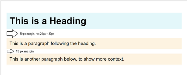
So here’s how to fix it:
The easiest option is to simply add the margin to one element at the correct full distance. Or, you can add padding or a border to the parent container. This usually prevents the margins from collapsing into it.
Or you can add overflow: hidden; or another overflow value (like auto ) to the parent. That forces the element to establish its own layout context, which stops margin collapse
Simple enough once you know what’s happening.
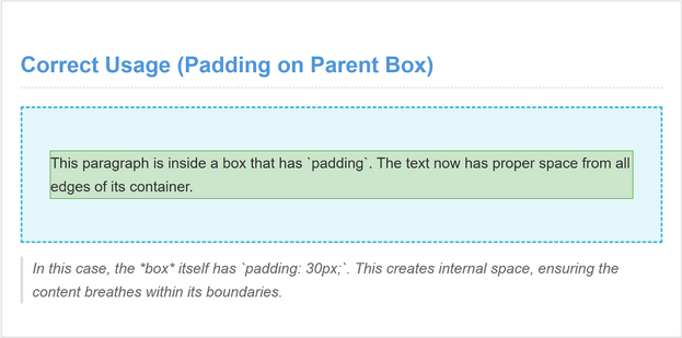
Issue #2: “My content is still touching the edge of the box”
Almost everyone makes this mistake at some point, and it's simply using margin when you meant to use padding .
For example
You’ve got a <div> , maybe with a background color or border, and inside it there’s some text or a heading. You try to space things out, so you add margin , but the text still hugs the edge of the box.
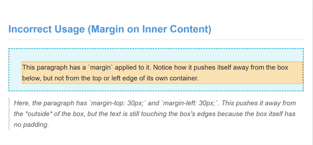
Remember, margin controls space outside the element, so if you add margin to a <p> tag, you’re pushing it away from other elements on the page but not away from the edge of its own container. So if the parent <div> doesn’t have padding, the content inside it will still sit right up against the edge, no matter how much margin you add.
To fix it, the space needs to come from padding on the .box itself:
.box {
    background: #f0f0f0;
    padding: 20px;
}
Now the background color will wrap around the text, and the text has room to breathe.
Issue #3: “My background color doesn’t cover the whole element”
Have you ever had a situation when you’ve added a background color to a section such as a card, or a button but somehow, the color doesn’t fill all the space around the content? Maybe there’s extra space above or below the element that stays white, even though you expected it to be colored.
The reason for this is because you’re using margin , but expecting padding behavior.
The thing to understand is that background colors only fill the actual box of the element and NOT the margin around it. So if you’ve added margin to space things out, that space will be visually empty. The background won’t stretch into the margin, because the margin is
For example
Let’s say you have this:
<div class="card">
    <p>Content goes here.</p>
</div>
.card {
background-color: #ffe9b3;
margin: 20px;
}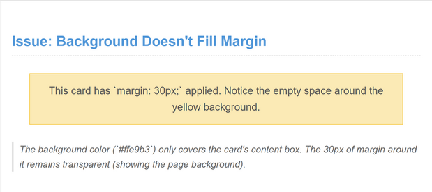
The card gets spaced 20px away from other elements, but the yellow background only fills the content area and not the margin, so the outer spacing will still be whatever the page’s background is. (Which is white in this example).
So if you want the background to feel complete and wrap around the content nicely, you need to use padding instead. Now the content will have breathing room
Issue #4: “I’m using padding, but it’s making my element too big”
This one throws people off because the element looks fine in the design, but once you add padding, it suddenly pushes past its container or overflows in unexpected ways.
This is because by default, padding adds to the size of the element.
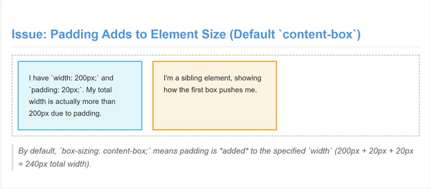
That means if you set a width of 300px and then add 20px of padding on each side, the total width becomes 340px because it now has 20px extra padding on each side. And that extra 40 pixels can break layouts, especially in columns, flexboxes, or side-by-side components.
This is especially noticeable when your layout has a fixed width or limited space, like in a grid or side panel, because the card either overflows, shrinks its siblings, or causes scrollbars to appear.
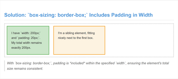
The fix is to use box-sizing: border-box; like so:
.card {
    width: 300px;
    padding: 20px;
    background: #f0f0f0;
    box-sizing: border-box;
}
Handy right?
box-sizing: border-box; gives you predictable, layout-friendly behavior and you don’t have to do mental math every time you add spacing. It’s such a useful fix that many developers apply it globally at the start of every project:
* {
    box-sizing: border-box;
}Issue #5: “I can’t figure out what’s causing the weird gap”
Both margin and padding can come from a surprising number of places such as default browser styles, inherited styles from a framework, or even auto-generated spacing from flex or grid behavior. And when you're styling something like a <ul>, <h1>, or <section>, the browser often applies default margins that you didn’t write yourself.
With all these possibilities, how do you find whats causing the issue?
Well, the quickest way to figure out what’s happening is to inspect the element in your browser. Right-click on it, choose Inspect, and look at the box model diagram in the Styles panel.
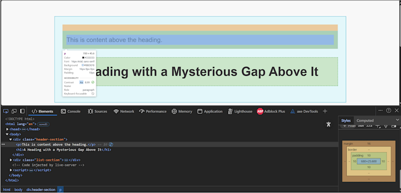
There, you’ll see:
Padding (usually light green or yellow)
Border
Margin (often shown in orange)
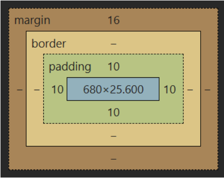
That little diagram is pure gold because it shows you exactly what space is being applied, how much, and from where.
For example
If there's a random gap above your heading, and you see that the browser added a margin-top: 1em to the <h1>, then mystery solved.
From there, you can either reset or override it directly like so:
h1 {
    margin-top: 0;
}
Or, if you want to wipe all default styles and start clean, you can use a CSS reset or a normalize.css file but that's a bigger topic for later.
TL;DR
The key idea here is to make sure you’re not just guessing and then altering the wrong thing, so use the inspection tool.
Because once you know whether the space is coming from margin, padding, or something else entirely, fixing it becomes much easier and you don’t run the risk of adjusting the wrong thing.
Issue #6: “I used the right spacing but it looks wrong on smaller screens”
This one comes up all the time.
So you’re using margin and padding exactly the way you should, and the layout looks perfect on your laptop… but then you check it on your phone, and everything feels tight, squished, or awkwardly spaced. Buttons stretch too far, text boxes are too wide, or sections feel cramped.
What’s happening?
Well it usually comes down to people using fixed units like px in places where flexible units would work better.
For example
Let’s say that you use something like padding: 40px; , so that it always adds exactly 40 pixels of space.
The problem is it will always add 40 pixels of space - regardless of the screen size. And on a smaller screen, 40px might eat up half the width of the container, like so:
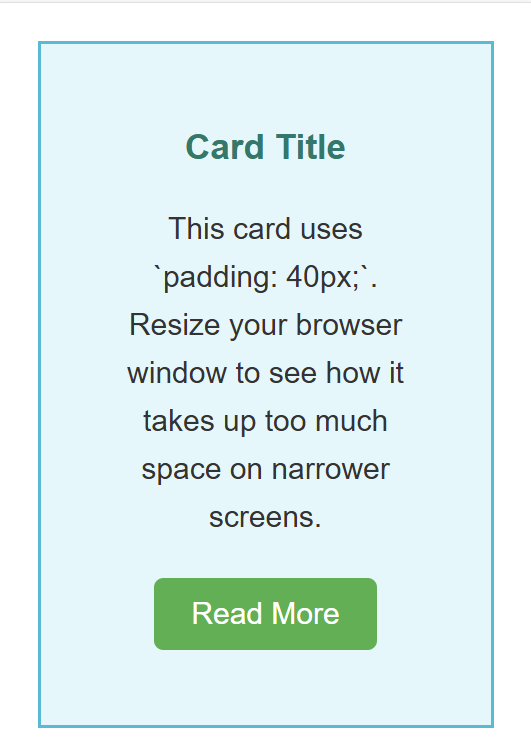
Multiply that across multiple elements, and your layout starts to feel bloated and unbalanced.
The solution is to not use fixed pixels everywhere, but to use relative units that scale. em and rem scale with text size so these are great for padding inside buttons, cards, and inputs, while % works well when you want spacing to respond to container size.
You can also use clamp() , as this lets you define flexible values that grow or shrink between a minimum and maximum. Or you can also use media queries to manually adjust spacing on different screen sizes.
For example
Here’s an example using clamp() for padding:
.card {
    padding: clamp(0.5rem, 2vw, 2rem);
}
This means:
Never go smaller than 0.5rem
Prefer scaling based on 2vw (2% of the viewport width)
Never go larger than 2rem
This gives you padding that feels right at every screen size, but without needing multiple breakpoints.
TL;DR
Even when you’ve picked the right spacing technique, the units you choose matter just as much. A layout that feels great on desktop should still feel balanced on mobile, and flexible units help you get there.
Time to play around with your own spacing!
So as you can see, although margin and padding might seem like small details, they shape how your entire layout feels. The trick is in understanding what causes the common issues so you can solve them.
And the best way to learn is to have a play around. Break things then fix them, so you can see how they work. Add some padding to a card. Try changing the margin between two sections. Inspect what’s happening in the browser. The more you play with it, the more natural it’ll feel!
P.S.
Remember, if you want to learn more about CSS, then check out my complete CSS bootcamp:
You’ll learn everything from CSS basics to advanced CSS techniques by completing 100+ exercises and projects, as well as how to create beautiful, responsive websites that wow users and employers.
Even better?
Once you join, you’ll get access to our private Discord community, where you can ask questions and get answers from me, other students, and other working tech professionals.
Best articles. Best resources. Only for ZTM subscribers.
If you enjoyed this post and want to get more like it in the future, subscribe below. By joining the ZTM community of over 100,000 developers you’ll receive Web Developer Monthly (the fastest growing monthly newsletter for developers) and other exclusive ZTM posts, opportunities and offers.
No spam ever, unsubscribe anytime
