


One of the easiest ways to build responsive, mobile-first CSS projects on the web is to use the Flexbox features inside of Bootstrap.

Introduced in Bootstrap 4 and fully optimized in Bootstrap 5, Flexbox (Flexible Box Layout) is a one-dimensional layout model in CSS that allows developers to design complex, flexible layouts with ease. Since Bootstrap 5, most of the framework is built with Flexbox, making it even more powerful for responsive design.
Flexbox is incredibly handy, in that it provides a more efficient way to arrange, align, and distribute space among items within a container. This makes it an invaluable tool for a web developer, especially when working with responsive designs.
Combine that with Bootstrap's grid system and you suddenly have far better alignment and layout possibilities.
(It’s also a great way to build projects quickly when you’re starting out as you can use many pre-built components in addition to the layout framework provided).
But how do you use it?
Well have no fear! In this quick tutorial, I’ll walk you through some basic examples of how to enable and use Flexbox within Bootstrap, so let’s dive in…
Sidenote: If you want to learn more about Flexbox and Bootstrap, as well as everything about CSS (including the most important basics to modern and advanced CSS techniques), then check out my complete CSS course.
Become a CSS Pro and never create an ugly website again 😎

You'll learn how to use CSS to create beautiful, responsive websites that wow users and employers, plus you'll be building awesome real-world projects along the way to practice your skills and build your portfolio.
With that out of the way, let’s get into this tutorial…
An introduction to the Bootstrap grid system
If we want to see how Flexbox works within the Bootstrap grid system, we first need to understand that grid system, so let’s break it down.
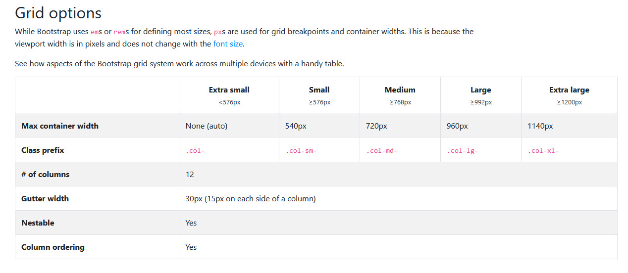
The Bootstrap grid system is a responsive, mobile-first fluid grid system that appropriately scales up to 12 columns as the device or viewport size increases.
If you’ve ever used a drag-and-drop site builder, it’s very similar to that layout but without all that excess code bloat.
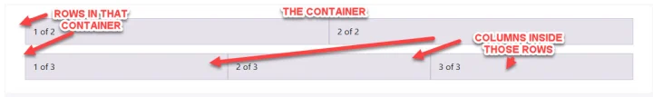
The grid system has three main components.
It always requires:
- a container (fixed-width or fluid)
- rows within the container, and
- columns within the rows
One of the really cool things about Flexbox with Bootstrap, is that you can create complex layouts like this, without having to deal with floats or other tricky CSS properties.
Sidenote: A "float" is a CSS property that affects layout. This is important because rows, which house columns, clear their float. This means that the row is instructed to appear below any floated elements within it.
This ensures proper alignment and prevents layout issues that might arise from elements not being in the expected positions.
Anyway, back to the 3 main elements of the Bootstrap grid.
1. The container
Containers are the most basic layout component in Bootstrap. They are just a simple div that encloses your website content, like so:
<div class="container"> <!-- or "container-fluid" -->
    <!-- rows and columns here -->
</div>
As you can see from the code, there are two types of containers in Bootstrap:
.containerprovides a centered, pixel-width layout.container-fluidprovides a full width layout that spans the entire width of the viewport- While
.container-xxl(introduced in Bootstrap 5) allows for extra-large screens, ensuring layouts scale up even better on ultra-wide monitors
For example
<div class="container">
    Content here...
</div>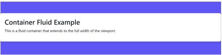
<div class="container-fluid">
<!-- rows and columns here -->
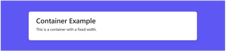
</div>A pixel-width layout refers to a web page layout where the width of the content is specified in pixels.
In the context of Bootstrap's .container class, it means that the content within the container is set to a fixed pixel width like 800px. This then creates a centered layout where the content is constrained to a specific number of pixels, and the remaining space on either side is left as margin.
For example
If you use <div class="container">, Bootstrap will center the content within a container that has a fixed pixel width. This provides a structured and controlled layout.
While the alternative, .container-fluid, creates a full-width layout, meaning the content spans the entire width of the viewport, without any fixed pixel constraints.
2. The rows inside that container
The .row class is used on a parent div to contain columns and ensure they stay in a horizontal row.
<div class="row">
    <!-- columns here -->
</div>
For example
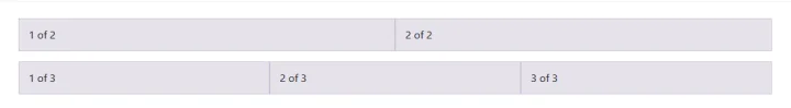
Here is a single row of 3 columns:

Obviously there can be multiple rows with different column effects in each.
Here we have 2 rows. The top row has 2 columns, while the bottom row has 3.
3. The columns inside those rows
Columns are the immediate children of Bootstrap rows and contain the actual content.
<div class="col-sm">
    Column content...
</div>
Bootstrap provides a set of column classes to layout your content on different screen sizes, ranging from .col- classes for extra small devices to .col-xl- classes for extra large devices:
.col-: for extra small devices (screen width <576px).col-sm-: for small devices (screen width ≥576px).col-md-: for medium devices (screen width ≥768px).col-lg-: for large devices (screen width ≥992px).col-xl-: for extra large devices (screen width ≥1200px)
The number following the - defines the number of Bootstrap grid columns the div should span.
For example
col-md-6 means the div should take up half of the Bootstrap grid on medium or larger devices.
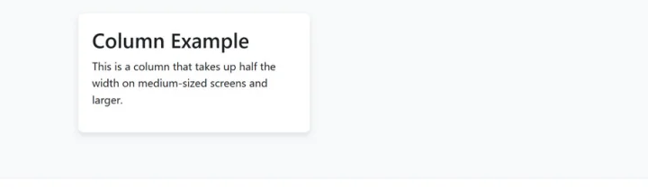
<div class="col-md-6">
    <!-- content here -->
</div>
About Auto-layout Columns
Important: If you don't specify a number with the column class, Bootstrap will auto-size the column based on the content.
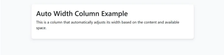
<div class="col">
    <!-- content here -->
</div>
Offset Classes
Sometimes you might want to offset columns or move them to the right or left, and so the .offset- classes allow you to do this.
For example
offset-md-4 pushes the column four columns to the right on medium or larger devices.
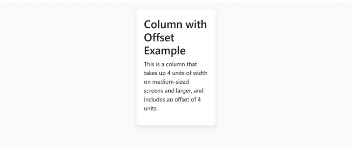
<div class="col-md-4 offset-md-4">
    <!-- content here -->
</div>
TL;DR
As you can see, Bootstrap's grid system is a robust and versatile tool for creating responsive designs. It uses a flexible container, rows, and a system of up to 12 columns to build a variety of layouts, which automatically adjust to the screen size.
Now that we understand this, let’s look at some of the methods that we can use Flexbox directly within that grid system, to make even more complex (yet simple) layout designs.
The key components of Flexbox within Bootstrap
The key components of Flexbox within Bootstrap include:
- Container: The container houses everything else inside it. It is usually a div element in HTML with a
.d-flexclass. This container becomes the flex container and its children become flex items - Items: Items are the children of the container. They automatically become flexible by virtue of their parent container. You can manipulate these items using further Bootstrap classes
- Direction: With Flexbox, you can easily choose the direction of the items, whether you want them to go in a row (left to right) or a column (top to bottom). The default direction is a row, which you can apply using the
.flex-rowclass
Sidenote: Both rows and columns can be reversed using row-reverse and column-reverse respectively.
I’ll go through some more examples in just a second, but here’s a little cheatsheet of Flexbox classes you can use inside of Bootstrap:
Commonly used Flexbox classes in Bootstrap
| CSS Class | Description |
|---|---|
.d-flex |
Makes the container a flex container |
.flex-row |
Sets the flex direction to row |
.flex-column |
Sets the flex direction to column |
.flex-row-reverse |
Sets the flex direction to row but in reverse order |
.flex-column-reverse |
Sets the flex direction to the column but in reverse order |
.justify-content-start |
Aligns items to the start of the container along the main axis |
.justify-content-end |
Aligns items to the end of the container along the main axis |
.justify-content-center |
Aligns items at the center of the container along the main axis |
.justify-content-between |
Distributes items evenly along the main axis, with the first item aligned at the start and the last item aligned at the end |
.justify-content-around |
Distributes items evenly along the main axis, with equal space around them |
.align-items-start |
Aligns items to the start of the container along the cross axis |
.align-items-end |
Aligns items to the end of the container along the cross axis |
.align-items-center |
Aligns items at the center of the container along the cross axis |
.align-items-baseline |
Aligns items at their baselines within the container along the cross axis |
.align-items-stretch |
Stretches items to fill the container along the cross axis |
.align-self-start |
Aligns a single item to the start of the container along the cross axis |
.align-self-end |
Aligns a single item to the end of the container along the cross axis |
.align-self-center |
Aligns a single item at the center of the container along the cross axis |
.align-self-baseline |
Aligns a single item at its baseline within the container along the cross axis |
.align-self-stretch |
Stretches a single item to fill the container along the cross axis |
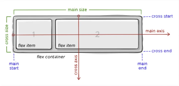
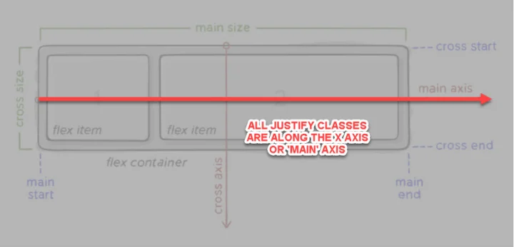
A quite note on Justify and Align
To help you grasp these classes a little easier, it helps to remember that any Justify class is on the X axis (otherwise called the 'Main' axis), and goes from left to right.
Justify layout explained
For example
.justify-content-start would start on the top left corner moving to the right. While .justify-content-end, starts in the far top right corner, moving left.
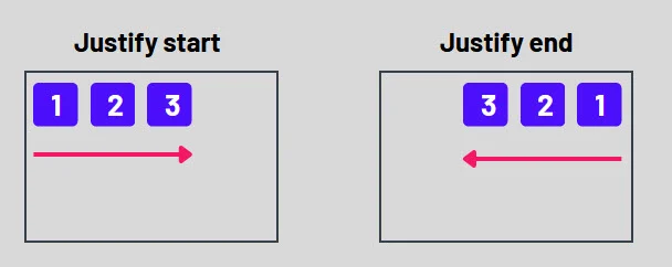
Unless you specify otherwise (by using a combination of classes), they will always start in the top corners, moving in the horizontal axis.
Align layout explained
The align classes deal in the Y axis (known as the 'Cross' axis), and go from top to bottom of the flexbox:

Also, unless you specify differently, they always start in the left corners, moving vertically.
For example
If we use the same example as we did in Justify, .align-items-start will start at the top left corner, moving down, while .align-items-end, will start at the bottom left corner, moving up.

TL;DR
Justify is on the horizontal axis, while Align is on the vertical axis.
It's easier to grasp when you see them working, so let's get into some examples, as well as how to get the flex options to show.
How to get Flexbox to work inside of Bootstrap (with examples)
Bootstrap is built with Flexbox (ever since version 4), but not every element’s display has been changed to display: flex as this would add many unnecessary overrides and unexpectedly change key browser behaviors.
This means that if we always want to use Flexbox in Bootstrap, we just need to add some predefined classes. These classes then trigger the Flexbox context for your layout.
For example
The .d-flex class applies display: flex to an element, initiating the flex context.
Simple right?
With Bootstrap 5, Flexbox is now the default for many components, including forms and input groups. This makes aligning form elements much easier, eliminating the need for additional classes. In fact, the old .form-inline class has been removed because forms now automatically adjust their layout based on their container.
This method worked great for me when I first started coding, as it allowed me to get comfortable building responsive layouts without having to write a lot of code to achieve it.
And that’s the beauty of Flexbox in Bootstrap - it removes the need for having a lot of additional code, while also allowing us to do cool stuff!
Alright, back to some examples of these in action.
I won’t cover all of them but just a few so you get the idea, and then can play around with this yourself.
Example 1: How to create a horizontal layout using Flexbox with Bootstrap
This is a simple example where we use Flexbox to create a horizontal layout wherein three divs will align side by side, like so.
First we create a div that will serve as the flex container and then add child divs that will act as flex items, like so:
The code looks like this:
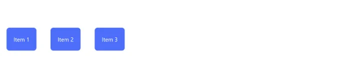
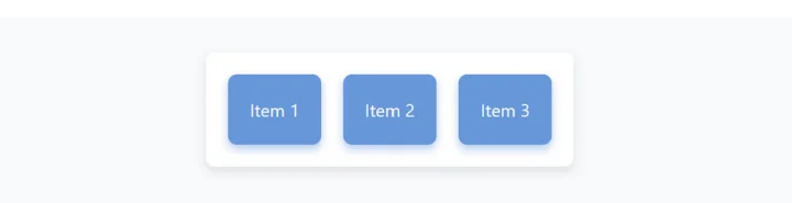
<div class="d-flex justify-content-start">
    <div>Item 1</div>
    <div>Item 2</div>
    <div>Item 3</div>
</div>
Notice how the child items are on the left side of the screen?
This is because in this code, .d-flex sets the display to flex and initiates a flex container. However, the justify-content-start class aligns the items at the start of the container, creating a left-oriented horizontal layout.
We can also align that in the center if we wish, by either removing the justify code to just be .d-flex, or a better approach is by changing it to be centered with .justify-content-center.
<div class="d-flex justify-content-center">
    <div>Item 1</div>
    <div>Item 2</div>
    <div>Item 3</div>
</div>
Example 2: How to create a vertical layout using Flexbox and Bootstrap
With the class d-flex, you've already set up a horizontal layout, but you can also add other Bootstrap classes to manipulate the layout further.
For example
To change the layout direction to vertical, we can use the flex-column class:
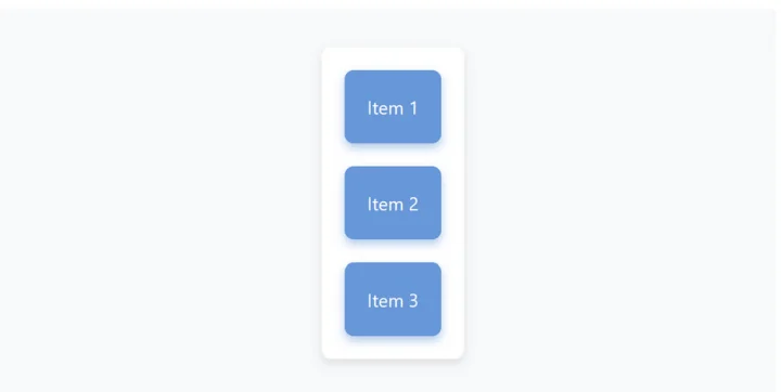
<div class="d-flex flex-column">
    <div>Item 1</div>
    <div>Item 2</div>
    <div>Item 3</div>
</div>
Here, the .flex-column class is used along with .d-flex to set the flex-direction to a column. This then causes items to stack vertically.
Example 3: How to add responsive design directions
Bootstrap also allows you to change the direction of the layout for different screen sizes.
For example
To stack the items vertically on small screens but then horizontally on medium and larger screens, we can achieve this by using the flex-sm-column and flex-md-row classes.
Desktop view:
Mobile view:
Pretty handy right?
The code is super simple also. It’s just:
<div class="d-flex flex-sm-column flex-md-row">
    <div>Item 1</div>
    <div>Item 2</div>
    <div>Item 3</div>
</div>
Example 4: How to center-align items in a container with Flexbox and Bootstrap
Flexbox with Bootstrap also gives you the ability to easily align items in the center, both horizontally and vertically.
For example
To center align your items both horizontally and vertically, you would use justify-content-center (like we did before) along with the align-items-center classes:
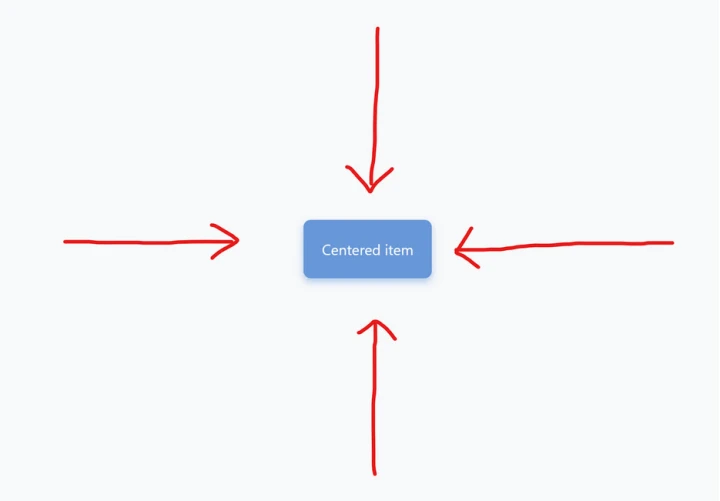
<div class="d-flex justify-content-center align-items-center" style="height: 100vh;">
    <div>Centered item</div>
</div>
With the addition of justify-content-center and align-items-center, the flex item is centered both horizontally and vertically, while the height: 100vh style makes the container take up full viewport height.
Go ahead and try these Flexbox classes out for yourself!
I know we only just scratched the surface here, but as you can see, when you use Flexbox features inside of Bootstrap, it’s incredibly easy to create complex layouts with just a few classes, making your CSS cleaner and easier to maintain.
If you haven’t tried using this yet (or even tried Bootstrap) then definitely give it a go. Its grid system is a great way to get started with responsive design with minimal code, thanks to its ability to define different layout behaviors for different screen sizes.
Whether you're building a complex web application or a simple responsive website, mastering Bootstrap and Flexbox will undoubtedly make your life as a front-end developer easier.
Keep coding, keep learning, and above all, don't forget to enjoy the process!
P.S.
This guide was just the tip of the iceberg of what's possible with these tools, and there is a lot you can do with Flexbox and also CSS Grid when coding from scratch.
If you want to learn all this and more, then check out my complete CSS course here.
You can even watch the first few lessons for free here.
If you decide to enroll, you’ll also get access to our private Discord server where you can ask me, other alumni, and other working Web Developers any questions you might have.
Hope to see you inside!


