Photo Credit: Figma
Here at Zero To Mastery, we love Figma. We love it so much that we teach it in our Complete Web & Mobile Designer bootcamp and we use it ourselves to create, present and test our design work.
Our Design Instructor, Daniel, also wrote a super detailed guide on why you should use Figma that I highly recommend checking out.
Unsurprisingly, as Lead Designer at Zero To Mastery I spend most of my day in Figma. I'm always really excited to try out any new feature they introduce to see how I can make the design process even more open and collaborative.
Config 2021 was Figma's virtual conference that took place last week. It was a jam packed agenda so it wasn't possible to get to see everything. But to help you out, these are my non-exhaustive and completely subjective key design takeaways from the two-day event.
📣 Announcements... so many announcements!
A design conference would not be a design conference without at least one announcement. Config 2021 absolutely spoiled us - Christmas came early for us Designers. From 'branching', audio calls (!!!), and a new mobile app with fixes to Figma Mirror, this is definitely a period of huge growth for Figma.
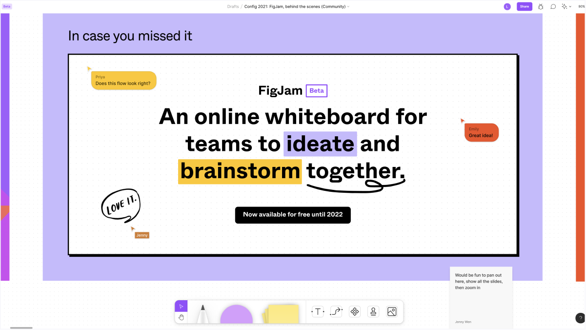
Photo Credit: Emily Lin, Jenny Wen and Priya Kotak
The most exciting new offering is FigJam, a white boarding tool that extends the multi-player nature of Figma, and let's face it the design process as a whole. Design is not a process that exists independently of Product Management, Strategy and Development. Brainstorming, fleshing out ideas and user flows, and running critiques should all be collaborative. I can't wait to start using this with the whole team here at Zero To Mastery!
Check out the Keynote presentation below for more details on these new launches:
FigJam is free for the rest of 2021. Other announced launches are currently in beta and will be available soon.
💣 Truth bomb: Design like you give a damn
In her presentation, Anna E. Cook (Senior Product Designer and Accessibility Specialist at Recurly), revealed that as of 2020, 98% of the web has accessibility issues. This was based on a study of the top 1,000,000 websites.
This is a staggering figure that highlights the lack of understanding and/or prioritisation of making the web an inclusive place for all.
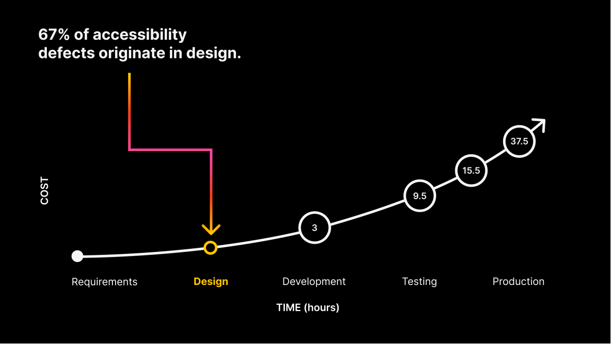
Photo Credit: Anna E. Cook
Even though 67% of accessibility issues come from design; baking accessibility into your website requires understanding and commitment beyond the design team. It requires a strategised approach from stakeholders, content creators and developers to make sure a website is truly inclusive. To make this happen it may require someone in the company to become an advocate and bring other departments on board.
The good news is that you don't need to be an accessibility expert to be an accessibility advocate. You can start small and build from there. The best place for you (if you're a Designer) to start is with your design system. If you go one by one and make sure the elements in your design system are accessible, it means that when other Designers and ultimately Developers use a component from your system, you have empowered them to replicate accessible design across their work.
❌ Don't hoard the work. Document it and take your vacation time.
It's totally normal to seek advice or read blogs when you're starting your first job or looking to advance your career. While good-intentioned, some advice can be toxic. For example, "make yourself irreplaceable." Have you heard this before?
In her presentation Aurora Pleguezuelo (Senior Systems Designer at Github) talked about how this advice led her to fear for her position and begin to hoard design work.
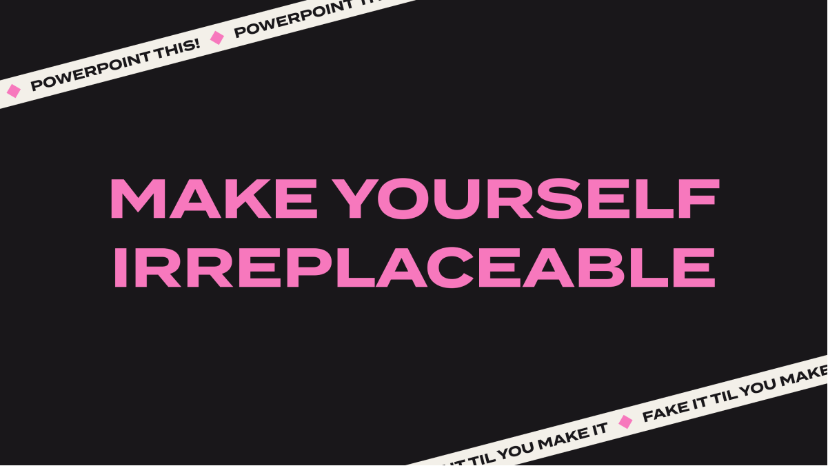
Photo Credit: Aurora Pleguezuelo
What's important to remember with this advice is that becoming an expert and becoming irreplaceable are two completely different goals. No one should seek to become irreplaceable. It's not sustainable for you and it's a point of weakness for your company to have one person who is the single source of knowledge on something.
"Design debt is the result of smaller conversations we never had." - Aurora Pleguezuelo
As a Designer, this is where being transparent with your work, building a design system and maintaining documentation are crucial. If you have conversations about process (why and how are we solving a problem in a particular way) and you document the details (e.g. this button should have a border radius of 3px) then your team are empowered to continue this work while you unchain yourself from your desk and use your vacation time.
☠️ The sacrificial concept
Sometimes it's difficult to give honest feedback on a design. Whether you're a colleague or a user participating in UX research; it's human nature to want to be polite or to say what you think the other person wants to hear. So, as the Designer in this situation, what can you do to get useful feedback?
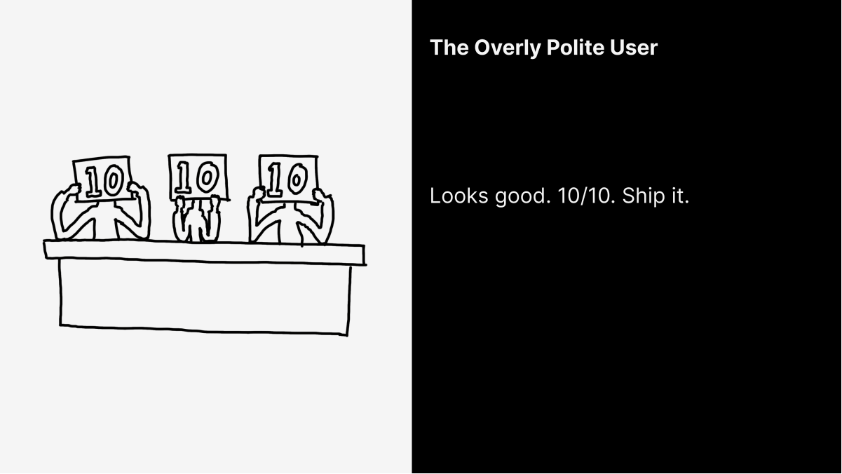
Photo Credit: Daniel Sauble
Daniel Sauble (Lead Product Designer at New Relic) presented this idea of creating a 'sacrificial concept'. This would be an objectively bad idea that would encourage people to ignore politeness and say what they really think. This honesty would then hopefully overlap into giving useful feedback about the other - actually serious - concepts.
This is a really interesting idea because getting honest and unbiased feedback is difficult. Coming from an agency background it makes me nervous, what if a client loves the bad idea?!?! 👀 Worth trying though!
🖍️ Figm-illustrating
An exciting development is how users have been pushing Figma's functionality to produce amazing illustrations. This begs the question, can Figma corner the market for Illustrators in the same way they are doing for Web Designers?
Case in point: This Figma portrait of Taylor Swift by Bonnie Kate Wolf is incredible.

Photo Credit: Bonnie Kate Wolf
Joey Lamelas (Senior Product Designer at GoFundMe) gave some brilliant tips for using Figma to create illustrations. These are the best ones that I'll be trying out in my work:
- There will need to be a different layer for almost everything in the illustration, so get your layer groups organised early. Your future self will thank you. Also, if you want to contain details within a shape you can use a mask instead of grouping layers.
- Treat your layers like a puzzle and work big to small. You can also break up the work so you are able to focus on smaller sections to build up complex illustrations.
- Use fill stacking to build up colours and effects within an object without having to use lots of layers.
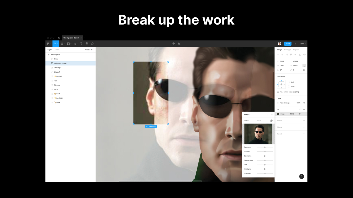
Photo Credit: Joey Lamelas
Next steps
There were so many fascinating talks that I didn't cover above so I really recommend checking out these resources as Figma publishes them:
- Explore the Figma Community page to dig into the individual presentations. These are available now.
- Check out the conference videos. They will be uploaded to the Figma YouTube channel next month.
I'd love to hear your takeaways as well. Come let me know what you thought and say hi to me on Twitter. Also let me know if there are other topics you'd like to write about.
