


In our information tracking economy, data-driven decision-making has begun to firmly cement itself as a cornerstone of successful business strategy.
Why?
Well, if you know how your business is performing, then you can make better, more educated choices. The trick of course is having tools to help you find this data, but also knowing how to use those tools effectively.
Incorrect data + bad tools = worse decisions!
Which is why in this guide, I’m going to walk you through the best practices when using Power BI, as well break down its dashboards, data models, and workspaces.
By understanding and implementing these best practices, you'll not only get more accurate data, but you’ll be able to produce powerful, insightful, and dynamic reports - and just as importantly, foster a data-driven culture within your organization.
Also, just so you know I’m not some random person on the internet, I want you to know that I have first hand experience with these tools, so these tips are tried and tested!
Why listen to me?
My name is Travis Cuzick. I’m one of the instructors here at Zero To Mastery, and I’ve been architecting and coding data solutions for well over a decade for some of the biggest companies on the Fortune 500.
This means I have extensive experience querying and manipulating literal multi-terabyte enterprise data stores in my work as a Data Solutions Engineer, at major U.S. financial institutions.
As you might guess, I also teach Power BI, so if you have questions about the topics here, want a deep dive into Power BI, or even want to learn it from scratch, then check out my complete Power BI course.
You'll learn the full Power BI suite of tools, the M programming language, and the DAX formula language, all while analyzing real-world datasets and building enterprise-level projects.
No joke, this course will take you from absolute beginner in Power BI, to being able to get hired in 2024 as a confident and effective Business Intelligence Analyst - so it’s useful for users of any level of experience.
Also, not only do you get access to the course content, but you also have access to me via our private Discord channel, to ask any questions, or get advice from other students and working Data Engineers.
Check it out here, or watch the first few videos for free.
With that out of the way, let’s get into the guide.
Power BI: Dashboard Best Practices

Creating an effective Power BI dashboard isn't just about throwing data onto a canvas and hoping it sticks. It’s about having the right information in the best format.
Here's a quick overview for dashboard best practices:
- Be clear on what data the end user needs
- Design your dashboard with the end user in mind
- Use the right visualization option for the data
- Keep consistent with colors, fonts, and styles
- Update your data
- Set up warning alerts
So let's have a look at what each of these means, and how to implement them.
Be clear on what data the end user needs
Because most dashboards are going to be viewed by mutiple people, it's important that you don't just focus on what you want to see only.
Instead, carefully consider the final audience who will read your reports and their needs:
- Are they executives needing high-level summaries?
- Or are they analysts who crave detailed data?
Likewise, in terms of the data required, do they want to see:
- Sales performance tracking?
- Operational efficiency?
- Forecasting future trends?
It's important to get clear on this at the start before you layout your design, as the purpose of your dashboard will fundamentally shape its design.
Most new Power BI users set up their dashboard without a plan of what they want to track, which usually means a mess of information.
This graph is cool, and so is this feature so they throw any old thing in! (We're all guilty of it).
Design your dashboard with the end user in mind
One of the greatest strengths of Power BI is its interactivity and customization.
With that in mind, (and what we just said about the end users), be sure to adjust your design and layout for the actual audience who will interact with it.
For example
If you're designing the dashboard for c-suite, then you might want more interactivity and overview of information.

You could even use drill-downs, tooltips, and slicers to let users explore the data at their own pace.
Another cool thing about Power BI dashboards?
You can create different views of the same data for different users!
This means you can set up one layout that's all spreadsheets and bar charts for the analysts, and then use bookmarks to pull that same info into a separate, more visually appealing and simplified dashboard for the C-suite.
Better still, as you update the one, the other updates also!
Speaking of bar charts though…
Use the right visualization option for the data
Some data visualizations work better than others in different instances, so be sure to pick the best ones for what you need.
For example
Bar and column charts are excellent for comparing quantities, whereas line and area charts are best for showing trends over time.

Maybe not the alien though, unless it fits your business tone!
And remember, more complex does not mean better. If a simple (but widely familiar and understood) chart type can convey your findings clearly, then there's no need for a more complex one.
Keep consistent with colors, fonts, and styles
It’s really easy to make a mess and look less professional, simply by using too many colors, fonts and styles.

It’s not just a style issue either. Consistent design actually aids comprehension and reduces cognitive load, while bad design does the exact opposite.
This means if you’re struggling to convey your data points and get decision buy-in, it could be as simple as improving and simplifying your design to make it easier to understand.
If in doubt:
- Stick to a consistent color scheme throughout the dashboard, and use colors to highlight important information or indicate performance (e.g., green for good, red for bad)
- The same rule applies to fonts and styles: choose a legible font and use it consistently, reserving different styles or weights for emphasis
Update your data
Ensure your dashboards are always up to date with the latest data, as outdated information can lead to poor decisions!
The good news is, Power BI provides several options for refreshing your data, from manual refreshes to scheduling automatic updates.

Set up warning alerts
Finally, it’s also a good practice to set up alerts for significant changes in your data.

This way, you and your users can stay informed of any sudden issues, without constantly checking the dashboard. Instead, you’ll know about it and be able to get it fixed asap.
You can even set the level of change to be alerted.
For example
If you’re getting 1,000 conversions a day, and it drops 5-10% then it might be just a slow day. However, if it suddenly drops to zero, then you probably have some broken point in the process.

It doesn't have to be zero though. If there's a 30% drop, you could also have an alert for this, which is incredibly helpful.
OK, so that’s the dashboard best practices done, now let’s look at the data model itself.
Power BI: Data Model Best Practices
A good looking dashboard is useless if the information it's collecting isn’t set up correctly. Like we've said many times before - bad data leads to bad decisions.
With that in mind, here are some of the best practices you should follow when working with your Power BI data models.
Here's a quick overview for data model best practices:
- Understand and use the correct relationships
- Use calculated columns and measures correctly
- Optimize your data processing performance
So let's get into them.
Understand and use the correct relationships
When dealing with multiple tables in your data model, understanding and defining the correct relationships between these tables is absolutely crucial, as these relationships will determine the accuracy (or inaccuracy) of any calculations in your report that span multiple tables.
The good news, is that Power BI allows for one-to-one, one-to-many, and many-to-many relationships (although one-to-many relationships are by far the most common).
For example
A one-to-many relationship might exist between a 'Customers' table and a 'CustomerOrders' table, where one customer can place many orders, but each order is only associated with one customer.

Being clear on these relationships is key.
This way you can ensure that both the calculations across tables, and their corresponding visualizations based on those calculations, are actually accurate.
Use calculated columns and measures correctly
Calculated columns and measures are two powerful tools in your Power BI toolkit, but each can impact your data model's performance differently, in different scenarios.
For example
A calculated column is calculated at the row level of your table and then stored in the data model, taking up memory as a result.
Why do we care about this?
Well, mainly because measures are calculated at runtime, based on the context defined by your report visuals.
As such, it’s generally a best practice to use measures for any aggregations and calculations you want to perform on the fly in your visualizations, as opposed to creating (and then summarizing) calculated columns
That being said, calculated columns can be a good option for data when you need to either filter or group by.
Just keep in mind that unnecessary calculated columns can bloat your data model and reduce performance. Creating the same columns in Power Query, or even at the data source itself, is often a superior alternative, and then have that import across.
Optimize your data processing performance
Optimizing your data model for speed and performance is a key best practice, especially with larger datasets, where time to process can be extensive.
However, there’s a few things that you might not think of, that can cause some definite issues if not dealt with. Therefore, I recommend that you…
Don’t load unnecessary data
Before loading data into Power BI, make sure that you clean your data in the data source itself, or during the Power Query stage.
- Remove unnecessary columns
- Filter out irrelevant rows, and
- Make sure your data types are optimized for space
This way you won’t be loading any added or unneeded data into your model.

Use a star schema
Wherever possible, try to organize your data model into a star schema, like so:
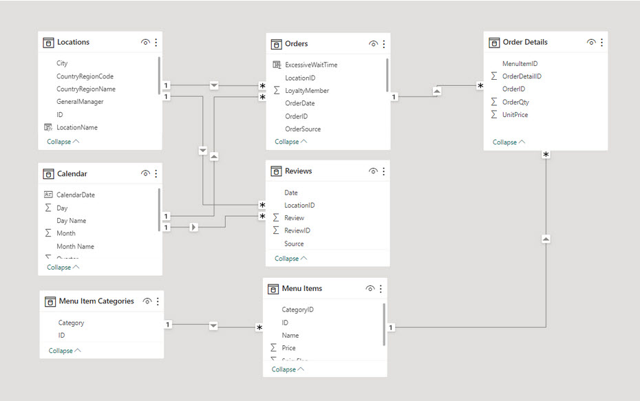
If you don't know, a star schema is simply a visual tool to help you to organize your data inside of your data model.Usually this means having one or more fact tables at the center of your model, related to various dimension tables.
Star schema models are actually really easy to understand and perform well in Power BI.
Manage cardinality correctly
Cardinality refers to the number of unique values in a column, and it can hugely impact data processing.
How? Well, high cardinality columns (like those containing multiple rows of unique IDs) can consume a lot of memory and slow down your reports. So, if you don't need to perform calculations on these columns, consider removing them from your data model.
Simple!
Minimize the use of memory-intensive DAX functions
Finally, it’s worth noting that functions like EARLIER, RANKX, and certain iterative functions (like SUMX and AVERAGEX) can seriously slow down your reports, if used extensively or on large datasets.
With that in mind, I recommend that you use these functions sparingly, and always look for alternatives that might perform better.
Power BI: Workspace Best Practices
A well-organized workspace isn't just about neatness—it's about increasing productivity, collaboration, and reducing errors.
So let's explore some of the best practices for managing your Power BI workspace, to make your day to day life easier.
Here's a quick overview for workspace best practices:
- Organize your workspace
- Assign roles and manage access control
- Use version control!
- Deploy and share reports safely
So let's get into them, and how to use these.
Organize your workspace
Structuring your workspace can significantly enhance your efficiency.
Therefore, I recommend that you:
- Create separate workspaces for different projects, departments, or teams
- Inside each workspace, use folders to group related reports, dashboards, and datasets
- And adopt a clear, consistent naming convention for all your Power BI objects
This naming convention should provide enough information for you to understand the content without having to open it.
For example
A sales report for 2024 might be named "Sales_Report_2024".
Nothing mind blowing here, but once you have to search through report, report1, master report, master report(1), every month, you’ll thank me for this.

Assign roles and manage access control
Power BI workspaces have several roles:
- Members
- Contributors
- Admins, and
- Viewers
Each role comes with different permissions, which as you can guess, vary from being able to create and edit content to just viewing it.
I cannot stress this enough, but assign roles based on the responsibilities of the users. This not only ensures that users can do their jobs but also protects your data from accidental changes or deletions.

But your work isn’t done once roles have been created and assigned. You’ll also want to regularly review and update the users assigned to these roles.
The reason being is that in large companies, people will often change roles or leave the organization. So make sure their access rights are updated accordingly to maintain the security of your data.
Use version control!
Like any other development project, version control is crucial in Power BI, as keeping track of changes can help you revert to a previous version if something goes wrong.
Power BI doesn’t have built-in version control, but you can use platforms like GitHub or Azure DevOps for this purpose. Alternatively, you can also use Power BI's "Download Report" feature to save versions locally or on a shared drive.

Typically you'd want to save a "version" whenever you've made a significant change to your dashboard. As a rule of thumb though, I would say that when it comes to version control, saving often is usually better.
Handle versions correctly
Also, similar to what I said before about reports, but each time you download a local version, make sure to maintain a consistent naming structure similar to the one outlined above:
- Sales_Report_2024_v1
- Sales_Report_2024_v2
- etc
Once you have many "versions", it's a good idea to create an archive folder where you store all the old versions.
Then if something breaks, the CEO deletes a bunch of data, or even if someone just requests a chart to be re-added that used to be there - you'll always have something to fall back on to save yourself a big headache!
Deploy and share reports safely
And the final best practice tip when it comes to workspace habits, is to always deploy and share your reports in a controlled manner.
What do I mean?
Well, it goes without saying that you should always test your reports thoroughly before deployment. You don’t want to send the wrong information.
But it’s also important to share your reports through Apps or shared workspaces instead of sharing the .pbix files directly. This then gives you more control over who can access the data and what they can do with it.
Also, remember to educate your users about responsible data use!
This includes not sharing sensitive data with unauthorized people, and always checking the data source and last refresh date before making decisions based on the report.
Embrace the Power (BI) of best practices
All puns aside, when you embrace and use these best practices in your Power BI use, you’ll find your job gets so much easier.
- Reports are done faster and approved
- The data is more accurate and quicker to process
- And your interactions with the tool get even easier
As with any set of best practices though, these are meant to be guidelines rather than rigid rules. Every organization, every dataset, and every user is different, so be sure to experiment, learn, and adapt these practices to fit your unique requirements.
They will not only enhance your Power BI proficiency but, hopefully, also fuel a more data-driven culture within your organization!
P.S.
Again, if you have questions about the topics here, want a deep dive into Power BI, or even want to learn how to use it from scratch, then check out my complete Power BI course.
You'll learn the full Power BI suite of tools, the M programming language, and the DAX formula language, all while analyzing real-world datasets and building enterprise-level projects.
Also, not only do you get access to the course content, but you also have access to me via our private Discord channel, to ask any questions, or get advice from other students, as well as working Data Engineers, Analysts, and Scientists!


