


Want to bring your web projects to life?
In this tutorial, I'm going to walk you through multiple eye-catching animations that you can add with HTML, CSS, and JavaScript. I'll take you step-by-step and give you specific code examples so you can follow along!
Once we go into how JavaScript animates, I'll also show you how to use 3 different common libraries used - anime.js, GreenSock, and three.js.
Sidenote: If you want to learn JavaScript from scratch, then be sure to check out ZTM’s complete Web Developer course.
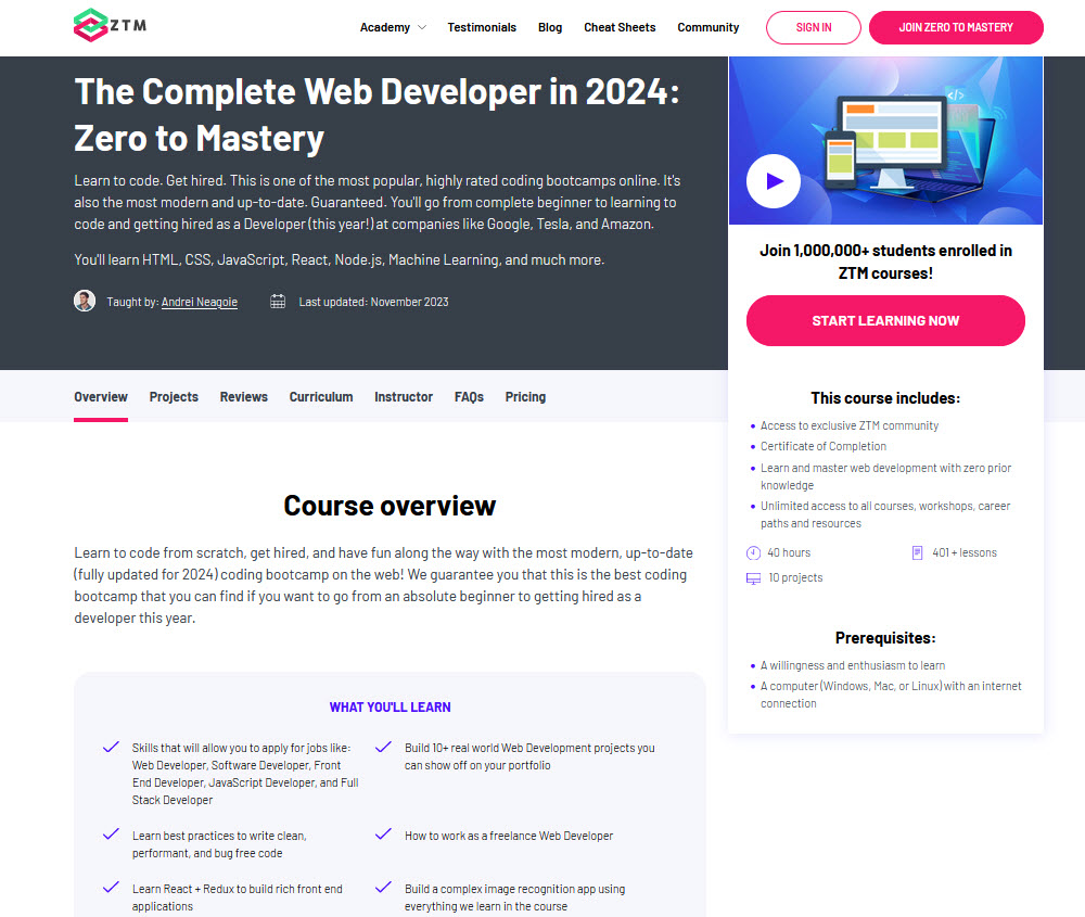
You can check it out here or watch the first few videos for free.
Alternatively, if you’re already using JavaScript and want to sharpen your skills by building some real-world projects, then check out my JavaScript Projects course.

You can check that course out here or watch the first few videos for free.
Oh, and FYI: If you join Zero To Mastery, you get access to all of the courses on ZTM, not just the two I've mentioned.
Alright, with that out of the way, let’s get building these JavaScript animations!
CSS Animations and Transitions
Creating CSS Hover Effects

Creating a stunning webpage is all about attention to detail, and even something as simple as a clickable link can make a big difference when it's designed just right.
In this first animation mini-project, I'll walk you through how to style a link with an eye-catching hover effect that's sure to impress your website visitors.
To get started, let's take a look at the HTML code we'll be working with:
<a href="#">Your Link Here</a>This is a basic anchor tag that will serve as the link we want to style.
Now, let's dive into the CSS code that will transform this link into a stylish element that users will love to click on. First, we'll set the background color of the page to a deep blue-gray shade using the background-color property.
We'll also use text-align to center the link within the page.
body {
  background-color: #2c3e50;
  text-align: center;
}
Next, we'll style the link itself.
We start by removing the default underline using text-decoration: none. Then, we'll use display: inline-block and margin-top to position the link vertically on the page.
a {
  text-decoration: none;
  display: inline-block;
  margin-top: 33vh;
}
To make the link stand out, we'll use a deep blueish-gray color for the font. We'll also use the font-family, font-size, and font-weight properties to customize the typography.
Finally, we'll give the link some padding and a rounded border using padding and border-radius.
a {
 color: #0f1a23;
 font-family: 'Open Sans', sans-serif;
 font-size: 30px;
 font-weight: 600;
 padding: 1rem;
 border-radius: 50px;
}
Now, let's add some visual interest with a subtle box shadow.
We'll set the shadow to a zero spread distance and a blueish-gray color. Then, using the transition property, we'll animate the color change and shadow expansion when the link is hovered over.
a {
 box-shadow: inset 0 0 0 0 #1e2c3a;
 transition: color .3s ease-in-out, box-shadow .3s ease-in-out;
}

a:hover {
  color: #fff;
  box-shadow: inset 300px 0 0 0 #1e2c3a;
}
This means that when the user hovers over the link, the font color will change to white and the box shadow will expand to the right, giving a sleek, modern effect that's sure to impress.
And there you have it!
With just a few lines of CSS, you can take a simple link and transform it into a stylish element that looks great and is easy to interact with.
Give it a try on your own website and see the results for yourself!

Creating CSS Transitions

Transitions are a powerful way to animate CSS properties smoothly over time.
We incorporated it into our previous example to shift smoothly between color and box-shadow properties.
In this section, we’ll create a 3D button that looks like it's being pushed when clicked by adding a transition to the position of the button.
First, let's take a look at the HTML code we'll be working with.
We have a simple button inside a div container:
<div class="button-container">
  <button>Button</button>
  </div>
Now, let's dive into the CSS code that will transform this button into a visually appealing and interactive element.
We'll start by setting the background color of the page to a dark shade of gray and centering the button within the page using display: flex, align-items, and justify-content.
body {
  margin: 0;
  height: 100vh;
  display: flex;
  align-items: center;
  justify-content: center;
  background: #333;
}
Next, we'll style the button itself.
We'll give it a border, padding, and border-radius to make it look like a button. We'll also add a box shadow to create depth and give it a sleek look.
Finally, we'll use a linear gradient for the background to create a subtle color gradient effect.
.button-container {
  border: 2px solid black;
  padding: 10px;
  border-radius: 7px;
  box-shadow: inset 0 20px 4px -10px rgba(255, 255, 255, 0.7);
}

button {
  cursor: pointer;
  outline: none;
  width: 120px;
  height: 75px;
  font-family: Helvetica, sans-serif;
  font-size: 25px
  colour: white;
  text-shadow: 0 2px 5px black;
  background: linear-gradient(to top, #696969, #575757);
  border: 2px solid black;
  border-radius: 7px
  box-shadow: inset 0 20px 4px -19px rgba(255, 255, 255, 0.4), 0 12px 12px 0
rgba(0, 0, 0, 0.3);
}
To make the button interactive, we'll add a transition to the hover and active states so that when the user hovers over the button, we'll change the background color to a darker shade of gray using a linear gradient.
When the button is clicked, we'll use the transform property to move it down a few pixels and change the box shadow to give it a pressed look.
button: hover {
  background: linear-gradient(to bottom, #696969, #575757);
}

button:active {
    transform: translateY(3px);
    box-shadow: 0 6px 6px 0 rgba(0, 0, 0, 0.3);
}
And there you have it!
With just a few lines of CSS, you can create a button that looks great and is fun to interact with.
Experiment with different colors and styles to create your own unique button.

Adding CSS Easing

Adding animations and transitions to your website is a great way to enhance the user experience and make your website more engaging.
In this section, we'll show you how to create an animated icon using Font Awesome and CSS transitions.
The key concept that we'll be focusing on is easing, which controls the rate of change for the transition effect.
To get started, let's add the Font Awesome stylesheet to our HTML using the link tag:
<link rel="stylesheet" href="https://cdnjs.cloudflare.com/ajax/libs/font-awesome/6.1.0/all.min.css">Next, let's take a look at the HTML code we'll be working with. We have a div container with an i tag inside that contains the Font Awesome icon we want to animate:
<div class="icon-container">
  <i class="fas fa-solid fa-ghost" title="BOO!!!"></i>
  </div>
Now, let's dive into the CSS code that will transform this icon into a fun and interactive element.
We'll start by setting the background color of the page to a dark shade of gray and centering the icon within the page using display: flex, justify-content, and align-items.
body {
  display: flex;
  justify-content: center;
  align-items: center;
  height: 100vh;
  background-color: #1c1c1c;
  overflow-y: hidden;
}
Next, we'll style the icon itself. We'll give it a font size of 200px, a white color, and position it absolutely within its container.
We'll also add a transition property to animate its transform, color, and font-size properties.
By using the ease-out value for the transition-timing-function property, we'll create an effect that starts quickly and then slows down gradually.
.icon-container {
  position: relative;
  width: 200px;
  height: 200px;
}

.fa-ghost {
  font-size: 200px;
  color: white;
  position: absolute;
  top: 0;
  left: 0;
  transition: transform 1s cubic-bezier(0.68, -0.55, 0.265, 1.55), color 1s
  ease-out, font-size 1s ease-out;
}
To make the icon interactive, we'll add a transition to the hover state of its container.
When the user hovers over the container, we'll use the transform property to scale the icon up by 1.2x, change its color to red, and increase its font size to 220px.
.icon-container: hover .fa-ghost {
  transform: scale(1.2);
  color: red;
  font-size: 200px;
}
Boom, we did again!
Just a few lines of CSS and the power of Font Awesome and you can create an animated icon that's sure to catch your visitors' attention.
Try experimenting with different easing functions and transition properties to create your own unique effects.

Creating a CSS Card Flip

Next, we’ll explore how to create a card flip animation using CSS transforms.
These are a great way to showcase information or images on a web page in an interactive way. Our card will have a front and back side, which we will style using CSS.
To get started, we will need to create an HTML structure for our card. We will use a div element with the class card as the outer container.
Inside this div, we will create another div with the class card-inner to serve as a container for our front and back faces.
Then, we'll create two more div elements with the classes card-front and card-back.
Each of these divs will contain the content we want to display on the front and back of our flip card, respectively.
<div class="card">
  <div class="card-inner">
    <div class="card-front">
      <div class="image-placeholder"></div>
    </div>
    <div class="card-back">
      <div class="image-placeholder"></div>
      <h2 class="card-title">Bac Title</h2>
    </div>
  </div>
</div>
Now that we have our HTML structure, we can begin styling our flip card using CSS.
We'll start by setting the dimensions and perspective for our card, which will affect the appearance of the 3D transform we'll apply later on.
We'll also give our card a border-radius to make the edges look rounded.
.card {
  width: 200px;
  height: 300px;
  perspective: 1000px;
  margin: 0 auto;
  border-radius: 10px;
}
Next, we'll create the CSS for the card-inner class.
This class will be used to create the 3D transform that will give our card the illusion of depth. We'll set the transform-style property to preserve-3d to maintain the 3D space we'll create.
We'll also set the transition property to transform 0.8s so that our card smoothly animates between the front and back faces on hover.
.card-inner {
  width: 100%;
  height: 100%;
  transform-style: preserve-3d;
  transition: transform 0.8s;
  position: relative;
}
Now, we'll add the CSS for the card-front and card-back classes. These classes will be used to style the front and back faces of our flip cards, respectively.
We'll position them absolutely within the card-inner container and set their backface-visibility property to be hidden so that the back face isn't visible until the card flips over.
We'll also add some basic styles for the content within these divs, such as a font size and font family.
.card-front
.card-back {
  width: 100%;
  height: 100%;
  position: absolute;
  backface-visibility: hidden;
  display: flex;
  flex-direction: column;
  justify-content: center;
  align-items: center;
  font-size: 24px;
  font-family: 'Montserrat', sans-serif;
  border-radius: 10px;
  padding: 20px;
  color: #333;
  box-shadow: 0px 0px 10px rgba(0, 0, 0, 0.5);
}
Now, let's add the unique styles for each face:
.card-front {
  background-color: #fff;
}

.card-back {
  background-color: #333;
  color: #fff;
  transform: rotateY(180deg);
}
We set different background colors for the front and back faces.
Additionally, we’ll change the text color for the back face to white, and apply a transform: rotateY(180deg) to make sure it's positioned correctly when the card flips.
Lastly, let's style the image placeholders and the card titles:
.image-placeholder {
  width: 100%;
  height: 100%;
  background-color: #ccc;
  margin-bottom: 20px;
}

.card-title {
  margin: 0;
}
We're giving the image placeholders a background color and a margin at the bottom to separate them from the card titles.
For the card titles, we simply remove any default margin, and that's it! With this CSS, your flip card should now be fully functional and stylish.
When you hover over the card, it will smoothly animate and reveal the back face. Have fun experimenting with different styles and content for your flip card!

Creating CSS Keyframes

Let's have some fun and create a simple animation using CSS keyframes. More specifically, we'll create a pulsing circle with a lightning bolt icon in the center.
This is a great way to add some fun visual interest to your website!
First, we need to create the HTML structure for our animation. We'll create a container div with the class container.
Inside that, we'll create a div with the class icon-container, and inside that div, we'll create another div with the class circle. Inside the circle div, we'll add the lightning bolt icon using the Font Awesome library.
<link rel="stylesheet" href="https://cdnjs.cloudflare/ajax/libs/font-awesome/6.1.0/css/all.min.css">
<div class="container">
  <div class="circle">
    >i class="fas fa-bolt"></i>
    </div>
  </div>
</div>
Now let's add some CSS to style our icon.
We'll set the background color of the body, and then use a CSS grid to center our icon container both horizontally and vertically.
body {
  background-clor: #b9b9b9;
  margin: 0;
}

.container {
  display: grid;
  place-items: center;
  height: 100vh;
  width: 100vw;
}
Next, we'll style the inner icon container.
We'll set its position to relative so we can position our circle element inside it. We'll also use a CSS grid to center our icon element inside the circle.
.icon-container {
  position: relative;
  display: grid;
  place-items: center;
}
One way to create animations is by using keyframes, which define the intermediate steps of an animation.
To use keyframes, you start by defining an animation using the @keyframes rule. This rule lets you specify the intermediate steps of an animation, using percentage values from 0% to 100%.
For example
You can define an animation that scales an element up and down by using the following @keyframes rule. We'll begin by defining the keyframes that we'll use in our animation.
We'll create two keyframes: one that will pulse the circle by scaling it up and down, and one that will widen the circle's border.
@keyframes pulse {
  0% {
  transform: scale(1);
}
50% {
  transform: scale(1.5);
}
100% {
  transform: scale(1);
  }
}

@keyframes widen {
  0% {
  border-width: 3px;
}
50% {
  border-width: 7px;
}
100% {
  border-width: 3px
  }
}
Next, we'll apply the keyframes to our circle div and our lightning bolt icon. We'll set the circle's background color to white, and we'll give it a semi-transparent opacity.
We'll also set the circle's width, height, border-radius, and border color. We'll animate the circle's border using the widen keyframes that we created earlier.
.icon-container i {
  color: green;
  animation: pulse 2s infinite;
}

.circle {
  background: whitesmoke;
  opacity: 0.9;
  width: 160px;
  height: 160px;
  border: 2px solid green;
  border-radius: 50%;
  animation: widen 2s infinite;
  display: grid;
  place-items: center;
}
Once you've completed these steps, you'll have a simple but impressive animation.
By using keyframes in your CSS, you can create smooth and dynamic animations that enhance the user experience.
Experiment with different properties and values to customize your animation and make it truly unique.
With a bit of creativity and some CSS knowledge, you can create unique animations that will make your website stand out from the crowd.

How JavaScript Animates
Using setInterval vs. requestAnimationFrame

Have you ever wanted to create an animated element on your webpage that moves across the screen?
Well lucky for you, I'm going to show you how to use JavaScript's setInterval() function to animate an element's position on a continuous loop.
To start, let's take a look at the HTML and CSS we'll be using for this project.
Our HTML will contain a simple element with a dragon icon...
<link rel="stylesheet" href="https://cdnjs.cloudflare.com/ajax/libs/font-awesome/6.1.0/all.min.css">
<i class="fa-solid fa-dragon:></i>
Which we'll style using CSS to give it a red color and position it in the center of the screen.
body {
  display: grid;
  place-items: center;
  min-height: 100vh;
  overflow: hidden;
  background: #b22222
}

.fa-dragon {
  width: 50px;
  height: 50px;
  position: absolute;
  font-size: 100px;
}
With our HTML and CSS in place, we can now move on to the JavaScript portion of our project.
We'll start by creating a variable to track the position of our dragon icon on the screen and set its initial value to 0 since the icon will start at the left edge of the screen.
Next, we'll use setInterval() to continuously update the position of our dragon icon on the screen.
let position = 0;
const dragon = document.querySelector('.fa-dragon');
In the setInterval() function, we'll increment the position variable by 5 pixels and update the position of the icon using the style.left property.
We'll also check if the icon has gone off the right edge of the screen and reset its position to the left edge.
setInterval(() => {
  position += 5;
  dragon.style.left = position + 'px';

  if (position > window.innerwidth) {
    position = -50;
  }
}, 50);
And that's it! Now our dragon icon will continuously move across the screen from left to right.
We just created a simple animation using setInterval(), and while it's a pretty nifty way to bring life to our web page, it does have a couple of drawbacks.
For instance, the time interval between each animation frame might differ based on the browser's performance, which can sometimes cause uneven animation speeds and a bit of visual stuttering.
But don't worry, we've got an alternative!

Now that our animation is up and running with setInterval(), let's explore requestAnimationFrame() and see how it stacks up.
Both methods can help us animate elements on a web page, but requestAnimationFrame() definitely has some perks over setInterval().
First off, requestAnimationFrame() is tailor-made for animations, unlike setInterval(), which is more of an all-rounder for timed operations.
What this means is that requestAnimationFrame() is optimized for animations, adjusting the frame rate according to the device's refresh rate.
The result? A smoother animation that's also easier on your device's resources—perfect for mobile devices with limited processing power.
Another cool thing about requestAnimationFrame() is that it only runs when the page is visible in the browser window, saving resources and reducing power consumption. This is super important for mobile devices and laptops where battery life is a priority.
Meanwhile, setInterval() keeps running even when the page isn't visible, which can lead to unnecessary resource usage.
So, let's give our dragon animation an upgrade with requestAnimationFrame(). We'll create a new function called animate() that'll update the dragon's position with each frame.
Then, we'll use requestAnimationFrame() to call the animate() function for each frame.
Check out the updated JS code below:
let position = 0;
const dragon = document.querySelector('.fa-dragon');

function animate() {
  position += 5;
  dragon.style.left = position + 'px';

  if (position > window.innerWidth) {
    position = -50;
  }

  requestAnimationFrame(animate);
}

animate();
Inside the animate() function, we're giving our dragon a little nudge—5 pixels to be precise—on each frame.
By using requestAnimationFrame(), we're making sure the animate() function gets called again for the next frame.
The result? A silky smooth animation that's not only optimized for performance but also super friendly to your device's battery life.

To wrap it all up, requestAnimationFrame() really takes the cake when it comes to animating elements on a web page.
It's fine-tuned for animations, and it's easier on resources, which is a big win for mobile devices and laptops. With requestAnimationFrame() on our side, we can craft animations that are not only visually stunning but also power-efficient!
Adding timing functions

Let's keep the good times rolling here. We're now going to dive into the world of timing functions in JavaScript animations.
I'm going to show you how to use FontAwesome's spin method to make a basketball seem like it's bouncing and rolling across the screen.
Plus, we'll throw in some timing functions to give the animation that extra touch of smoothness and realism.
First things first, let's tackle the HTML and CSS code.
We'll need the FontAwesome stylesheet and an icon element for our basketball.
<link rel="stylesheet" href="https://cdnjs.cloudflare.com/ajax/libs/font-awesome/6.1.0/css/all.min.css>
<i class="fa-solid fa-basketball fa-spin:></i>
We'll also add some basic styles for the body to keep the content centered and prevent any overflow from showing up.
body {
  text-align: center;
  overflow: hidden;
}

.fa-basketball {
  color: #FF7F00;
  font-size: 125px;
  position: absolute;
  bottom: 0;
}
Time to shift gears to the JavaScript code!
We'll kick things off by grabbing the basketball icon element and setting up a few variables for our animation.
We'll use the position variable to track the basketball's screen location, while the direction variable helps us manage the ball's bounce.
Oh, and we'll need an acceleration constant to give the ball's movement a natural feel.
const ball = document.querySelector('.fa-basketball');
let position = 0;
let direction = 1;
const acceleration = 0.1;
Now, let's create the bounce() function, which will take care of all the animation magic.
In this function, we'll update the basketball's position on each animation frame using the position and direction variables.
To make the bounce even smoother, we'll apply a timing function.
And of course, we'll use requestAnimationFrame() to keep the animation looping. With the bounce() function ready to go, we can call it to kick-start the animation.
function bounce() {
  position += direction * 5;
  direction -= acceleration;
  ball.style.bottom = position + 'px';

  if (position <= 0) {
    direction = 1;
  }
  requestAnimationFrame(bounce);
}
Voila! With just a handful of code lines, we've crafted a bouncing basketball animation using timing functions.
Feel free to play around with the acceleration constant values to tweak the ball's movement, or test out different timing functions to see how they influence the animation.

Using JavaScript Animation Libraries (anime.js vs. greensock vs. three.js)
Creating an Anime.js Screensaver

Looking to jazz up your website with a touch of pizzazz?
Look no further than Anime.js, a potent JavaScript animation library that makes crafting eye-catching animations a breeze.
Let's walk through an example of using Anime.js to create a mesmerizing animation of layered shapes—perfect for a screensaver.
We'll kick things off by setting up the HTML and CSS for our shapes, then dive into the JavaScript code to breathe life into our animation.
Our HTML code is pretty simple. We will start by including Anime.js in our project. Outside of that, we've got a container div with a nested div that houses our shapes.
We're using SVG elements to shape up our design, and we've added classes to style each shape distinctively.
<script
src="https://cdnjs.cloudflare.com/ajax/libs/animejs/3.2.1/anime.min.js">
</script>
  <div class="animation-wrapper">
    <svg class="large shape color-1" viewBox="0 0 96 96">
      <circle cx="48" cy="48" r= "28"/>
    </svg>
    <svg class="small shape color-2" viewBox="0 0 96 96">
      <polygon points="48 17.28 86.4 80.11584 9.6 80.11584"/>
    </svg>
    <svg class="large shape color-3" viewBox="0 0 96 96">
      <rect width="48" height="48" x="24" y="24"/>
    </svg>
  </div>
</div>
As for our CSS code, we're setting up the styles for our container and shapes.
We're positioning the shapes absolutely within our container, and we're using the stroke and fill properties to color each shape.
body {
  display: flex;
  justify-content" center;
  align-items: center;
  position: absolute;
  width: 100%;
  height: 100vh;
  background-color: #1f2833;
  overflow: hidden;
}

.animation-wrapper {
  width: 80%;
  padding-bottom: 40%;
}

.layered-animations {
  position: absolute;
  top: 50%;
  left: 50%;
  display: flex;
  align-items: center;
  justify-content: center;
  width: 1100px;
  height: 550px;
  margin: -275px 0 0 -550px;
}

.layered-animations .shape {
  position: absolute;
  top: 50%;
  overflow: visible;
  width: 280px;
  height: 280px;
  margin-top: -140px;
  stroke: transparent;
  stroke-width: 1px;
  fill: #ffffff;
}

.layered-animations .small.shape {
  width: 100px;
  height: 100px;
  margin-top: -32px;
  stroke: currentColor;
  fill: currentColor;
}

.layered-animations .large.shape {
  width: 200px;
  height: 200px;
  margin-top: -48px;
  stroke: currentColor;
  fill: currentColor;
}

.color-1 {
  color: D322B2B;
}
.color-2 {
  color: #333;
}
.color-3 {
  color: D#202020;
}
Now, let's talk JavaScript.
We'll begin by employing the fitElementToParent function to resize and scale the SVG elements so that they fit inside their parent container.
It does this by setting the SVG elements' scale to a ratio of their parent container's width and the SVG element's width.
function fitElementToParent(el) {
  var timeout = null;
  function resize() {
    if (timeout) clearTimeout(timeout);
    anime.set(el, {scale: 1});
    var parentEL = el.parentNode;
    var elOffsetWidth = el.offsetWidth;
    var parentOffsetWidth = parentEl.offsetWidth;
    var ratio = parentOffsetWidth / elOffsetWidth;
    timeout = setTimeout(anime.set(el, {scale: ratio}), 10);
  }
  resize();
  window.addEventListener('resize', resize);
}
Next, the createKeyframes function generates an array of keyframe objects that are used in the animateShape() function to define the animations for each SVG element.
It takes a function as an argument that returns a random value that is used in the keyframe objects.
function createKeyFrames(value) {
  vcar keyframes = [];
  for (var i = 0; i < 30; i++) keyframes.push({value: value});
  return keyframes;
}
The animateShape function is called on each shape within the container and is responsible for animating the shape's position, rotation, and scale.
It uses the anime.timeline method to create a new timeline for each shape.
The target property of the timeline is set to the current shape, and the duration property is set to a random number between 600 and 2200. (The easing property is set to a random easing function from the array created earlier).
function animateShape(el) {
  var animation = anime.timeline({
    targets: el,
    duration: function() {return anime.random(600, 2200); },
    easing: function() { return easings[anime.random(0, easings.length - 1)]; },
    complete: function(anim) {animateShape(anim.animtables[0].target); },
  })
  .add({
    translateX: createKeyframes(function(el) {
      return el.classList.contains('large') ? anime.random(-300, 300) : anime.random(-520, 520);
    }),
    translateY: createKeyframes(function(el) {
      return el.classList.contains('large') ? anime.random(-110,110) : anime.random(-200, 280);
    });
    rotate: createKeyframes(function() {return anime.random(-180, 180); }),
    scale: createKeyframes(function() {return anime.random(0.5, 1.5); }),
  }, 0);
}
The layeredAnimation function is a self-executing function that animates the shapes contained within the .layered-animations container.
It starts by selecting the container and the individual shapes contained within it. It also creates an array of different easing functions that will be used to animate the shapes in different ways.
Finally, the animateShape function is called on each shape to start the animation process.
var layeredAnimation = (function() {
  var layeredAnimationEl = document.querySelector('.layered-animations');
  var shapeEls = layeredAnimationsEl.querySelectoAll('shape');
  var easings = ['easeInOutQuad', 'easeInOutCirc', 'easeInOutSine', 'spring'];

  fitElementToParentlayeredAnimationEl);

  function createKeyframes(value) {
    ... // Previous Code
  }

  function animateShape(el) {
    ... // Previous Code
  }

  for (var i =0; i < shapeEls.length; i++) {
    animateShape(shapeEls[i]);
  }

})();
With Anime.js, you have a powerful tool for creating dynamic and customizable screensavers.
By adjusting the properties of the animation, such as duration, easing, and keyframes, you can make the animation look however you like.
Additionally, you can customize the HTML and CSS to change the shape, size, and colors of the elements being animated.
Experiment with different values and configurations to create a screensaver that's uniquely your own!

Creating an Anime.js vs GreenSock Loading Animation tutorial

Have you ever been on a website that takes a bit longer to load and you're left staring at a blank screen?
Loading animations can help ease the frustration of waiting and make the experience more enjoyable for the user. In this section, we will use Anime.js to create a simple loading animation.
First, let's take a look at the HTML and CSS for this project, we will need to add Anime.js to our project again:
<script
src="https://cdnjs.cloudflare.com/ajax/libs/animejs/3.2.1/anime.min.js">
</script>
  <div class="circle-1"></div>
  <div class="circle-2"></div>
  <div class="circle-3"></div>
</div>
body {
margin: 0;
height: 100vh;
display: flex;
justify-content: center;
align-items: center;
background-color: #1f2833
}
.container {
display: flex;
justify-ciontent: space-between;
width: 300px;
}
.circle {
width: 50px;
height: 50px;
border-radius: 50%;
}
.circle-1 {
background-color: #66fcf1;
}
.circle-2 {
background-color: #45a29e;
}
.circle-3 {
background-color: #c5c6c7;
}We have a container with three circles of different colors inside. We will animate these circles using Anime.js.
Next, let's take a look at the JavaScript code:
const circles = document.querySelectorAll9'.circle');

anime.timeline({
  targets: circles,
  easing: 'easeInOutSine',
  loop: true,
  direction: 'alternate',
  delay: (el, i) => i * 300
})
  .add({
    duration: 1000,
    scaleX: 1.5,
    scaleY: 1.5
  });
We first select all the circles using document.querySelectorAll('.circle'). We then create an animation timeline using anime.timeline().
Inside the timeline, we set the targets to the circles and specify the easing function to be used for the animation.
We also set the animation to loop indefinitely and alternate direction using loop: true and direction: 'alternate'.
The delay property is used to specify a delay for each circle to start animating. In this case, we set the delay to be i * 300, where i is the index of the circle and 300 is the delay time in milliseconds.
Finally, we add an animation to the timeline using .add(). We specify the duration of the animation to be 1000 milliseconds and scale the circles to 1.5 times their original size using scaleX: 1.5 and scaleY: 1.5.
That's it! We've created a simple loading animation using Anime.js. You can customize the animation by adjusting the easing function, duration, delay, and other properties to fit your needs.
Anime.js makes it easy to create dynamic and engaging animations that can add value to your website or application. But there are other libraries out there, another one that comes up in a lot of lists is GreenSock:

Using GreenSock for Loading Animations
If you are looking for a way to create a loading animation with GreenSock instead of Anime.js, you'll be pleased to know that the code is more succinct and the animation looks smoother.
The HTML and CSS for the project would be the same as before, so there is no need to rewrite them. However, the JavaScript portion of the code would be different, as shown below.
First, we need to include the GreenSock library in our project by adding the following code to the head section of our HTML file:
<script src="https://cdnjs.cloudflare.com/ajax/libs/gsap/3.9.1/gsap.min.js">
  </script>
Next, we select all the circle elements using the querySelectorAll method, just like we did with Anime.js:
const circles = document.querySelectorAll('.circle');Now comes the fun part.
Instead of using a timeline object, we use a single to method, which allows us to specify the duration of the animation, the scale factor, and the easing function, all in one line:
gsap.timeline({repeat: -1, yoyo: true})
  .to(circles, {
    duration: 0.5,
    scale: 1.5,
    stagger: 0.3,
    ease: "sine.inOut"
  });
Here, we set up the timeline to repeat infinitely (repeat: -1) and alternate between the start and end states (yoyo: true).
Then, we use the to method to animate all the circle elements together, specifying the duration of the animation, the scale factor of 1.5, a stagger of 0.3 seconds between each circle, and the easing function of "sine.inOut".
As you can see, the GreenSock code is more concise and easier to read than the Anime.js code and when you run the animation, you'll notice that it looks smoother and more polished than the Anime.js version for these types of animations.
Moreover, GreenSock offers a range of premium plug-ins that provide additional features, such as advanced text animations, complex physics-based motion, and more.
These plug-ins are perfect for taking your animations to the next level and creating truly unique experiences.
So, if you're on the hunt for a powerful and flexible animation library to create breathtaking visual effects, GreenSock could be just the ticket for you, especially with its premium plug-ins at your disposal!

Using Three.js to build a Starfield

In this final section, we will explore how basic 3D animations can be achieved using Three.js, in this case creating a scene that simulates flying through space.
The sky is really the limit with Three.js if you look at some projects created with it, I think you’ll be surprised by what JavaScript can do and the kind of 3D animations you can see inside your web browser.
We are using the Three.js library to create the animation, so we need to include the Three.js library in our HTML file.
<script
src="https://cdnjs.cloudflare.com/ajax/libs/three.js/r128/three.min.js">
</script>
Next, we set the CSS for the canvas and the body:
body {
  margin: 0;
}
canva {
  display: block;
}
These three lines of code initialize the three key components of the Three.js environment: the scene, camera, and renderer.
The scene holds all the objects to be rendered, the camera determines the viewpoint, and the renderer is responsible for displaying the scene on the screen.
const scene = new THREE.Scene();
const camera = new THREE.PerspectiveCamera(
  75,
  window.innerWidth / window.innerHeight,
  0.1,
  1000
  );
  const renderer = new THREE.WebGLRenderer();
  renderer.setSize(window.innerWidth, window.innerHeight);
  document.body.appendChild(renderer.domElement);
Next, we will generate the starfield.
The starGeometry variable creates a buffer geometry that will store the positions of the stars, while starMaterial defines how the stars will be rendered (in this case, as small white points).
The starCount variable sets the number of stars in the field, and starPositions sets the positions of those stars using a loop that assigns a random value to each coordinate of each star.
Finally, stars is a THREE.Points object that combines the geometry and material into one, and scene.add(stars) adds that object to the scene.
const starGeometry = new THREE.BufferGeometry();
Const starMaterial = new THREE.PointsMaterial({
  color: 0xffffff,
  size: 0.1
});

const starCount = 10000;
const starPositions = new Float32Array(starCount * 3);

for (let i = 0; i < starCount * 3; i++) {
  starPositions[i] = (Math.random() - 0.5) * 2000;
}

starGeometry.setAttribute(
  "position",
  new THREE.BufferAttribute(starPositions, 3)
  "position",
  new THREE.BufferAttribute(starPositions, 3)
);

const stars = new THREE.Points(starGeometry, starMaterial);
scene.add(stars);
Now, we will position the camera and animate the scene.
The camera.position.z = 5 line sets the initial position of the camera along the z-axis. The animate function uses requestAnimationFrame to update the scene continuously.
The line camera.position.z -= 0.3 moves the camera backwards along the z-axis (i.e. towards the starfield), and the if statement wraps the camera back around to the front of the starfield once it has moved beyond a certain distance.
Finally, renderer.render(scene, camera) displays the updated scene on the screen.
camera.position.z = 5;

const animate = function () {
  requestAnimationFrame(animate);

  camerai.position.z -= 0.3;

  if (camera.position.z < -1000) {
    camera.position.z = 1000;
  }

  renderer.render(scene, camera);
};

animate();
Lastly, we will make the canvas responsive to window resizing.
The addEventListener line adds a listener that will call the onWindowResize function when the window is resized.
The onWindowResize function adjusts the aspect ratio of the camera to match the new dimensions of the canvas, updates the camera projection matrix accordingly, and sets the new size of the renderer.
This ensures that the starfield continues to fill the entire screen even when the window is resized, giving the impression that the viewer is flying through a vast and endless space.
window.addEventListener("resize", onWindowResize, false);

function onWindowResize() {
  camera.aspect = window.innerwidth / window.innerHeight;
  camera.updateProjectionMatrix();
  renderer.setSize(window.innerWidth, window.innerHeight);
}
The animate() function is where the magic happens.
This function is called recursively by the requestAnimationFrame() method, which tells the browser to run the function the next time the browser is ready to repaint the screen.
This function updates the position of the camera in the z-axis by a constant value of -0.3 units, which gives the impression of forward motion through space. If the camera's z-position falls below -1000 units, the function resets it to 1000 units, giving the impression of an endless starfield.
Finally, the function calls the renderer's render() method, which renders the scene using the camera's viewpoint and displays it on the canvas.
By combining the power of Three.js and the flexibility of JavaScript, you can create stunning and immersive 3D environments that transport your users to other worlds.
Whether you're creating a space-themed game or just want to make an out-of-the-box website, Three.js has the tools you need to make your vision a reality.

Now it’s your turn to start animating!
CSS animations work wonders in adding a visual splash to your website without diving too deep into complex JavaScript, while JS animations provide that extra layer of flexibility and control.
Grasping animations and transitions is a key skill for crafting engaging and interactive user experiences on the web.
With a strong foundation in these concepts and techniques, you'll be able to breathe life into your designs and truly captivate your audience, so make sure you add some of these animations to your own designs!
P.S.
If you want to learn JavaScript from scratch, then be sure to check out ZTM’s complete Web Developer course.
You can check it out here or watch the first few videos for free.
If you’re already using JavaScript and want to improve your skills further by building real-world projects step-by-step then check out my JavaScript Projects course or watch the first few videos for free.
Oh, and FYI: If you join Zero To Mastery, you get access to all of the courses on ZTM, not just the two I've mentioned!


![[Guide] Computer Science For Beginners preview](https://images.ctfassets.net/aq13lwl6616q/3SYSMGBVgnRvlAY0JiEBOi/7065751f30d315eb4e7fb7f6b2e164c4/Computer_science_for_beginners.png?w=1200&h=676&q=50&fm=webp&bg=transparent)


