Have you ever got your layout looking just right, and then suddenly part of your text disappears or a scrollbar shows up out of nowhere.
It sucks right?
Overflow issues can make a clean design look messy fast, and it’s not always obvious what’s causing them. The good news is that CSS gives you simple tools to take control, you just have to know how to use them.
Which is why in this guide, I’ll walk you through what overflow actually is, how to manage it in multiple directions, as well as the common mistakes to avoid so that your layouts stay tidy and predictable.
Sidenote: Want to take your web design to the next level? Check out my complete CSS course:
Learn everything from CSS basics to advanced CSS techniques by completing 100+ exercises and projects. You'll learn how to use CSS to create beautiful, responsive websites that wow users and employers. Become a CSS Pro and never create an ugly website again.
With that out of the way, let’s get into this 5-minute tutorial…
What is CSS overflow?
Most people don’t realize this, but when we design a page on a website, we group things into boxes to help us build it. Each box then holds a part of the page.
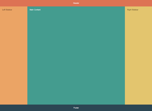
It’s kind of like Lego.
We connect the pieces block by block so everything ends up in the right place, with headlines at the top, images and text underneath, and call-to-action buttons where we need them.
The average user never sees this. It’s just how the browser organizes the page so it knows how to display it. We then fill those boxes with whatever content we want such as text, images, buttons, a mix of these, or even other boxes.
The issue of course is that sometimes things don’t fit neatly.
Maybe your text runs longer than the space you gave it, or your image is wider than the box you dropped it in. When that happens the content won’t shrink to fit, and it spills out past the edges of the box.
The thing is, this is CSS working as intended.
Erm, what?
Yep! This is because CSS is set to show everything by default, even the parts that don’t fit, thanks to the overflow: visible property.
For example
Imagine you’ve created a small box to hold an image. However, the image is 600px wide, but the box is only 500px.
.box {
  width: 500px;
  height: 500px;
  border: 4px solid black;
}

.box img {
  width: 600px;
  height: auto;
  padding: 20px;
}
Since visible is the default, the browser happily shows the whole image, even though part of it sticks out.

Obviously, we don’t want this as leaving content semi-visible usually makes pages look broken.
So what's the solution?
Well, for most people the first instinct is to make our design responsive so it shrinks like so:
.box img {
  width: 460px;
  height: auto;
  padding: 20px;
}
And that’s great for images in this particular situation. However, this isn’t always the correct solution because not everything can shrink like that.
For example
A code block, a chat window, or a long username still needs overflow rules to handle the extra content cleanly.
This is why we also have CSS values like hidden, scroll, or auto. These allow us to handle overflow in different ways depending on the situation and what we want to happen.
So let’s get into them.
How to control CSS overflow with value properties
There are 8 major values we can use.
Each one solves a different kind of problem you’ll actually run into when building pages. The easiest way to understand them is with an example so let’s work through them.
overflow: hidden
One of the most common uses of overflow: hidden is when you want to crop or mask a decorative element so it doesn’t spill outside its container. A good example is a background image.
For example
Let’s say that you’ve got a banner section that’s 200px tall, but your background image is much taller than that. By default, the image would stick out and make the whole layout awkward like so:

Not great right?
But with overflow: hidden you can keep the edges clean by clipping anything beyond the box.
.banner {
  width: 100%;
  height: 200px;
  border: 2px solid black;
  overflow: hidden; /* crop anything outside */
  background: url("banner.jpg") no-repeat center;
  background-size: cover;
}
What’s happening here is the browser still loads the entire background image, but only the 200px slice inside the container is visible. The rest is cut off.
This is really useful for things like cropped thumbnails, decorative shapes, or background photos where users don’t need access to the hidden parts. But it’s not a good choice for important content (like text or images people expect to read or view), because once it’s clipped, the user has no way of seeing it.
overflow: scroll
scroll tells the browser to keep all the content and always add scrollbars, no matter what.
These then allow the user to click on the bar and move vertically or horizontally depending on which way it overflows.
For example
A classic use case for this is code snippets on an article. Think about a blog post or documentation site where someone pastes a long line of code.
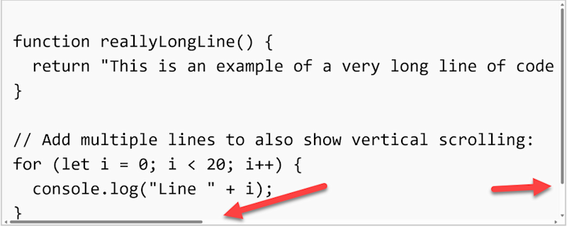
You don’t want that line pushing your layout sideways, so instead, you contain it inside a fixed-width box and let the user scroll to see it all.
.code-snippet {
  width: 400px;
  height: 150px;
  border: 1px solid #ccc;
  overflow: scroll; /* always show scrollbars */
  font-family: monospace;
  padding: 8px;
  background: #f9f9f9;
}
This guarantees users can always access the full content. The tradeoff though is that scrollbars show even when there’s nothing to scroll, which can look clunky in some layouts.
The good news is we can use the next method to get around this.
overflow: auto
auto works just like scroll, but only shows scrollbars if they’re needed.
This is usually the better choice for text-heavy UIs like chat apps, article previews, or code samples. If the content fits, everything looks clean. If it overflows, scrollbars appear automatically so nothing is lost.
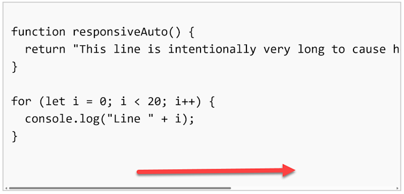
.code-snippet {
  width: 400px;
  height: 180px;
  border: 1px solid #ccc;
  overflow: auto; /* scrollbars only when needed */
  font-family: monospace;
  padding: 8px;
  background: #f9f9f9;
}
The only issue is that scrollbars can suddenly appear and nudge things around when content changes, so watch out for small layout shifts.
This is why the best practice is to use auto when you know overflow
overflow: clip
At first glance, clip looks almost identical to hidden in that both cut off anything that doesn’t fit inside the box. But there’s an important difference: with clip, scrolling is completely disabled.
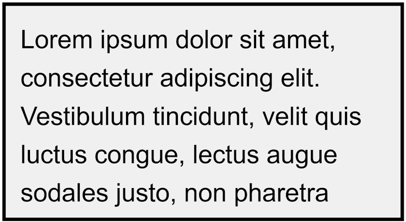
.box {
  width: 200px;
  height: 100px;
  border: 2px solid black;
  overflow: clip; /* cut it off, no scrolling possible */
}
With hidden, the content is clipped but you could still make it scrollable later by switching the property to scroll or auto.
For example
A blog post preview that shows the first paragraph, with the rest hidden until the reader clicks “Read more”
A dropdown menu that hides items until the user expands it
A carousel where only the active image is shown, and the others are clipped but still accessible through navigation
In all of these cases, the hidden content is still there in the DOM, and you’re making it accessible through some kind of interaction (button, hover, expanding).
With clip, you’re saying that
Why does this matter?
Well, this makes clip slightly more efficient for the browser to render, especially in large layouts or when you have many elements on the page. But it comes at the cost of flexibility in that once it’s clipped, that content is completely gone to the user.
overflow-x and overflow-y
Up to this point we’ve been controlling overflow in both directions at once. But real layouts don’t always work that way. Sometimes you want to allow scrolling in one direction, while completely blocking it in the other.
For example
Think about a chat app. Messages stack vertically, and you want people to scroll up and down to see older conversations. But if a single long word or emoji pushes the layout sideways, horizontal scrolling would break the experience.
That’s where overflow-x and overflow-y come in.
.chat-box {
  width: 300px;
  height: 200px;
  border: 2px solid black;
  overflow-y: scroll;  /* allow vertical scrolling */
  overflow-x: hidden;  /* block horizontal scrolling */
}
Now, users can scroll up and down to see older messages, but they can’t accidentally scroll sideways and push the layout around.
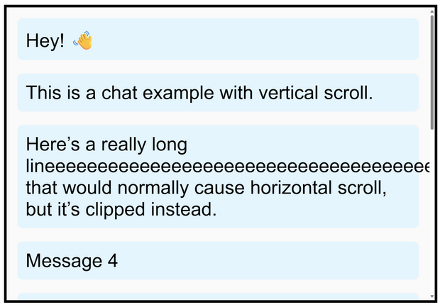
Another neat trick is that the overflow shorthand can take two values: the first for x, the second for y.
For example
.chat-box {
  overflow: hidden scroll; /* x hidden, y scroll */
}
This keeps your CSS concise while still giving you fine control.
In fact, overflow-x and overflow-y are perfect when content naturally flows in one direction (like chat messages, timelines, or lists) and you don’t want to deal with the other.
text-overflow
Sometimes the problem isn’t an image or container at all, but text. Specifically, text that refuses to fit neatly in the space you’ve given it.
For example
Imagine a form where users type in their name, or a file upload where the filename shows in a small box. You can’t predict how long that text will be, and shrinking it responsively isn’t practical. (Also, it would be unreadable).
However, if the text overflows, then it either spills past the box or gets cut off mid-letter, both of which look broken.
That’s where text-overflow comes in. It lets the browser replace the overflow with something more user-friendly.

.input-preview {
  width: 200px;
  white-space: nowrap;     /* keep it on one line */
  overflow: hidden;        /* hide anything that doesn’t fit */
  text-overflow: ellipsis; /* show ... when text overflows */
}
Now if the user’s text is too long, the browser shows a clean ellipsis … at the end. This signals that the content continues beyond the visible area, without wrecking the layout.
This is especially useful in user-facing UIs like forms, chat apps, or file lists, because users instantly see that they’ve hit a limit and can trim or adjust their input.
overflow-wrap
Sometimes text doesn’t overflow because it’s long in length, but because it’s a single unbreakable word or string.
For example
Think of a really long URL, a product code, or someone pasting a giant unspaced word into a comment box.
By default, browsers try to keep words whole and they won’t split them up. That means if a word is wider than its container, it just bursts out the side and breaks your layout.
That’s where overflow-wrap comes in.
It tells the browser: “If a word is too long to fit, go ahead and break it onto the next line.”
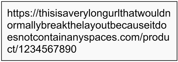
.description {
  width: 250px;
  border: 1px solid black;
  overflow-wrap: break-word; /* allow long words to wrap */
}
Now instead of pushing past the container, that long URL gets neatly split across lines and everything stays inside the box.
This is most useful for user-generated content i.e. things you can’t control, like usernames, chat messages, or links people paste into forms. Since you can’t predict what they’ll type, overflow-wrap: break-word makes sure their content won’t wreck your design.
white-space
white-space is pretty much the opposite of overflow-wrap . Instead of letting text wrap, it controls whether wrapping can happen at all.
So why would we want this?
For example
By default, browsers will wrap text onto a new line when it hits the edge of its container. But if you set white-space: nowrap, the text is forced to stay on a single line, no matter how long it gets.

.nav-item {
  white-space: nowrap;
}
This is really useful in navigation bars or buttons where you don’t want words splitting across two lines. For example, a menu item like “Contact Support” looks cleaner on a single line rather than breaking into “Contact” above “Support.”
The downside is that nowrap can create horizontal overflow, since the text won’t break itself. That’s why it’s often combined with overflow: hidden and text-overflow: ellipsis so the extra text is clipped cleanly with an ellipsis instead of spilling into the layout.
So while overflow-wrap ensures things
Time to tidy up your own UI
So as you can see, with the right overflow property (or combination), you can keep your layout working exactly as intended.
No more cut-off images or text breaking out of boxes!
The trick to learning this, of course, is to try it out. So go ahead and give it a go in your next project, and you’ll see how much cleaner and smoother your designs feel.
P.S.
Remember, if you want to learn more about CSS + HTML, then check out my complete CSS course:
You’ll learn everything from CSS basics to advanced CSS techniques by completing 100+ exercises and projects. You'll also learn how to use CSS to create beautiful, responsive websites that wow users and employers.
Even better?
Once you join, you’ll get access to our private Discord community, where you can ask questions and get answers from me, other students, and other working tech professionals.
Best articles. Best resources. Only for ZTM subscribers.
If you enjoyed this post and want to get more like it in the future, subscribe below. By joining the ZTM community of over 100,000 developers you’ll receive Web Developer Monthly (the fastest growing monthly newsletter for developers) and other exclusive ZTM posts, opportunities and offers.
No spam ever, unsubscribe anytime
