🙋♀️ Hi everyone, I’m Laura.
You may remember me from posts such as Key Takeaways for Designers from Figma's Config 2021 and... well that’s my only post... so far! Anyway, back to Career Paths...
Many of you enjoyed the brief Behind the scenes! How did we build ZTM Career Paths? section of Andrei's Your Roadmap to a Successful Career in Tech launch post so Andrei asked if I'd be able to pull back the curtains a little bit and share more about the process with the ZTM community.
I hope your enjoy the post and if you have any questions, comments, feedback, don't hesitate to reach out to me on Twitter or email us at support@zerotomastery.io!
💡 Where did it all start?
Let's jump right in. When I joined the Zero To Mastery team last September, discussions were already underway about two potential opportunities to help ZTM students achieve their goals faster and have a better experience using the website at the same time.
First of all, as Andrei mentioned in his Career Paths launch post, he was receiving lots of messages and seeing many discussions in our Discord community that were some variation of these two questions:
- I’ve just completed this course, what do I do next?
- I want to get a job in a particular area of development, design, machine learning, etc. how do I get there?
This meant that there was an opportunity for us to improve how we present our courses and workshops so that our students could be confident that they’re on the right track.
The second opportunity was to figure out how to replace Andrei's existing course roadmap image with a solution that would be more scalable as courses are added to the Academy and more accessible for as many students as possible.
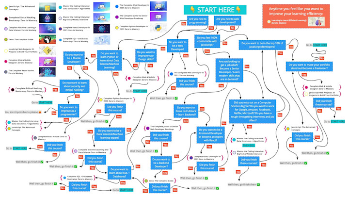
We know that around 30% of our users come to our site using their mobile phones, and that having to pinch and zoom into a small image and pan around to see the whole picture is not ideal and not possible for many people.
In these early discussions it seemed obvious to us that these two opportunities were linked, but before we got too ahead of ourselves we decided to do some research and make sure that we were actually trying to solve the right problems with the right solutions.
🔍 Understanding the problem
This research followed two different… paths.
As we had a clear idea of an element on our site that we wanted to change, I started with some market research. I looked at our main competitors and other online learning platforms to understand how they help users find the courses that are right for them. Do they allow users to filter courses? Do they give options of what to do after a course has been finished? What is best / worst about the experiences available?
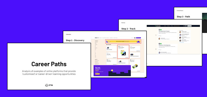
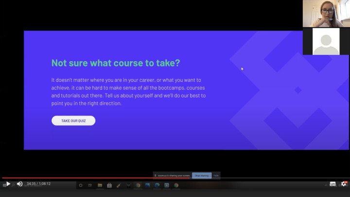
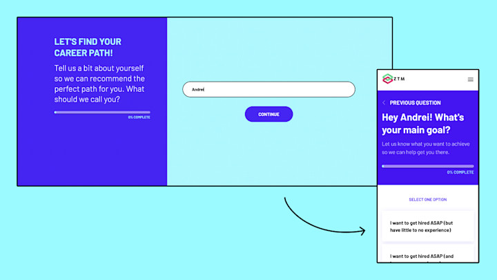
Through market research and internal discussions we had proposed that a quiz might be the best replacement for the roadmap. So, working with Andrei, I put together a rough clickable prototype of a quiz to test during the sessions. Not wanting to introduce any bias into our discussions I always left this prototype for last. After completing the quiz I asked participants some basic questions like ‘how would you rate this experience?’ but also some more in depth questions like ‘how could this support your needs?’.
Towards the end of last year you may have received an email from us asking to fill out a survey asking if you’d be happy to take part in these one on one research sessions. Thank you to everyone who answered our survey and thank you, thank you, thank you to everyone who took part in the sessions ❤️.
Over the course of two weeks I spoke to students of all different backgrounds and experience levels from all over the world. To break down the content of the interviews into something manageable, I produced empathy maps for each person, highlighting things students said, felt, thought and did.
After completing this research I came up with a list of recommendations, some of which have made it into our new Career Paths, while some will be part of our future plans to grow the feature.
📝 Bringing the research to life
The next step was to put together some likely user journeys and user flows that would map how different students would access and use the quiz and the career paths, whether they’re an existing Academy member or someone visiting ZTM for the first time.
It was during this stage that I brought the dev team on board, the incredible Cindy, Matt and Yihua, to get their point of view from a technical perspective.
With these initial user journeys I had tried to solve as many potential problems as possible and include features that would add exciting functionality. During this process we stumbled across a couple of issues figuring out how we put this into practise.
The Zero To Mastery Academy lives on a third party platform (Teachable) and there are limitations as to how we can interact and build upon it. This back and forth of ‘what is possible’ vs ‘what is not possible’ is a perfect case study in why user journeys and flows are so helpful. Writing or drawing diagrams that explain what the user might do and what they would expect, coupled with how the system is reacting to their actions, is much quicker than jumping straight into designing solutions.
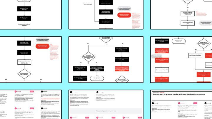
Basically, you can go back to the drawing board or put a pin in some ideas without worrying that you’ve invested too much time to rethink anything at this point. These technical limitations forced us to think very clearly and in a much more focused way about what problem we want to solve.
🎨 Refining our goals within the design phase
Once we, as a team, had pared back the ambition of the user journey phase to focus on the core goals of providing learning pathways for users and a method to help users pick the right pathway for them, I moved straight into the wireframe phase.
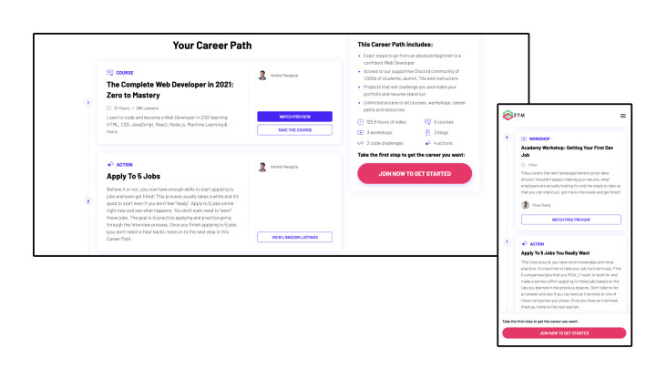
After an internal review, I moved into the design phase, turning pretty low fidelity wireframes into high fidelity mobile and desktop designs for the quiz and Career Path pages. Eagle-eyed students may also notice that we've switched up the navigation a little bit to create a new home for these paths.
🏗 Build! Build! Build!
Once the team were happy with the designs, we moved into build. As always, this was not the end of the road for design. To make life as easy as possible, I produced UI specifications and noted intended behaviour within the experience, helped the dev team break it down into build tickets and reviewed the build in progress to help work out any kinks.
Not being a Developer myself, I asked the team what some of their main challenges and lessons learned were during the process of bringing Career Paths to life.
Here are some nuggets of learnings from Cindy:
Figure out the best way to turn the design into reality & align with the design specs while making sure the code is readable and easy to maintain so that my future self will not despise my current myself.
Need to communicate more frequently with other team members to ensure that we are all on the same page and we are not ruining someone's life 😂 i.e. when I think changes I make won't affect others, think twice.
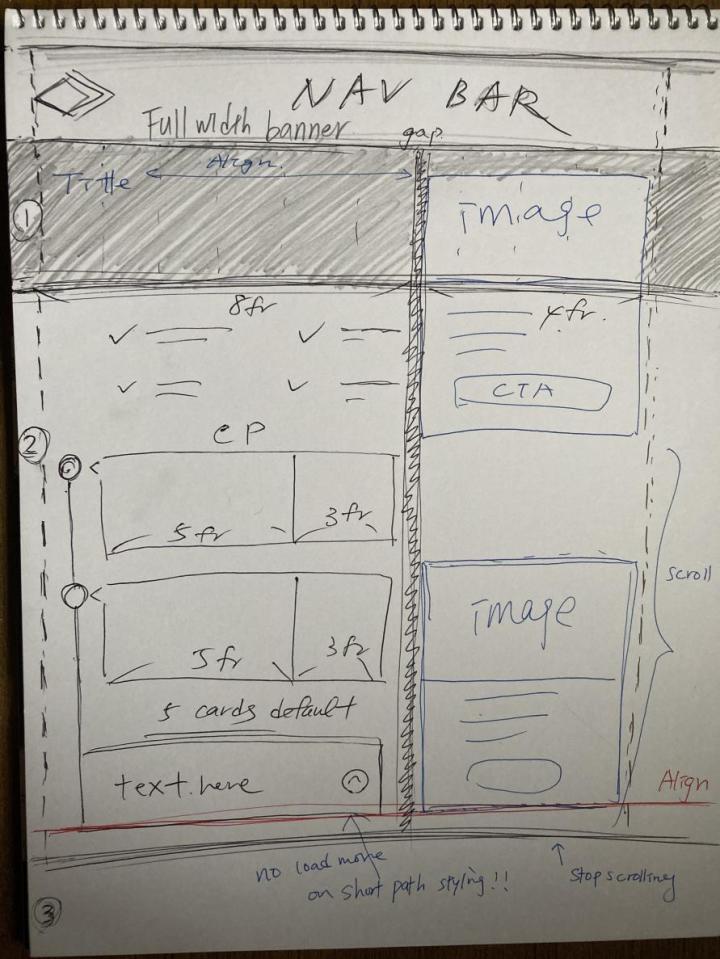
I love the way Cindy interpreted the design for the Career Path pages and how she sketched out my functionality notes to make sense for her:
For Yihua, the biggest challenge was figuring out the data models for the quiz so that when you select an answer on one screen you are taken to the correct next screen, and ultimately the correct Career Path. If we maintained our own backend and database (rather than relying on Teachable for this for now), this would have been much easier.
The biggest challenge for Matt was the strategy and implementation of Google Tag Manager. This allows us to gather data to see which features are popular with students and also where any features may not be having the impact we expect.
A learning point for me was how different devices behave differently. The styling on one device can be completely different from that of another device. - Matt
While the dev team and I were working on perfecting the build; Andrei and the ZTM instructors worked their magic on the content for the paths themselves. Dream team!
🔍 Test! Test! Test!
For a week or so before launch the whole team got involved with testing the quiz and the Career Paths. These final tests were to make sure the end to end quiz process worked as it should and to make sure the UI and content was as good as it could be.
Then we passed it on to our ZTM Community Star Mentors for their first impressions and feedback to iterate on in the future. This is not the end of our work on Career Paths!
🎉 Phase one launch!
It's alive!!! So far the response from everyone has been fantastic with over 4,000 students generating custom Career Paths via the quiz in the first few days alone. If you haven't had a go yet, what are you waiting for? 😜
Step 1: Pick a standard path or let us customize one for you.
- Option 1: Head to our Career Paths page where we list out our top Career Paths. Each of these paths assumes you have absolutely zero experience and are starting from scratch.
- Option 2: If you want a customized version of one of our Career Paths based on your experience, your goals, and your interests, take our 2-minute Tech Career Path Quiz. We’ll send you a custom path built just for you.
Step 2: Follow the exact steps provided to completion.
Step 3: Achieve your dream goals and send us your success story!
Do you have any feedback from Career Paths or the ZTM Tech Career Path Quiz so far? I'd love to hear from you. Message me on Twitter.
